TRAINING MANUAL
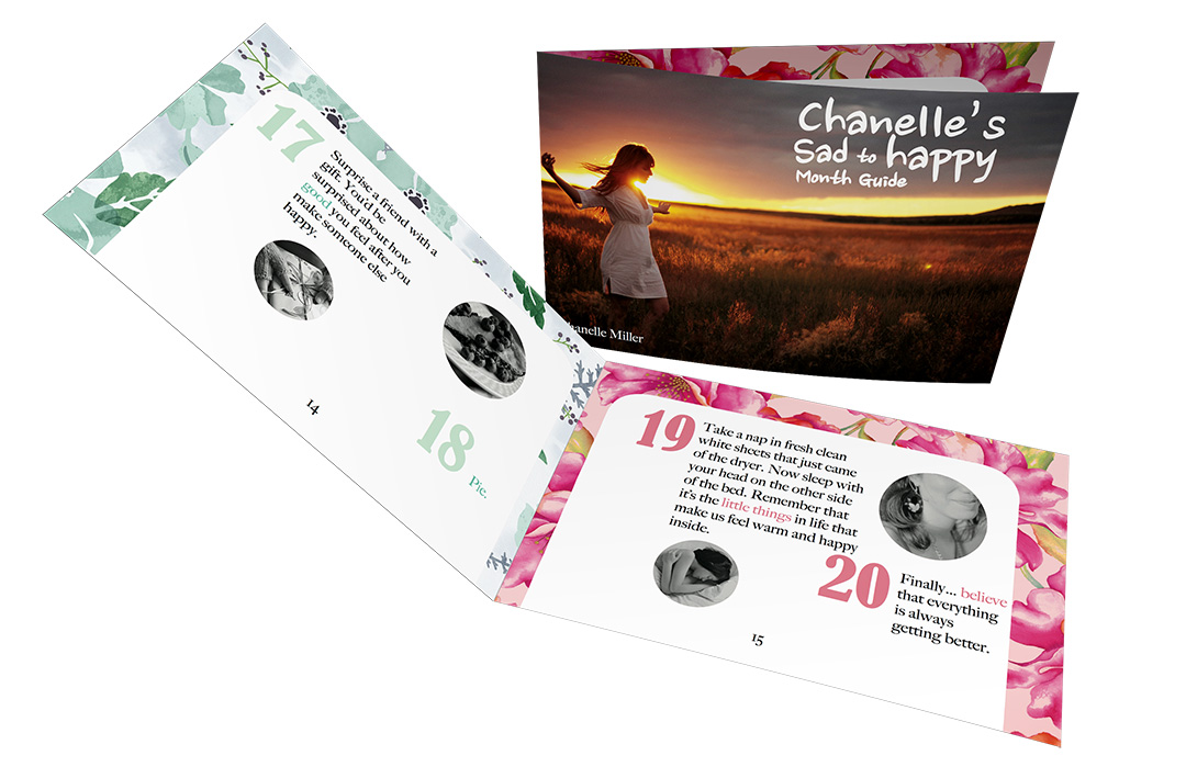
This is a sample of a training manual that which in total had 28 pages not including the back and front cover. What inspired me to write this training manual was that I was going through a rough time and felt it would be a way to not only help myself but others as well. Its’ purpose was to remind us of the little things in life and the happiness one can achieve. The style is very girly since the target demoprgaphic was towards females. I used light and happy colors like light blues, pinks and yellows to brighten up the manual as well as the readers day.
Size: 10.5 x 7 in
FRENCH MAGAZINE
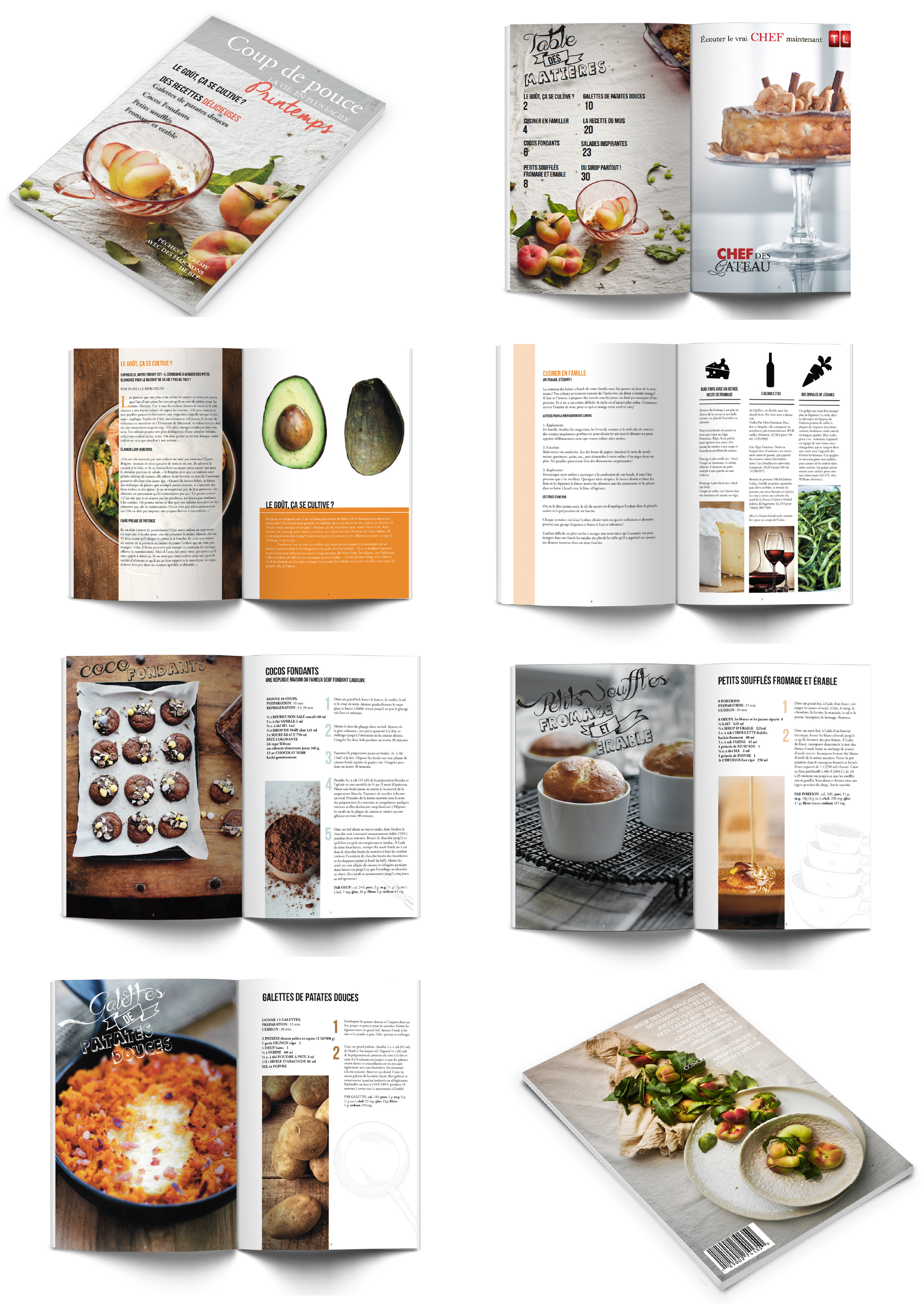
This is a sample of a french cooking magazine that I remade using my own style and copyright-free images. This was my favorite project to put together because I aspire one day to work at a magazine firm . The design was inspired by my love for french styled kitchens and homeade cuisine.
Size: 8 x 11
BUSINESS PROPOSAL
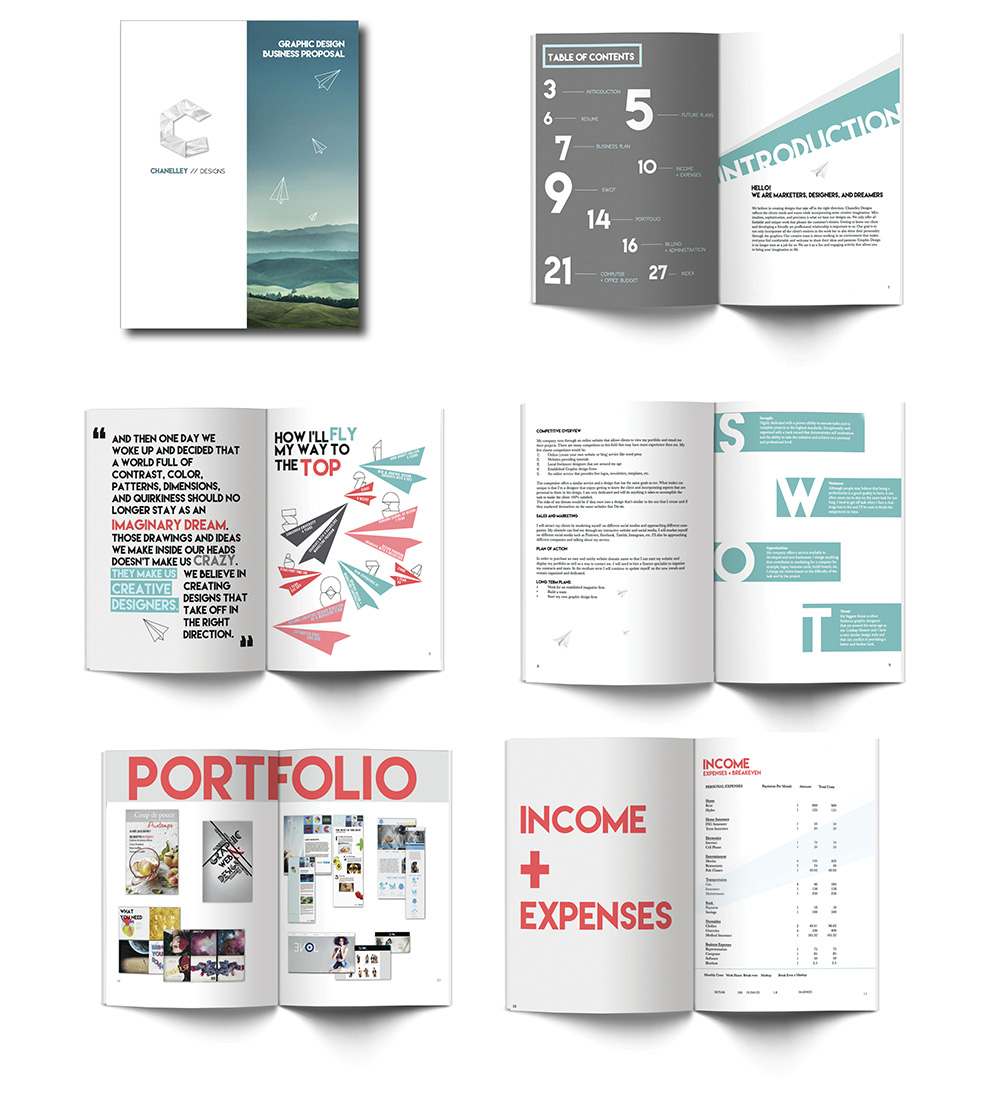
This is a sample of the business proposal for my fictional graphic design company which in total had 26 pages not including the back and front cover. I learned what to include in a basic business proposal and this assignment taught me how to prepare a freelance contract, my hourly rate based on my living expenses, how much it costs to open a graphic design firm and other important elements to include in a business proposal.
Size: 8.5 x 11 in
FUZZY BUDDY ADVERTISING
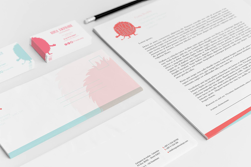
Fuzzy Buddy is a fictional, non-profit organization that allows children to draw a made up character and have it come to life in a stuffed animal form. The proceeds go to funding schools in Africa. I wanted the design to be simple and to have the focal point be the symbol. There were two main colors that my partner and I revolved the project around which were a playful blue and pink. We both made the designs and came to an equal compromise for each piece. The colors were chosen to show that boys and girls can profit from the organization.
VERNISSAGE POSTER
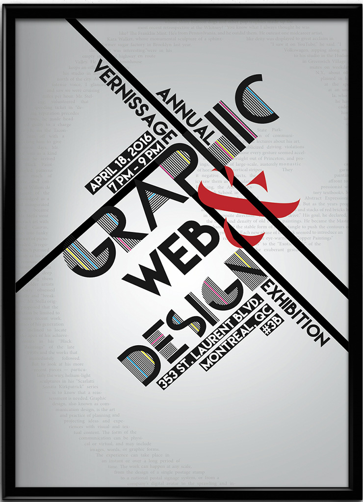
The poster above advertises an event hosted by the Graphic and Web Design program at John Abbott College. The event was meant to show the works of students graduating in the program that year. As for the poster, I played a lot with the typography by making the words flow with every direction of the other letters and words. I used an artistic and modern font to represent that graphic design is always evolving. The background is a subtle radial-gradient from gray to white to put the main focus on the design. I also included a very opaque golden rule symbol behind the intial design because I feel that it plays an important role in the design world.
Size: 11 x 17 in
DEBRA POSTER
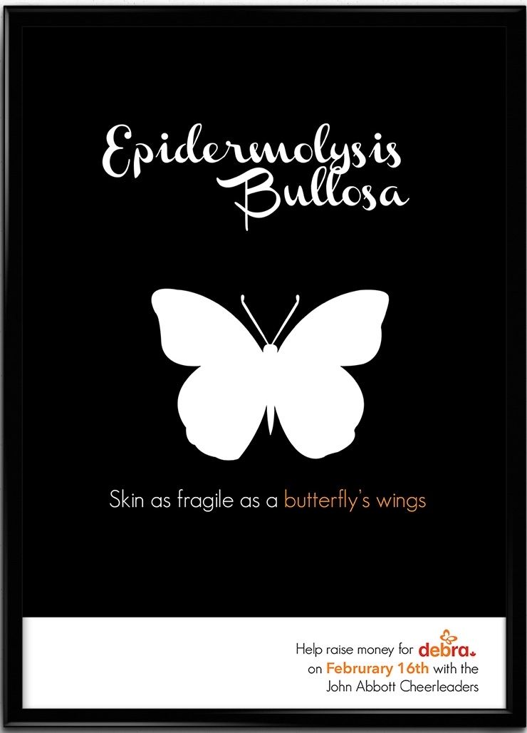
This is a poster for Debra (Dystrophic Epidermolysis Bullosa Research Association) Canada. It’s an organization that spreads awarness and care for those with a serious skin condition called Epiderlmolysis Bullosa. I used a butterfly to represent the fragility of children who suffer from this disease. Orange is the main color because it was the color used for the organization here in Canada. The fundraiser which I helped organize, raised 436 dollars for the cause.
Size: 8.5 x 11 in