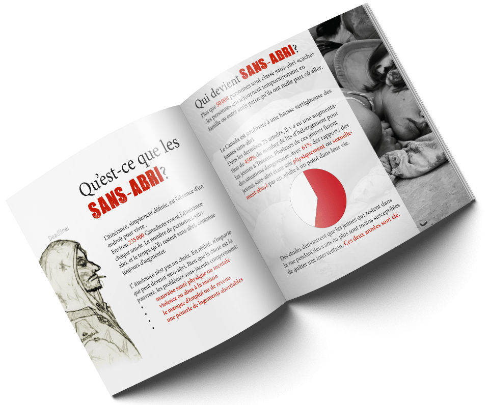
Another project which involved taking information from a pre-existing place and creating something from it. This time, for a booklet about homelessness, namely regarding youth. I was also required to include a hand drawn element, so I drew, in my own sketchy style, a man dressed in ragged clothing. The point of this project was to continue our use of grids for alignment as well as using design elements to draw attention to specific information. We needed to communicate a message with only a little bit of actual text.
Another challenged we faced is that not only did it need to be bilingual, but the english side had to be upside down. That way, it's easier to tell when one language ends and another begins.