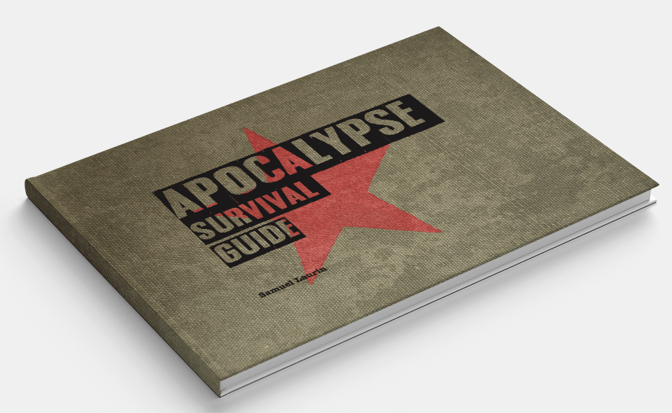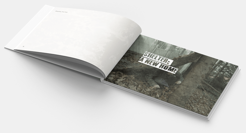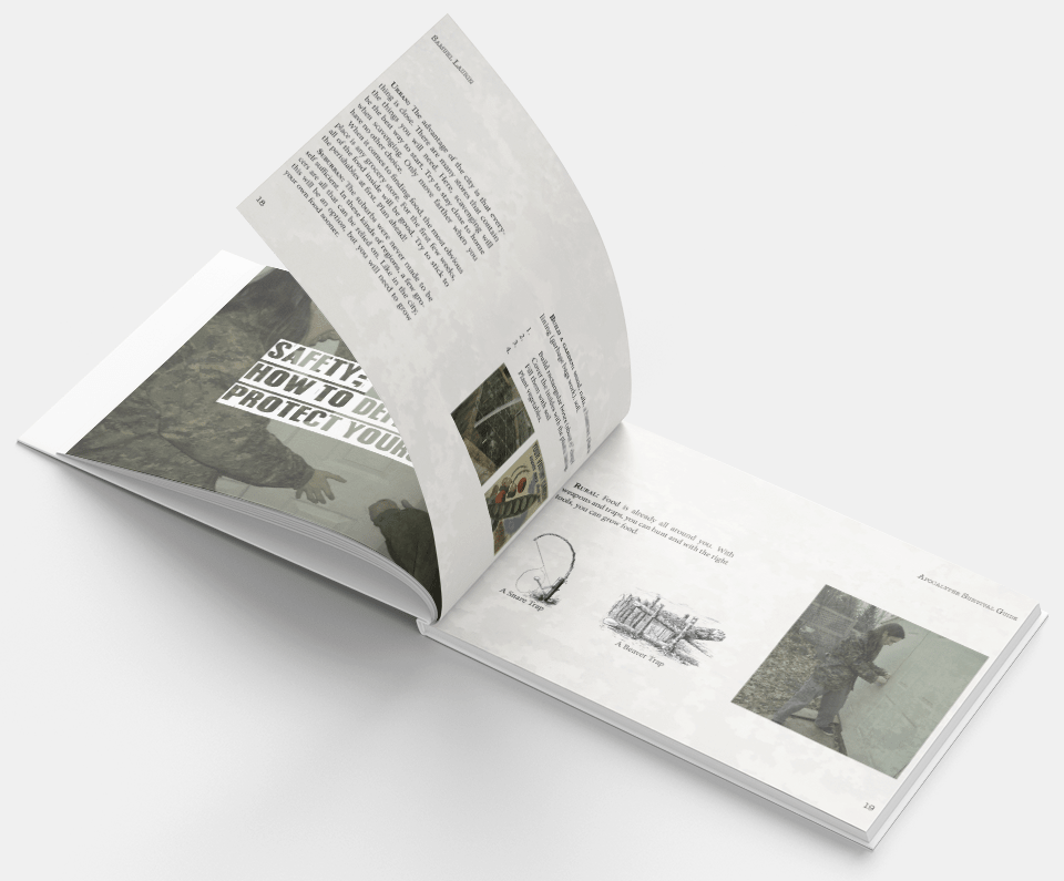
This project required I create an information booklet following a grid system. For the typography, I wanted to keep things simple, considering the theme of my booklet. I thought "If someone's trying to survive, they're not going to want long paragraphs of fluff. They want information fast". In following the style I wanted the booklet to have, I used a type face that resembled that of a typewriter. It gave the text a WWII telegram feeling, which I think captures an element of the kind of situation the reader might be in.
Though the grid I used throughout the booklet kept things consistent, I wanted to add a little detail that would continue across all pages. I added a texture of rusted metal over each page and brought down the opacity until it was just barely there. This, I think, also keeps with the theme of survival, like if the booklet was old and weather worn.

The actual version of the book I printed is spiral bound with a transparent plastic cover. Unfortunately, finding a mockup for a spiral bound book of the right dimensions proved very difficult.

