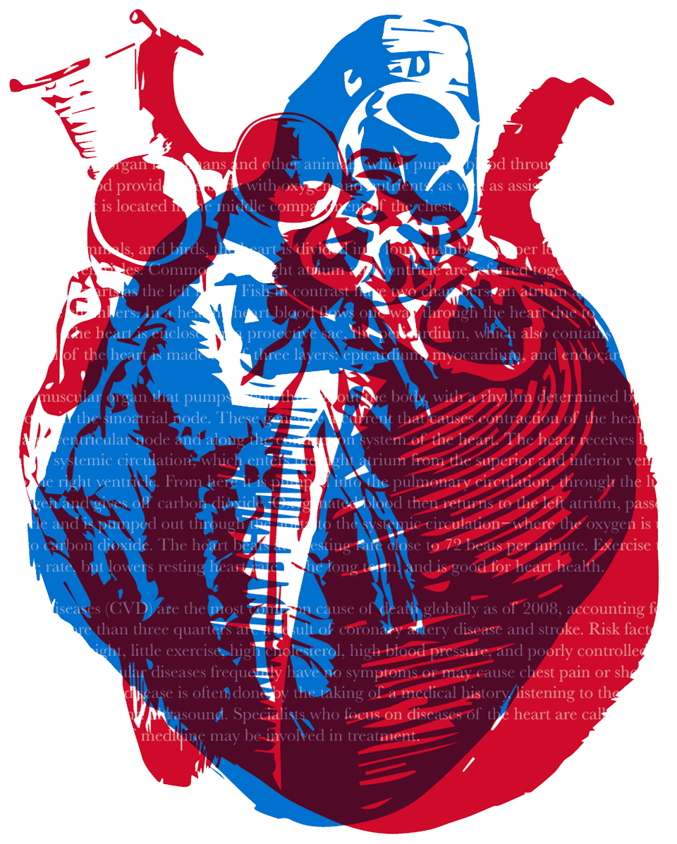
This wasn't even a project! I just had so much fun with this lesson that I kept on making things in this style. Overprinting lets two overlapping items be seen but instead of lowering the opacity, the colors remain vibrant. I created three that I like the most, after many strange ideas I don't even think I kept. These ones could be made into graphic tees, which I would love to do, as soon as I learn how.
Concerning the colors, I liked to use light grey and red to make the red pop, without darkening it too much which would have happened if I used a much darker color. For the hearts, I used red and blue, drawing inspiration from blood and veins.


