One of the most interesting projects I've done, and one of my favorite, has to be trade fair. Along with my teammate, I had to create a company and design it's logo, stationery and website. My teammate and I decided on a rather unusual company. Inspired by the fictional Vaoult-Tec, we made a company that builds and manages city sized communal 'bomb shelters' that can protect from any number of disasters.
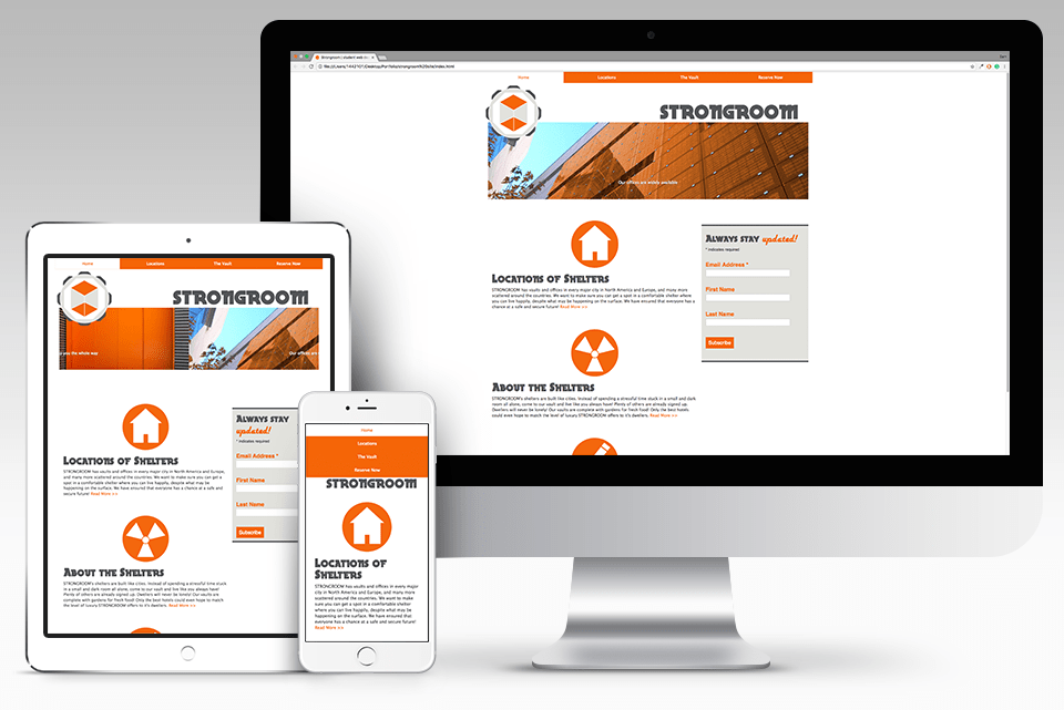
Since we technically were a security company, I used inspiration from pre-existing security websites for my own design. I also wanted to make it easily navigateable so that people of all ages can comfortably surf it's pages and learn more. I also kept it basic for that same reason. No need for anything fancy, just information in the form of text and images urging potential clients to arrange a meeting with us. The style of our typography came from a combination of the two things important to our company. Strength and family. The main big grey part of our text obviously represents the strength aspect. For the family values, we wanted to use a nice retro font style that would seem friendly and keep that 50s vibe from when family was extremely important to people.
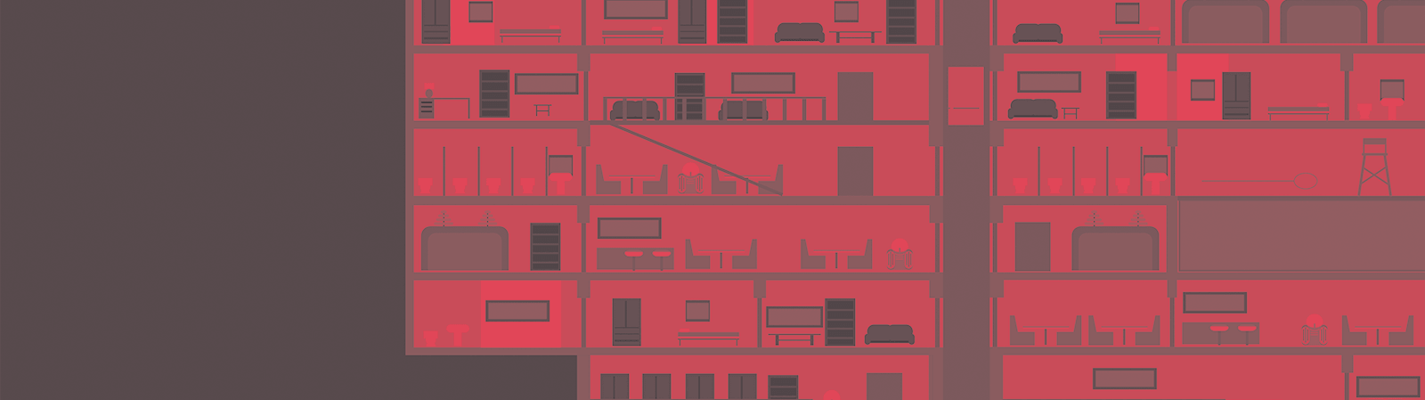
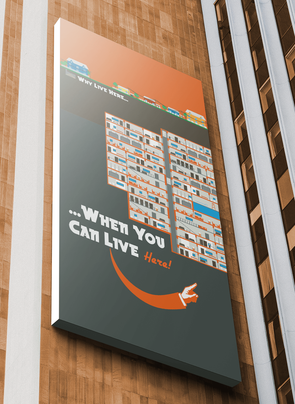
For my poster, I wanted to create something interesting and eye catching. The message is clear. Why have you own dark and damp shelter when you can live in an underground city! I put a lot of effort into details. Though it is in a simple style. there are all kinds of small things to look at. I wanted this to be something someone could hang up and notice something new each time they looked at it.
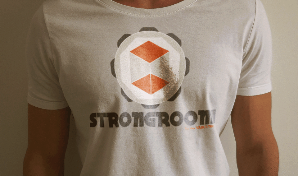
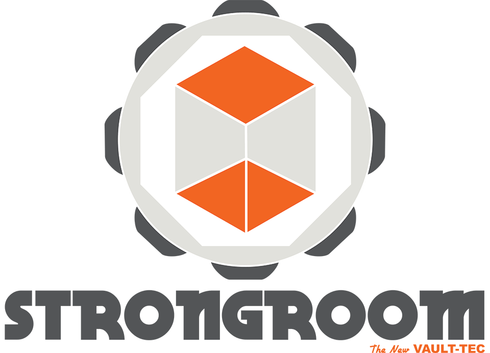
The logo we designed together, but the website here and the poster are mine. Our logo needed to reflect the strength of our company and it's shelters, while also reflecting their spaciousness and comfort. We created a strong grey outside mimicking a vault door. Inside, we created an orange and light grey cube, reflecting the 'room' in Strongroom. This was padded with white to give it more 'breathing space'.