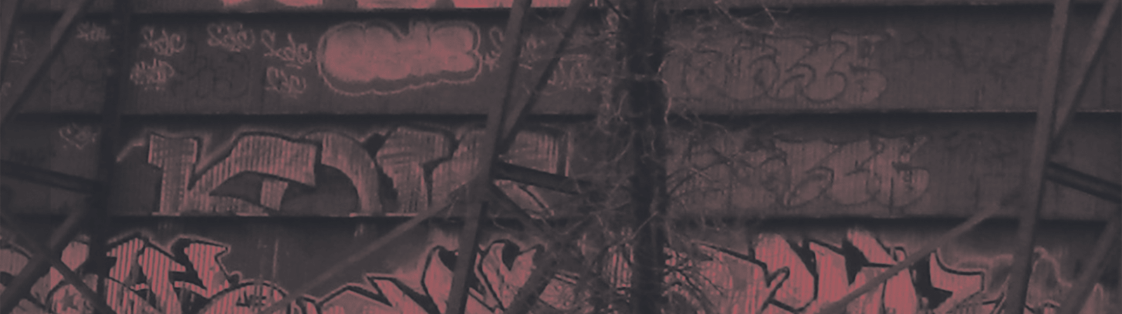
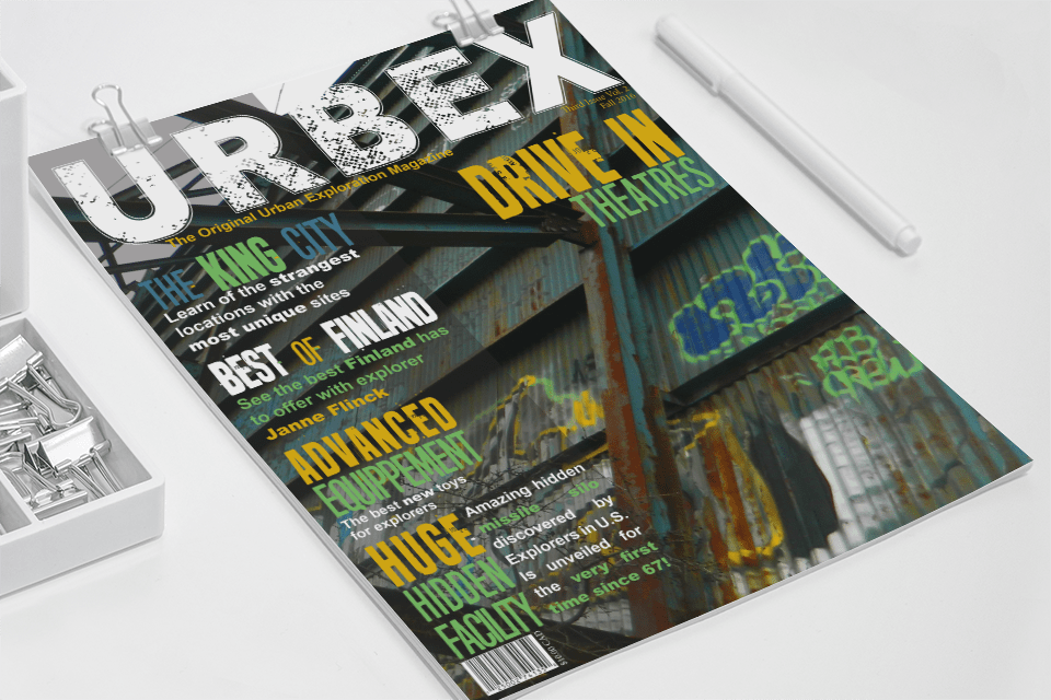
The idea for the project was to apply my knowledge of typography to make a magazine cover. I had to keep a balance between the backgroud image and the text. In both versions, the text color in the accent and basic clors were taken directly from the image to keep the cover tied together. Despite the basic colors being white, it was still the same white that could be found in the images.
The fonts I chose for the main features and titles are gungy and old looking, fitting with the theme of abandoned buildings (urbex is the exploration and photography of abandoned buildings). For body text, I went with a simple sans-serif font. To emphasize some elements of body text, without taking away from the titles, I made them bold.
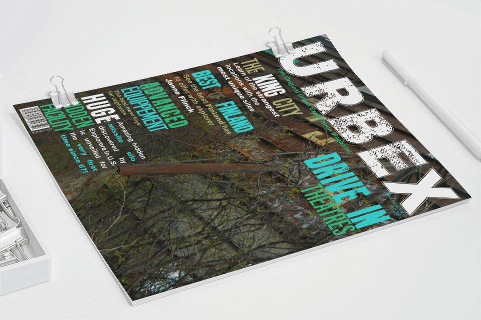
The first cover became the final version because the brighter colors were more interesting and vibrant. The second one's colors were unsaturated and didn't catch the viewer's attention, which was part of the objective of the project.