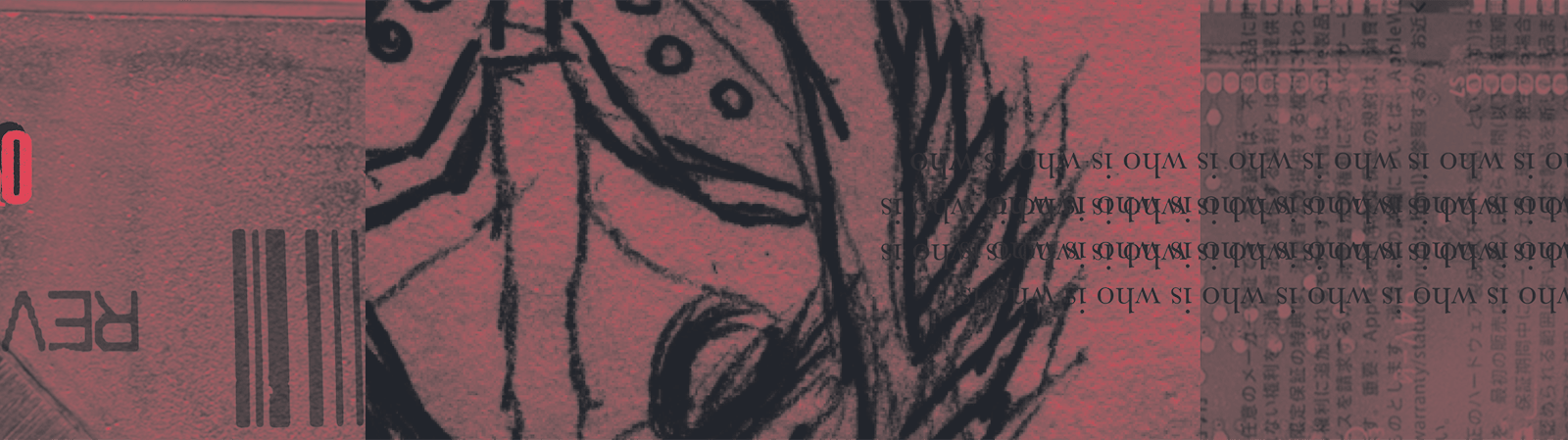
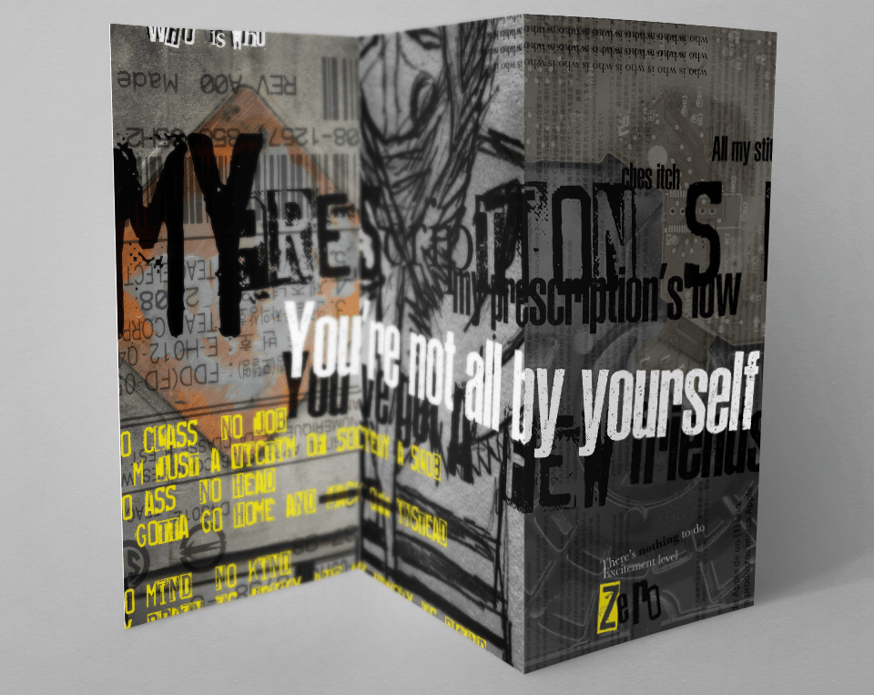
This project started simply with having to scan anything I wanted to get interesting textures. I also needed to draw something for the center. After that point, I could create the zfold brochure. I chose text that fit with the theme I saw developing. In this case, I used lyrics from a few punk and metal songs.
The rules for typography in this project were to use inspiration from the works of David Carson. I positioned text so that it would get cut off partially or completely, sometimes continuing on another line farther down. I included entire paragraphs in some sections and just a couple of words for others. The colors I used are just the default CMYK yellow and magenta, along with black and white.
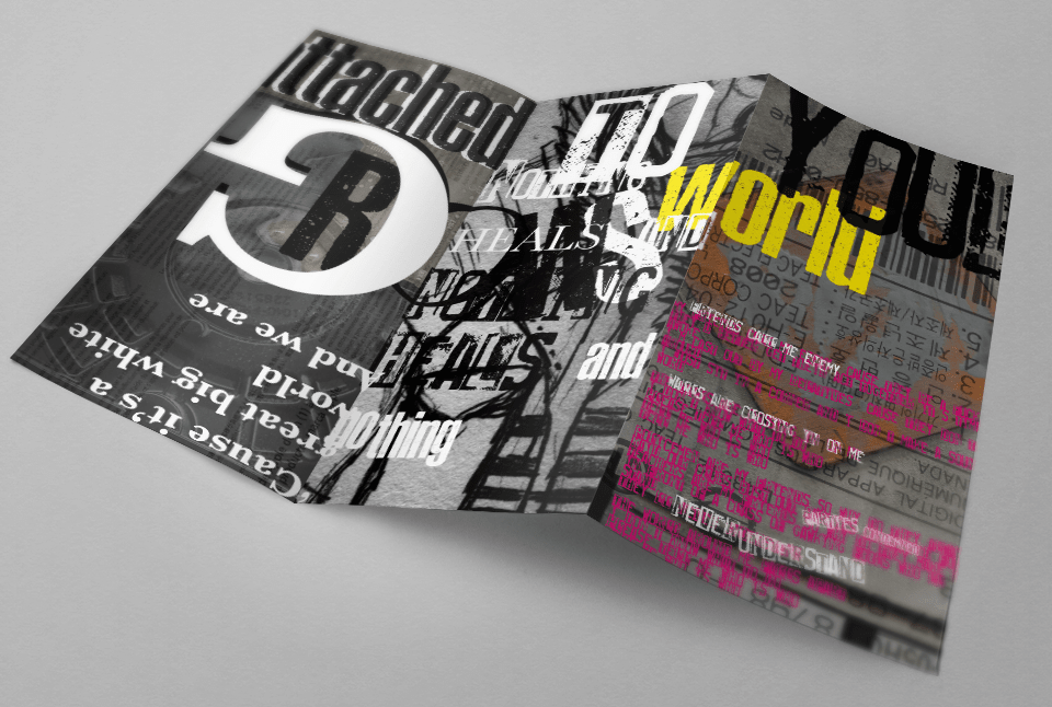
The themes I used along with fonts and colors are all chaotic. From this project, I've discovered a style I really love. I think David Carson's style of chaos and disorder makes things far more interesting than if things were simply ordered. However, I would never try to recreate this for a novel!