My Portfolio
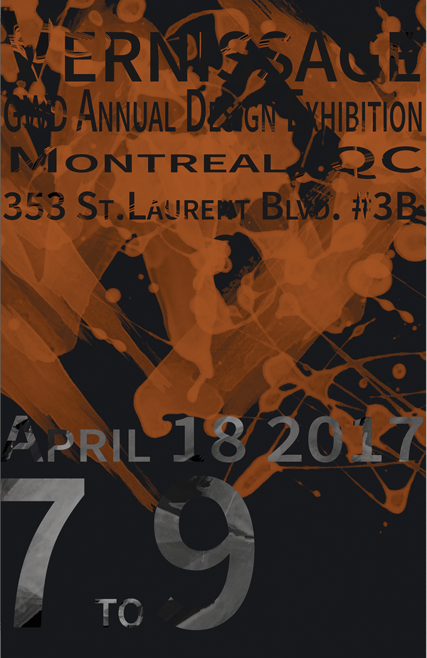
Vernissage Poster
When creating this poster I wanted to create something new and different. I created this poster for the vernissage for the Graphic & Web Design Program at John Abbott College. I chose to go with a very grungy look but one that still illustrates the artistic side of things. Although a very busy layout, I feel it is a success because the information is still readable and it represents student life.
Photoshop, InDesign
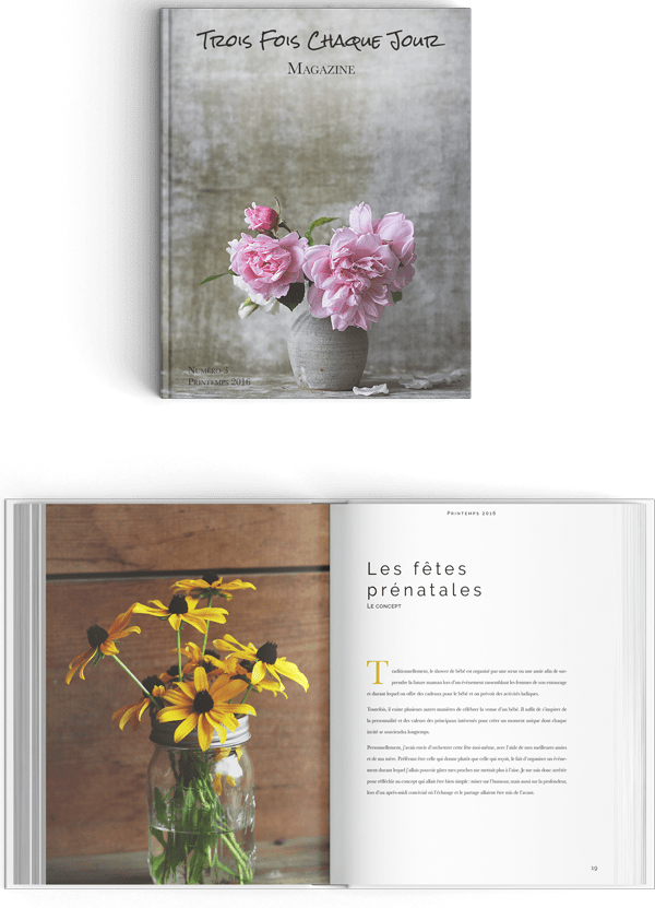
French Magazine Redesign
The goal here was to redesign a French magazine called Trois Fois Par Jour. I created a different layout but tried to keep the same beautiful feel of the magazine so that it still had a soft warm touch to it.
InDesign, Photoshop
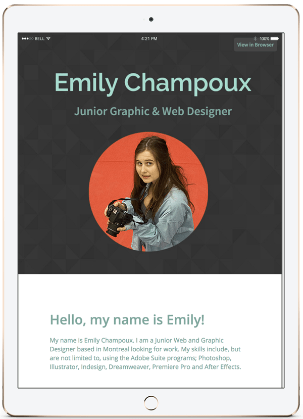
Personal E-blast
This is my own personal e-blast, I created it using HTML and CSS but also by using a program called Mailchimp. I wanted to create a clean look so I used simple fonts and colours to allow a lot of white space. All The photography is my own.
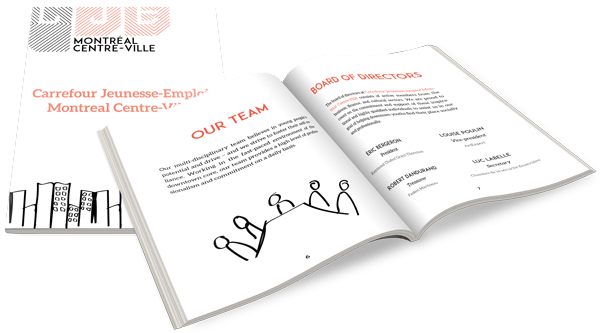
Bilingual Booklet
Here I have created a bilingual booklet based off of Carrefour Jeunesse-Employement (CJE) in Montreal. This organization helps young people get jobs in the city. I wanted the illustrations to look like rough sketches. I drew all the illustrations using a drawing tablet.
Illustrator, InDesign
WordPress Website
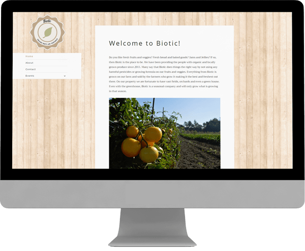
The goal of this project was to create a website using WordPress. The website created was for a fictional small business. Biotic supplies organic products at a reasonable price. The website layout is completely sedentary except for the page in the centre which moves freely up and down when the user scrolls. All the photography on the site is my own as well as the logo design.
HTML, CSS, WordPress
B.D.D Awareness
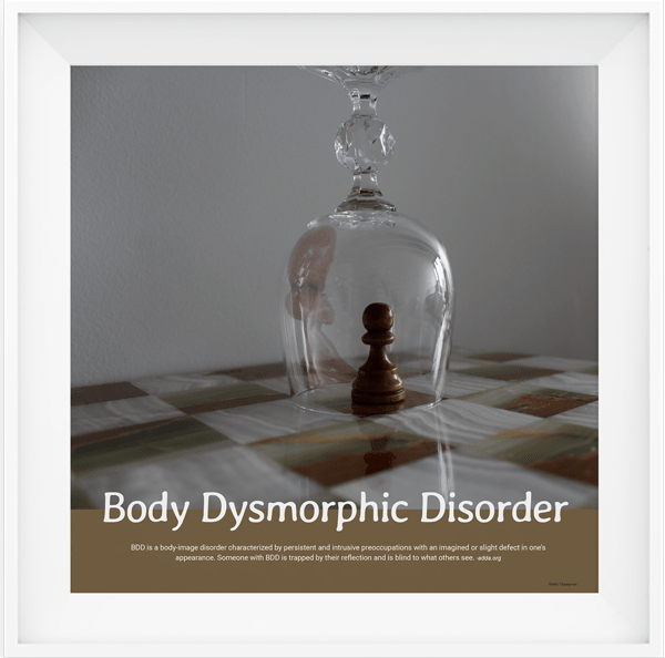
The inspiration behind this concept was to represent Body Dysmorphic Disorder (B.D.D) without using human presence. I decided to use staged photography. In the photograph, the pawn represents someone suffering from BDD. By trapping the pawn under the glass he is trapped by his own reflection and cannot see himself the way we do.
Photoshop, InDesign
Awareness Poster
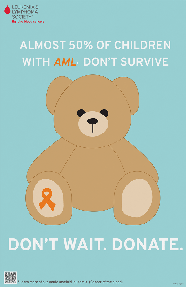
I created this piece because AML is something that is important. This type of Leukemia affects children. The teddy bear with the Leukemia ribbon on the foot is a symbol for a child. I choice a bright baby blue in order to represent childhood.
llustrator
Abstract Typography
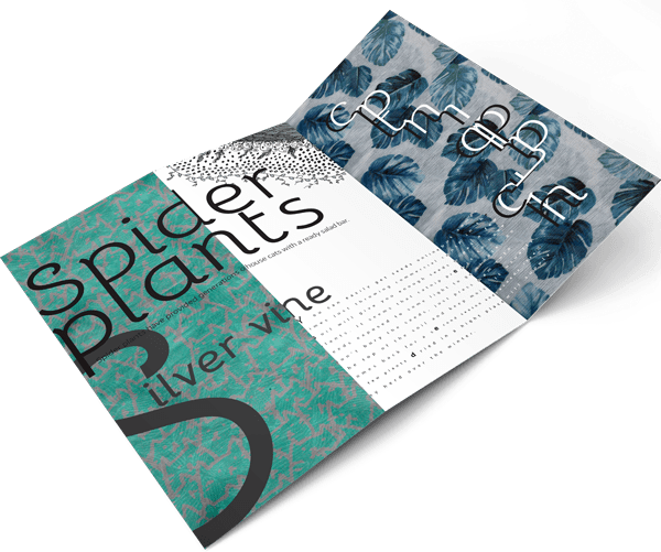
The Abstract Typography piece was created from using textures and fonts. The end result was an intriguing piece that can be read but it was not created for that purpose. The purpose of this piece was to grab people's attention. The textures and patterns in the back are all linked to one another and to the typography allowing it to flow nicely.
Photoshop, InDesign
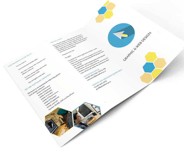
Program Brochure
This brochure was created as an example of a potential brochure for the Graphic & Web Design Program at John Abbott College. The colours and shapes were chosen to keep the feel of the brochure less corporate and more artistic and free. This was done to show the artistic side of the program and the dynamic education it has to offer.
Illustrator, InDesign
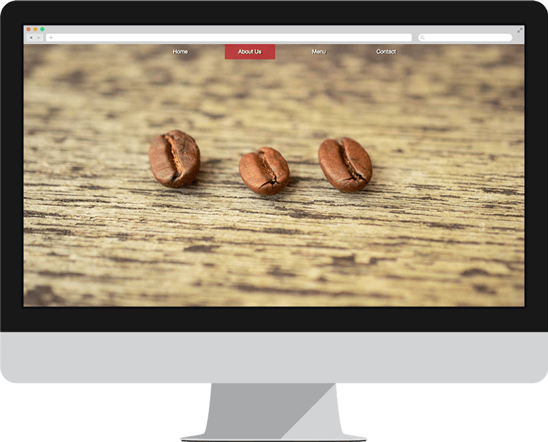
Fade Cafe
Fade Cafe is a fictional coffee shop in downtown Montreal. The coffee shop has an urban but modern vibe, this vibe was portrayed through the website and stationary. The use of the colour red is a pushy colour that attracts the view to the strong images and extraordinary street art it has to show.
CSS, HTML