Typography Poster
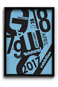
Software:
Illustrator
Description:
This is a promotional poster for the annual Graphic & Web Design Vernissage. It was inspired by the Bauhaus art movement and David Carson’s work. I focused on typography and colors to create a simple and effective design.
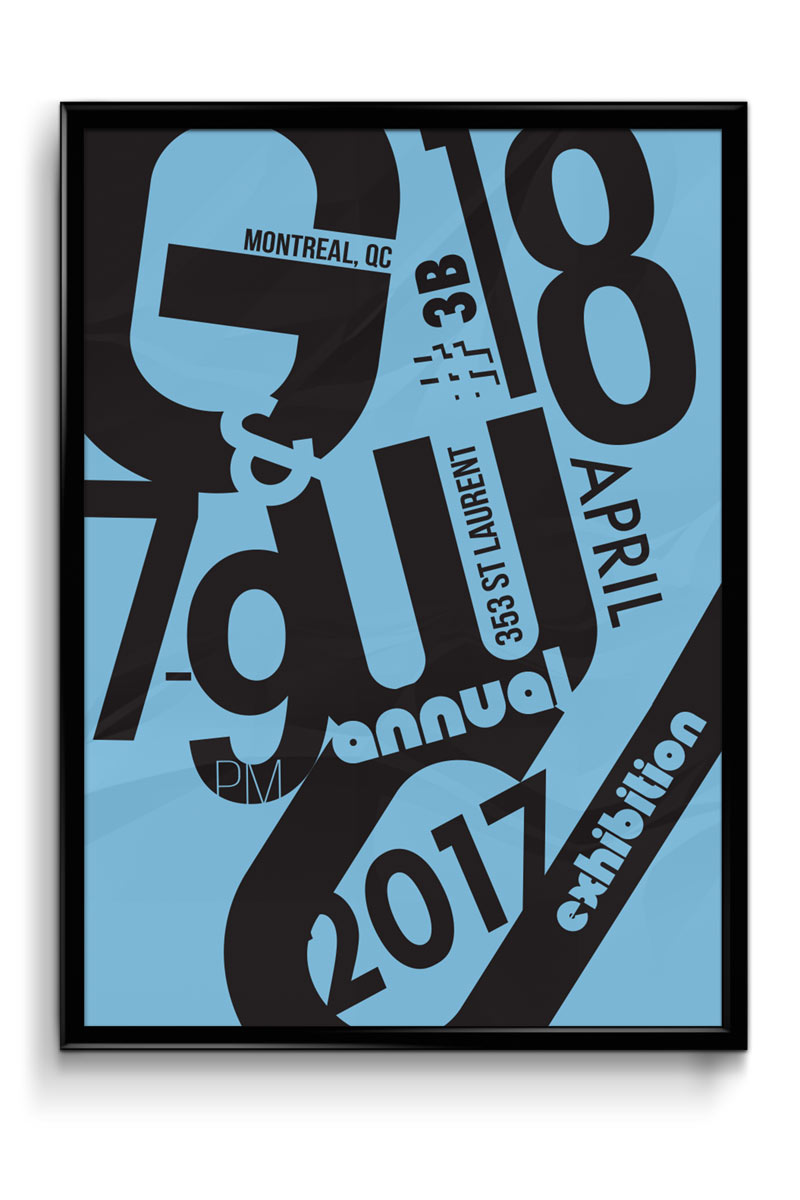
Book Cover
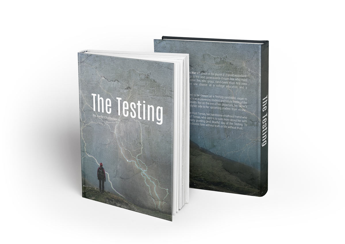
Software:
Photoshop
Description:
This is a book cover for “The Testing” by Joelle Charbonneau. The dystopia is dark and mysterious something I tried to capture in the cover. The lightning is a symbol of the main character also pictured on the cover. I added a texture to the cover to make it more dynamic and go with the feel of the book.
Awareness Booklet
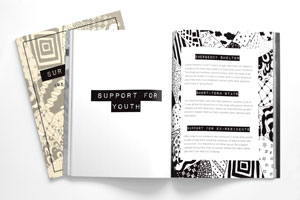
Software:
InDesign, Photoshop, Illustrator
Description:
This is a booklet made for a non-profit organisation. The target audience was children and teenagers therefore I used a "fun" sketch design. I used my own sketches to give it a notebook feel and make it appealing for children and teenagers.
French Magazine
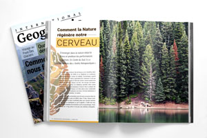
Software:
InDesign, Photoshop, Illustrator
Description:
This is a redesign of the French magazine “National Georgraphique”. A big part of the assignment was to use proper french punctuation techniques on the text. I focused on the use of large, high-quality images to help support the text as well as illustrations at the start of each article.
Promotional Poster
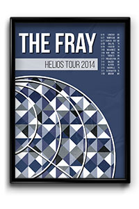
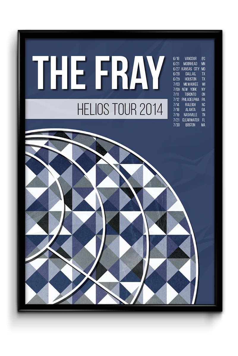
Software:
InDesign, Photoshop, Illustrator
Description:
This is a promotional poster made for The Fray's Helios Tour of 2014. I used colors from the album and created a simple pattern that was inspired by the original album artwork. The fonts are clean and reflect the rock/pop style of the band.
Duotone Brochure
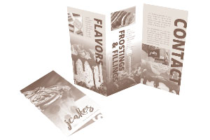
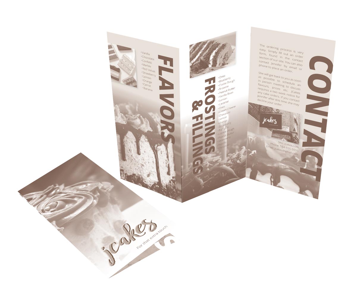
Software:
InDesign, Photoshop
Description:
This is a duo-tone brochure made for a fictional cake business called JCakes. All pictures were taken by myself and edited in Photoshop. I designed the logo to resemble icing on a cake. As for the duo-tone, I used brown and a light cream like color for contrast.