Portfolio Pieces
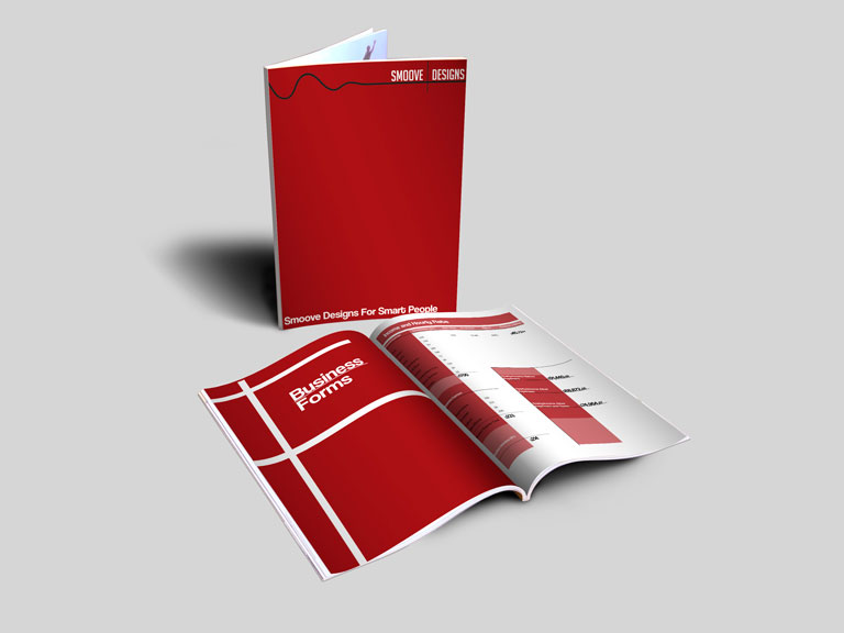
This is my business proposal I created for my company “Smoove”. A design company which specializes in modern design. My slogan was “smoove designs for smart people”.
This is my business proposal I created for my company “Smoove”. A design company which specializes in modern design. My slogan was “smoove designs for smart people”.
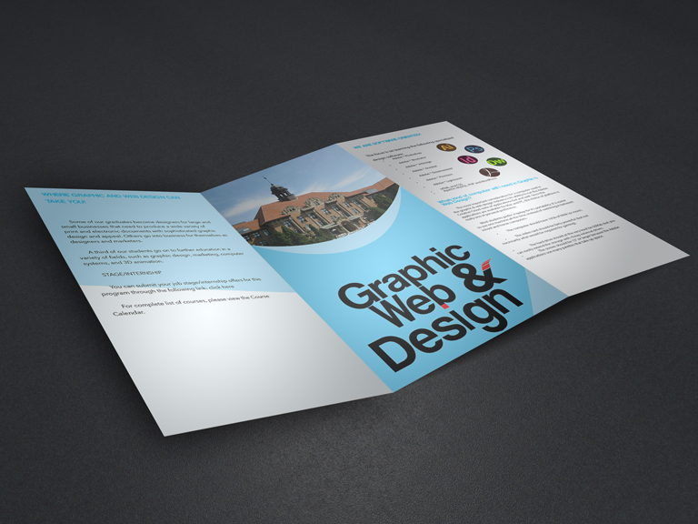
This is a brochure I made for our Graphic and Web Design program at my college. The logo and layout are my original designs. Aswell as the picture.
This is a brochure I made for our Graphic and Web Design program at my college. The logo and layout are my original designs. Aswell as the picture.
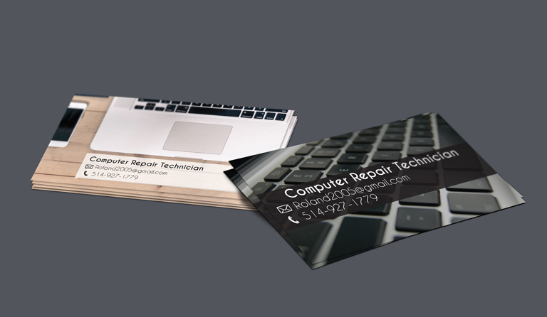
These are one sided business cards that I made for a client in my Integrated Projects course. the client wanted a simple design with minimal information as he was giving these business cards to people he already knew.
These are one sided business cards that I made for a client in my Integrated Projects course. the client wanted a simple design with minimal information as he was giving these business cards to people he already knew.
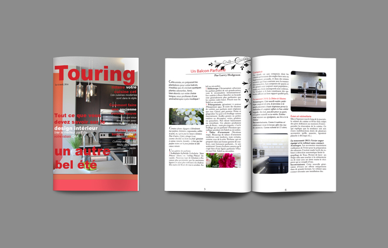
This is a magazine cover and article that I made for a biligual french publication course. The kitchen images are original content. I rather enjoyed making the magazine cover more than I thought I would. This project helped me understand typography and spacing using real world examples.
This is a magazine cover and article that I made for a biligual french publication course. The kitchen images are original content. I rather enjoyed making the magazine cover more than I thought I would. This project helped me understand typography and spacing using real world examples.
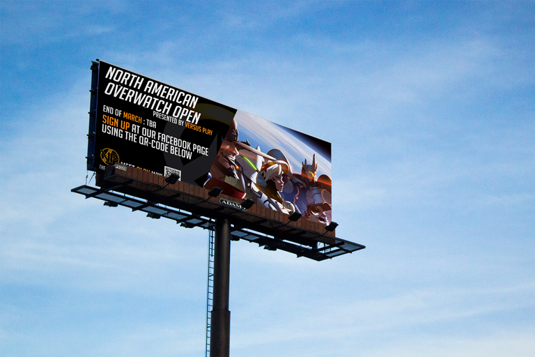
This is a poster I did for a group called VersusPlay3 who I have designed quite a few things for. They organize OverwatchTM tournaments and make the competition and prize pool available to anyone who wants to join. This is one of the first posters I created for them to help get the word out about the tournaments.
This is a poster I did for a group called VersusPlay3 who I have designed quite a few things for. They organize OverwatchTM tournaments and make the competition and prize pool available to anyone who wants to join. This is one of the first posters I created for them to help get the word out about the tournaments.
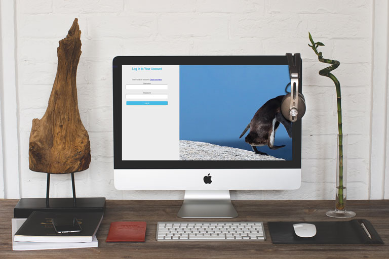
This is a simple log-in form I designed and coded to better understand UX design. It is easy to understand and know where to go. I also created a fully functioning change password page to go with it.
This is a simple log-in form I designed and coded to better understand UX design. It is easy to understand and know where to go. I also created a fully functioning change password page to go with it.
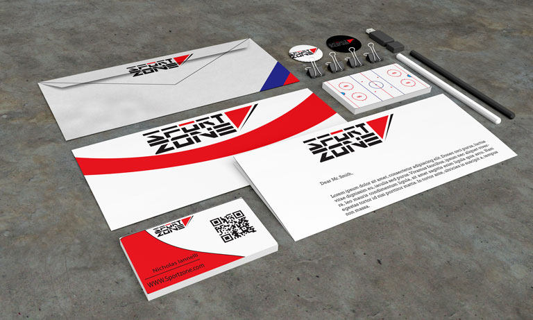
This was my trade fair project where I created a company/branding. I created “Sport Zone”. A website where you could stream all live sporting events in one place for a small monthly subscription.
This was my trade fair project where I created a company/branding. I created “Sport Zone”. A website where you could stream all live sporting events in one place for a small monthly subscription.
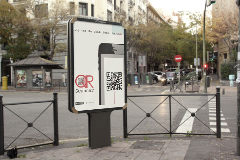
This is a public ad I designed with a team of my peers for a QR code app. I came up with the slogan for the app and I designed the layout/hierarchy of the poster.
This is a public ad I designed with a team of my peers for a QR code app. I came up with the slogan for the app and I designed the layout/hierarchy of the poster.
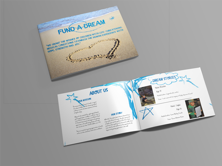
This is a reversable / bilingual booklet that I created for a made up charity. It is based on the Make-A-Wish foundation as part of the project was to find inspiration from a charity that already exists. The child like style is meant to help children of all ages want to pick it up and read it.
This is a reversable / bilingual booklet that I created for a made up charity. It is based on the Make-A-Wish foundation as part of the project was to find inspiration from a charity that already exists. The child like style is meant to help children of all ages want to pick it up and read it.
