PORTFOLIO
-Magazine re-design-
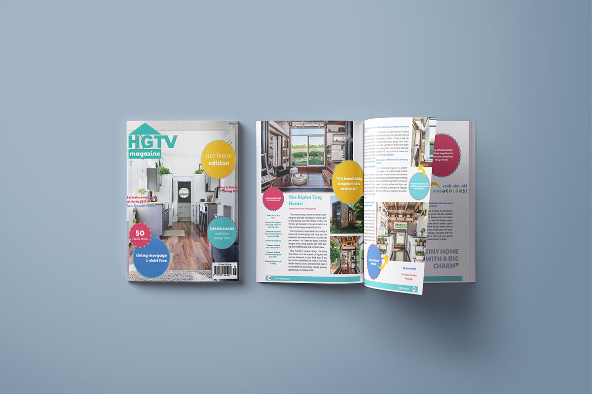
This magazine project, easily became one of my favorite design pieces that I got to work on. Us students were given the task to re-work a magazine and change its design. I chose HGTV magazine and, created a tiny homes issue. With vibrant colors, energetic fonts, it brought the entire spread together.
- Software Used -
Photoshop, InDesign
-Everyday Wellness-
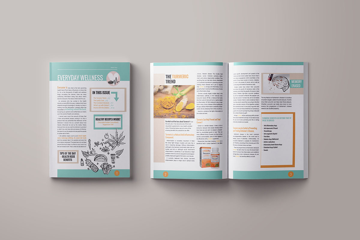
A monthly newsletter on the topic of health and wellness. I choose to use modern fonts and subtle colours to piece together this spread. Making it professional and appropriate for the target audience.
- Software Used -
Photoshop, InDesign
-Vernissage Poster-
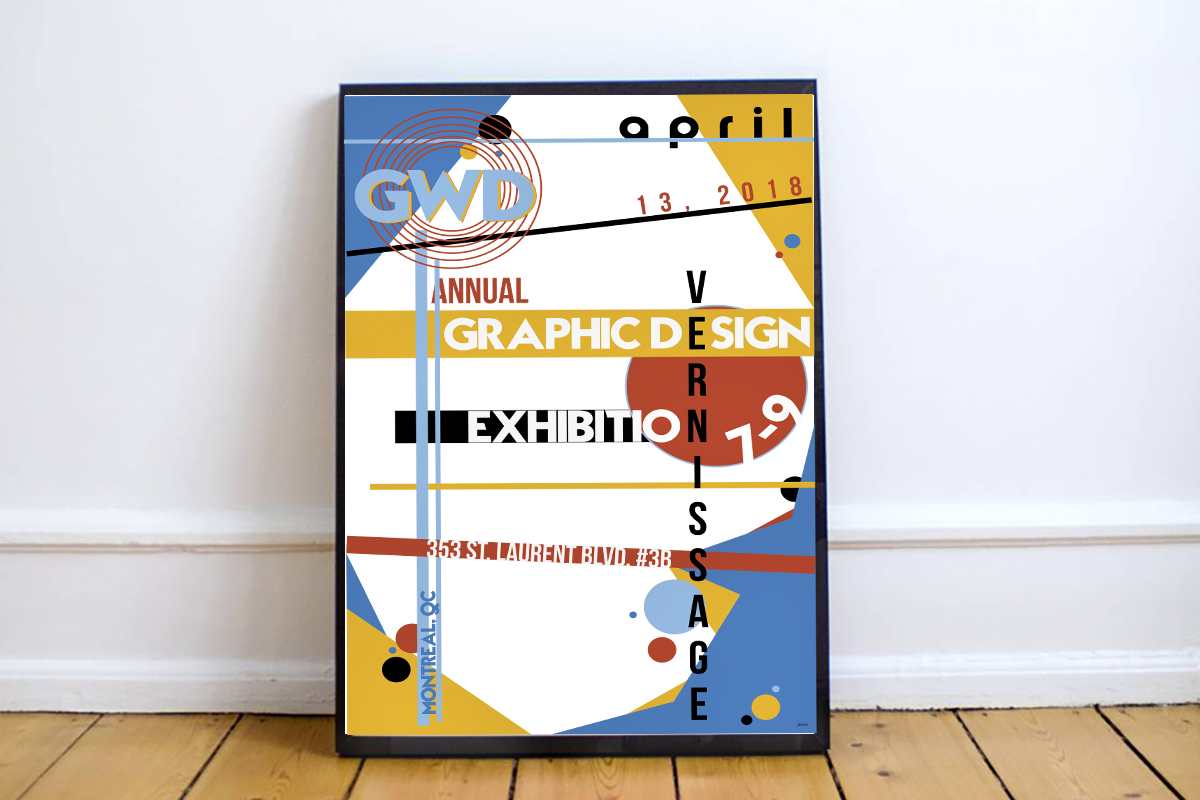
Every year, my program has vernissage for the graduating students to promote the various art work they have created throughout the years. With a Swiss type design in mind, this was my final product.
- Software Used -
Illustrator
-Awareness Poster-
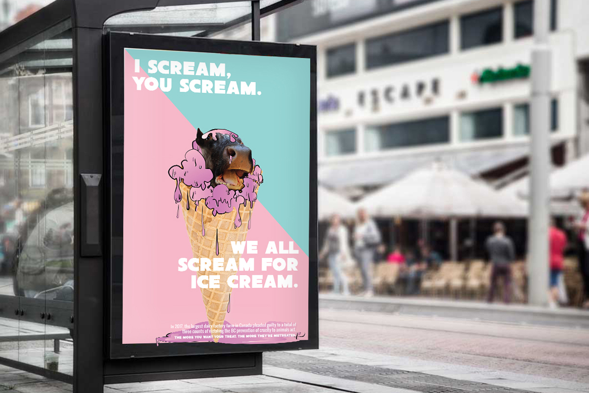
The following is a poster concerning the maltreatment of animals in the dairy industry. It is an intentional satirical piece. On one end, ice cream is considered fun, colourful etc. but there are sometimes harsh realities about where i it came from.
- Software Used -
Photoshop, Illustrator/p>
-Fitness drink brochure-
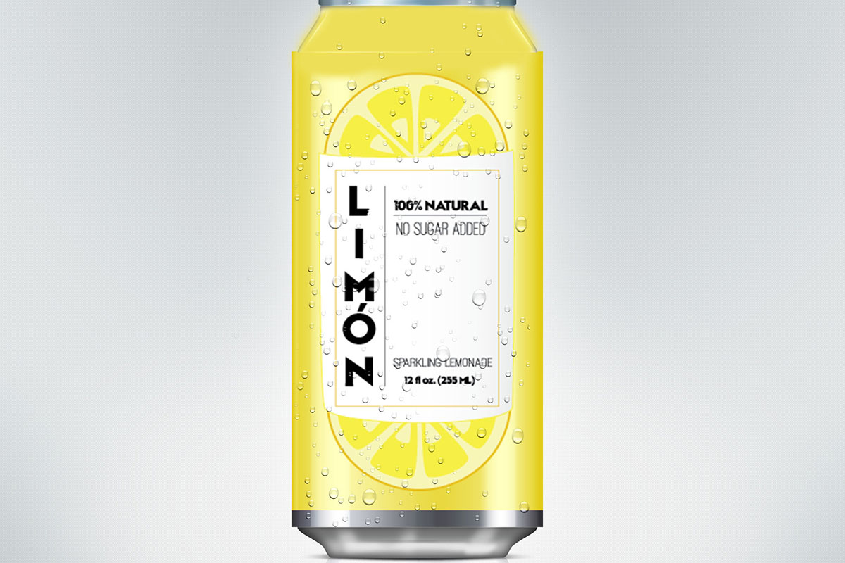
This piece is a brochure that I have designed to promote an imaginary company I called Perkaltyes, an all-natural sports drink. To create the image of strength and stability that this product will provide, bold colors and fonts were essential.
- Software Used -
Illustrator, Photoshop
-Skin care packaging -
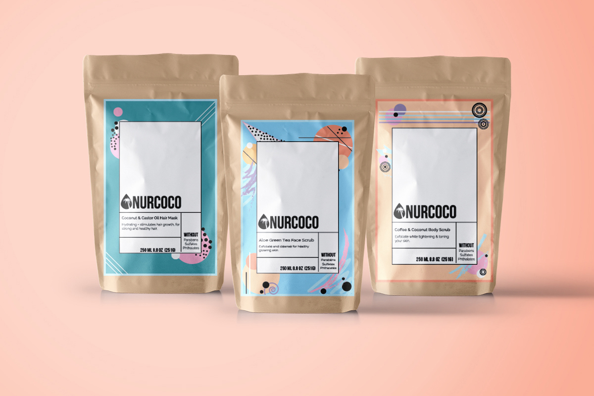
Combining the words nourished and coconut, I created this all natural facial scrub and titled the brand "NURCOCO". With a funky yet clean design. its packaging would target multiple.
- Software Used -
Photoshop, InDesign
-Logo Design-
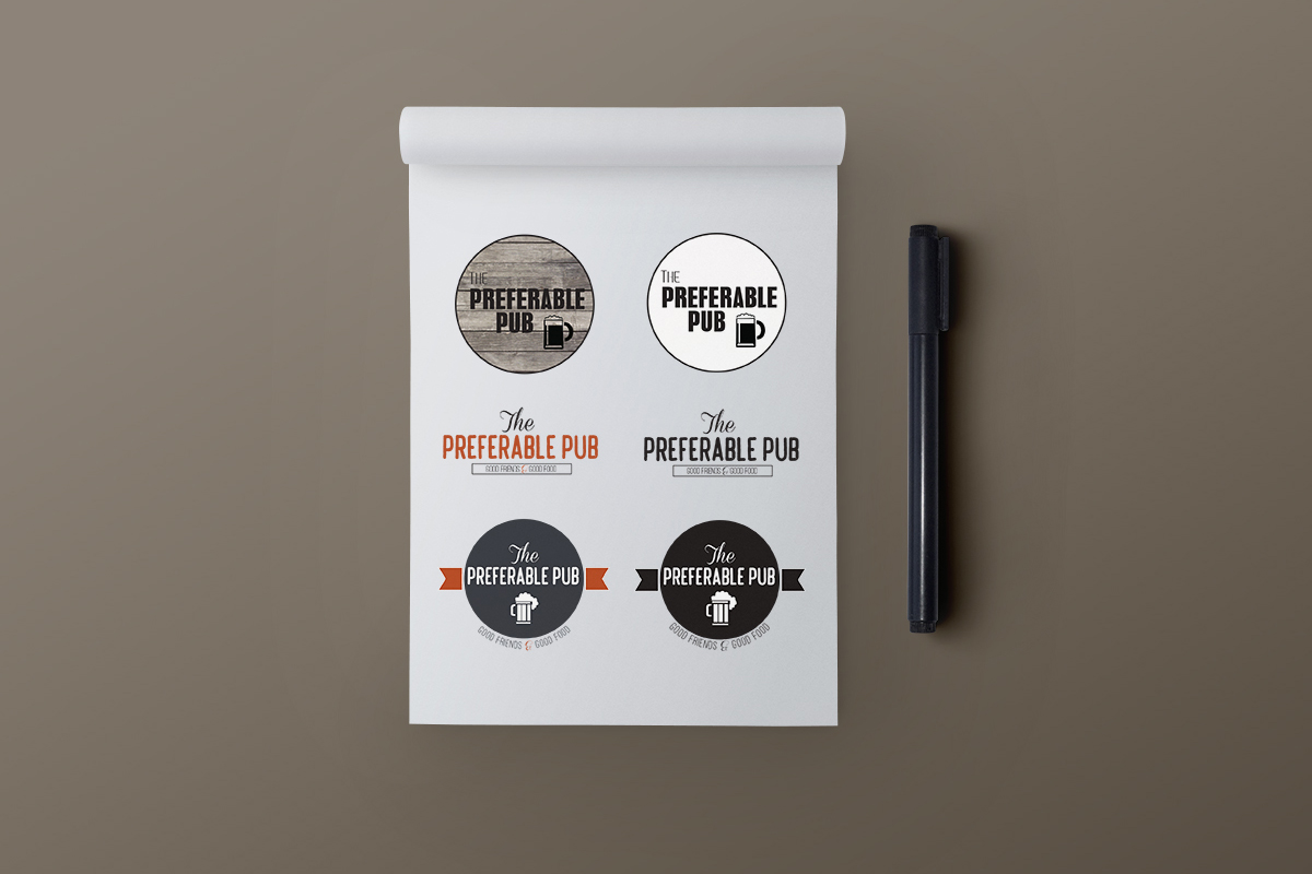
Preferable pub was the title that I had given this student only bar. I had completed each design in color and as well as black and white to show the "client" it's design potential.
- Software Used -
Photoshop, Illustrator
-Logo Design-
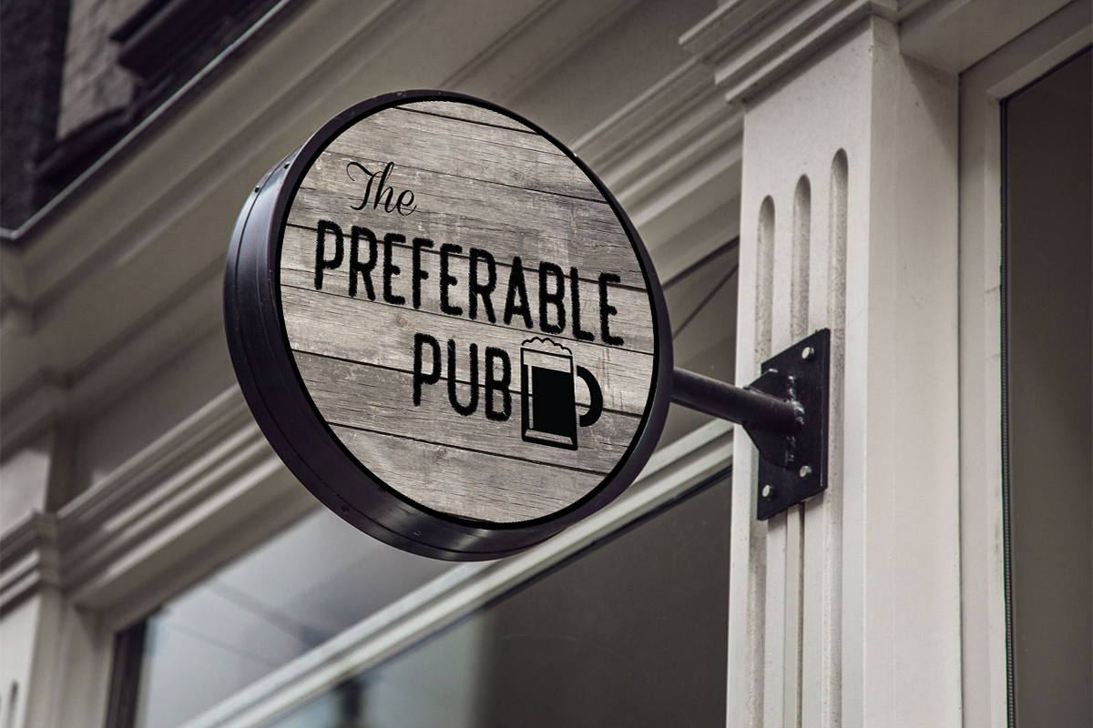
The result of the logo choice presented outside of the bar.
- Software Used -
Photoshop
-Ziggit Orignals Catalogue-
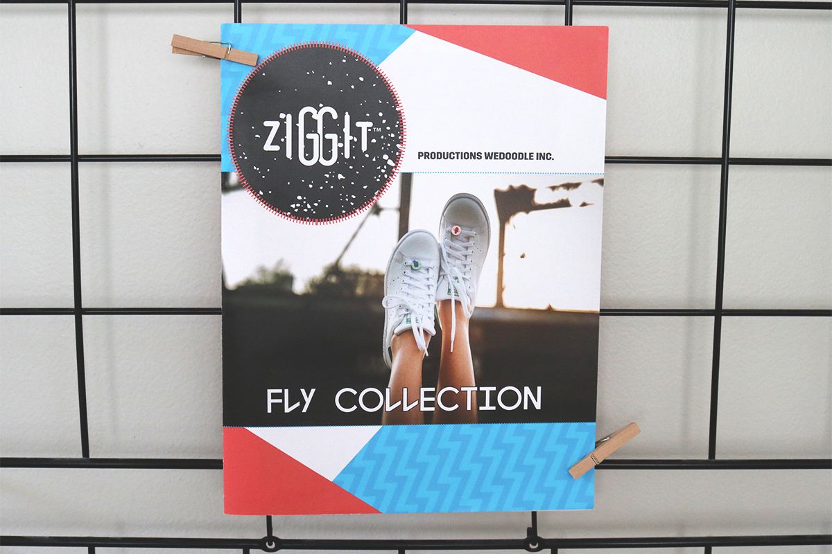
Here lies on of the catalogues I designed for the company Ziggit Styles over the course of summer 2017. As their design intern, I had the privileged to design a spread to display their clothing pins. With the company's style in mind, I used their key colors and designated fonts.
- Software Used -
Photoshop, InDesign
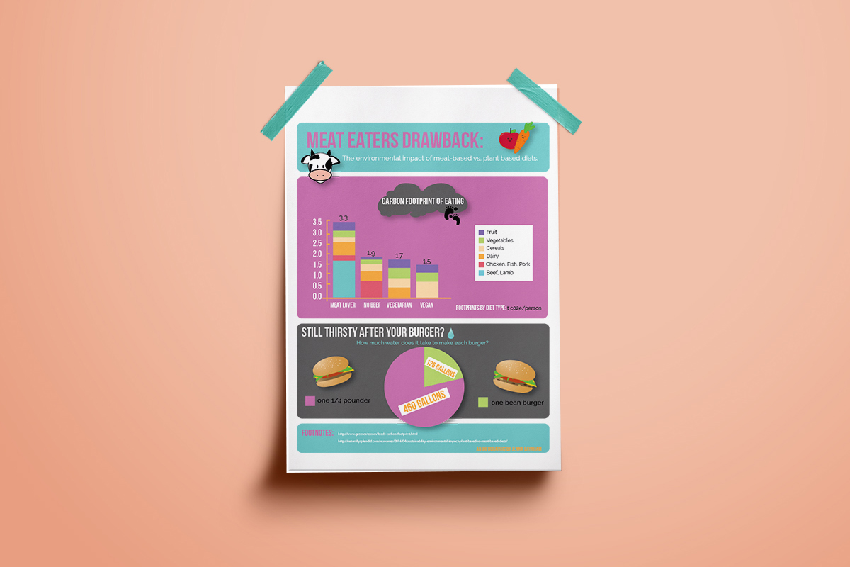
-Meat Eaters Drawback-
about one's carbon fiber footprint after consuming one hamburger. This includes information about C02 emissions and the amount of water it takes to make your favourite cheese burger.
- Software Used -
Photoshop, InDesign
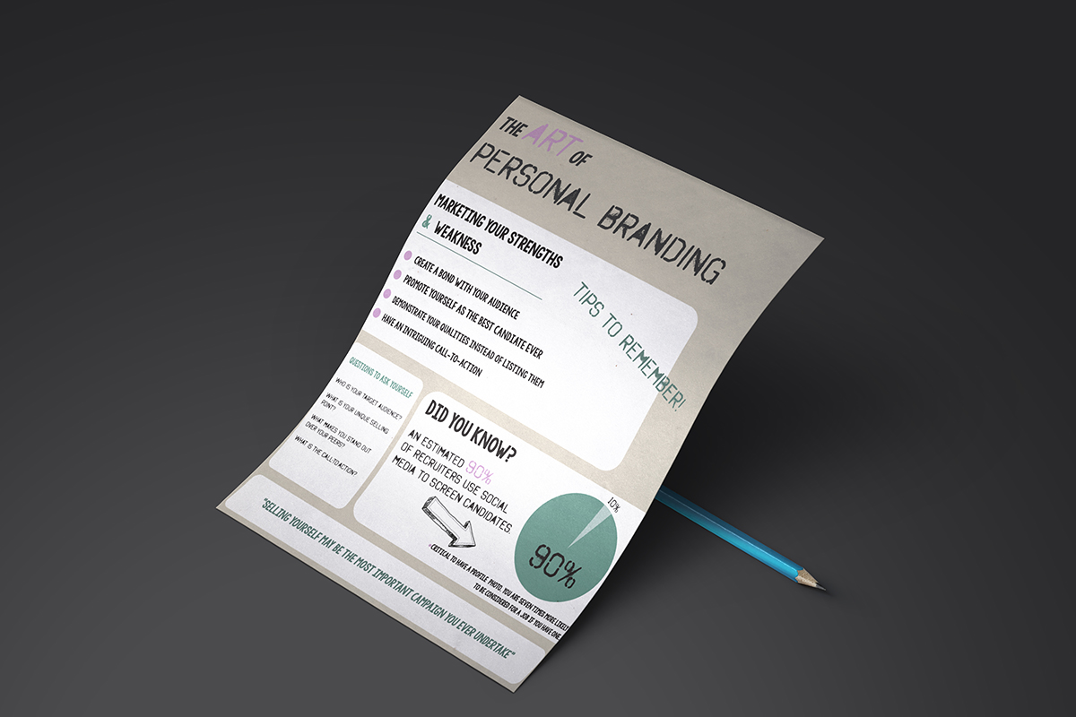
-Ziggit Orignals Catalogue-
Here lies on of the catalogues I designed for the company Ziggit Styles over the course of summer 2017. As their design intern, I had the privileged to design a spread to display their clothing pins. With the company's style in mind, I used their key colors and designated fonts.
- Software Used -
Photoshop, InDesign
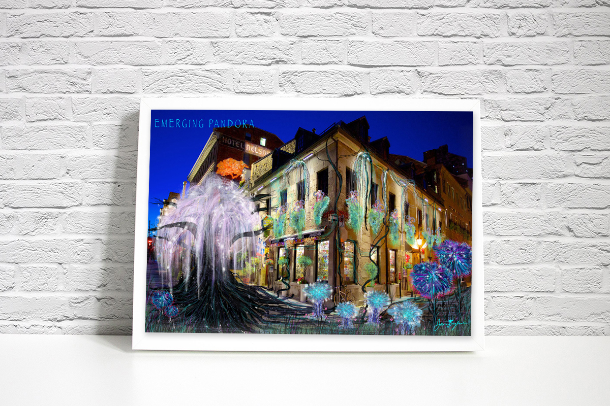
-Concept Art-
Using a photograph of the the Old Port in Montreal, I used various brush settings in Photoshop to create an Avatar-type land in the most unexpected place.
- Software Used -
Photoshop