
Elayah Jade Website
Dreamweaver + Wordpress
The goal behind this project was to create a website for client trying to sell or promote their product and or services. All of this had to be done using Wordpress and including the child theme. The challenge for this website was to create something that really matched the person for whom we were making the website. The child theme was also quite difficult to work with, seeing as how the coding and it would not always work. To have the website really match the person it was designed for, I spent a fair amount of time talking to them and getting to know them, as well as getting their opinion on the design. Done during 4th semester, 2017
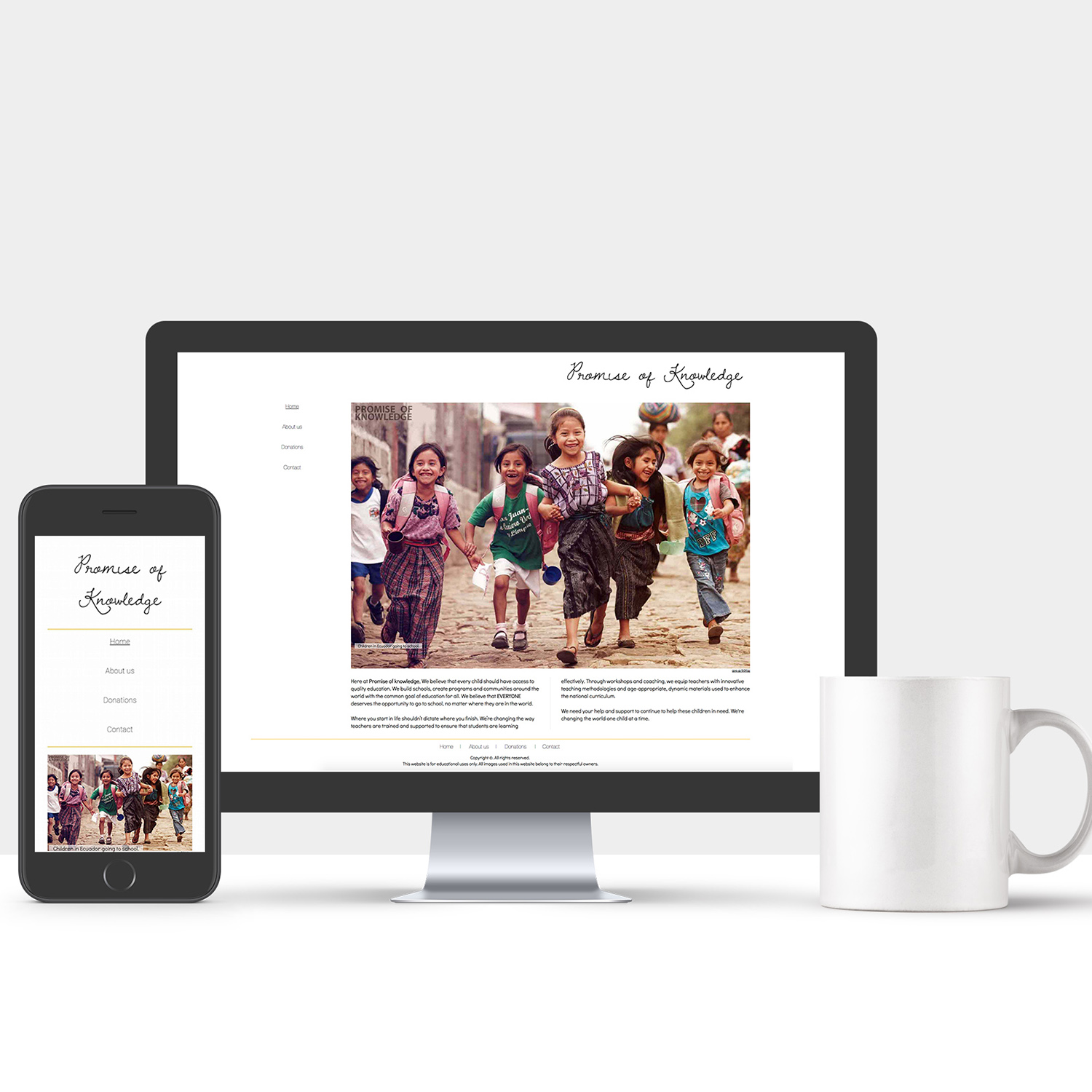
Minimalist NPO Website
Dreamweaver + Photoshop
The instructions for this project was to create a minimalist website for a non profit organization. The challenge for this project was to respect the minimalist design Style. To achieve this goal, I spent a lot of time looking at minimalist designs, and more specifically, minimalist websites. From there I had a better idea of what minimalist websites look like, I also had a better idea of what works well and what doesn't.

A new wave of japanese architecture
InDesign + Photoshop
For this project I had to recreate a famous Master grid and modernize it. The challenge behind this project was to properly figure out the grid that was used for the original and to recreate it, using more modern fonts and images. To properly figure out what grade was used, I had to try multiple times before getting it right. I decided to update the font for something that was a little bit more recent but something that also fits with the style of the grid.
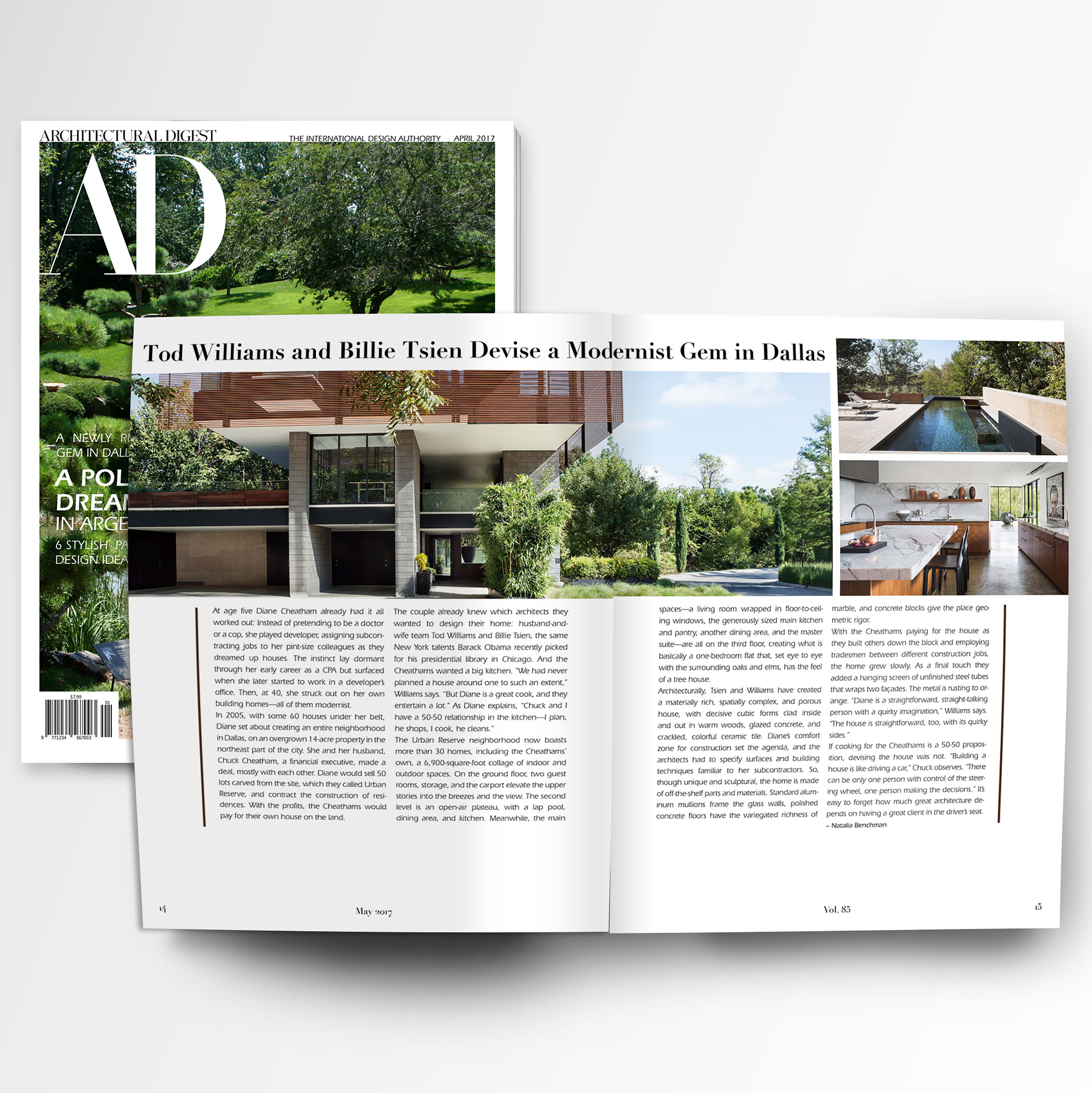
Architectural Digest Magazine
InDesign + Photoshop
For this project we had to choose a magazine and redesign the cover as well as the articles inside. The requirements for the project we're to make our version of the magazine look better than the original, as well as respecting the golden rules of typography. I fulfilled these requirements by designing the interior of the magazine in a very structured and angular way, to match the topic of architecture.
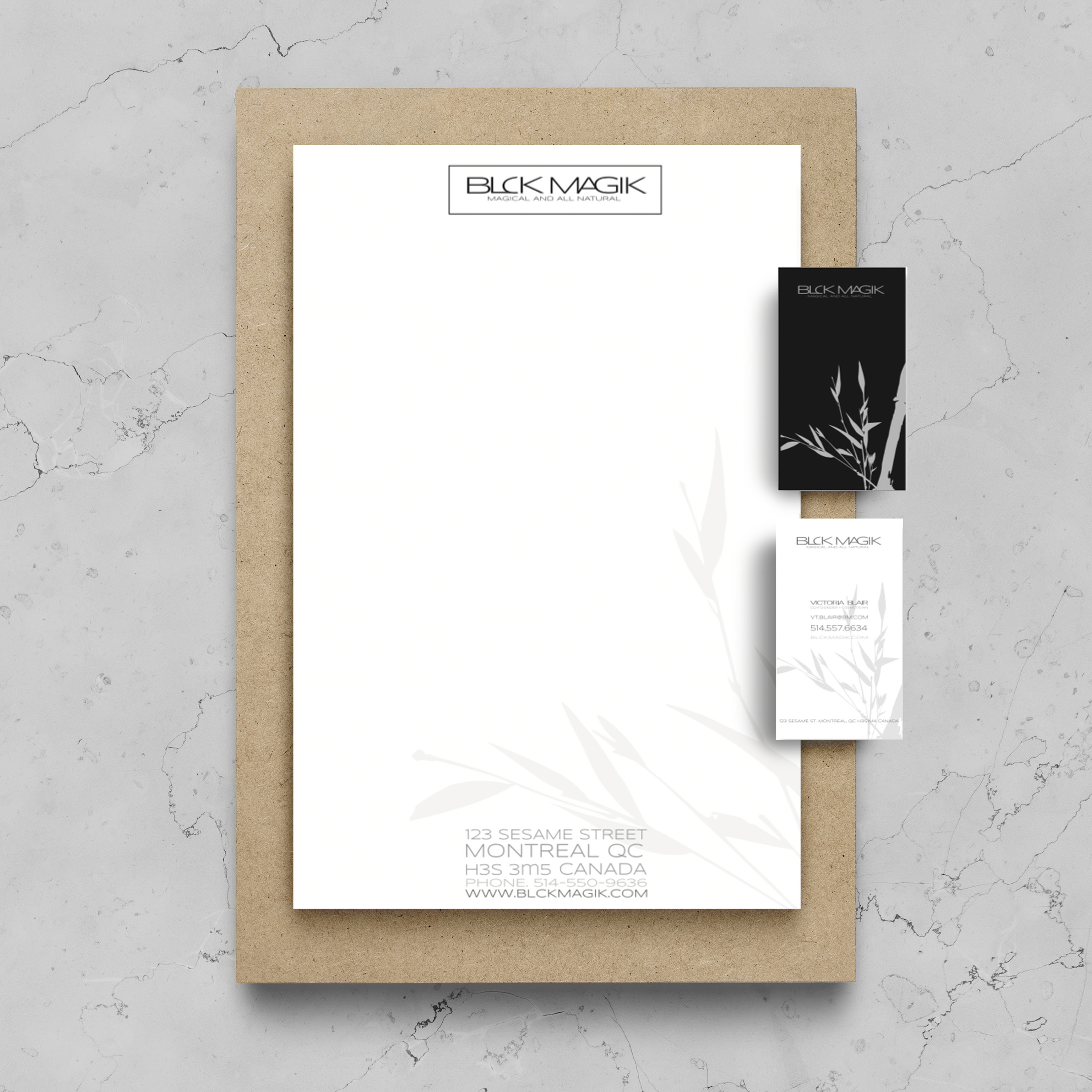
Black Magik Stationery Set
Illustrator + Photoshop
After having created a fake company, we had to design a stationery set for it. It had to include the letterhead, the envelope, and the business card. The challenge behind this project was to create a stationery set it looked professional but still captured the essence of the company. We succeeded this by using limited colors, giving our logo a watercolor effect to it, and using a clean and minimalist design.
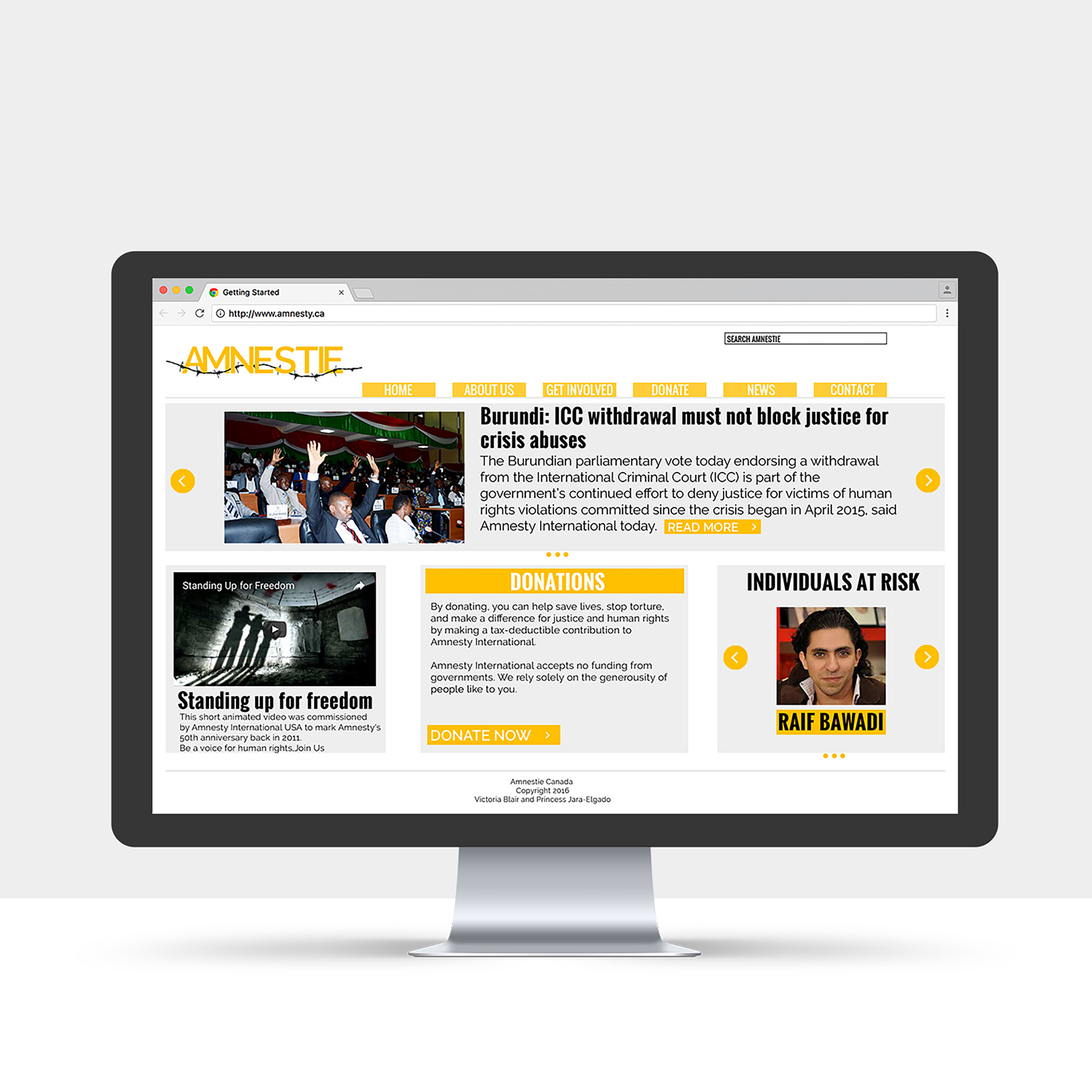
Amnesty wireframe and website mockup
InDesign + Photoshop
For this project, my partner and I had to recreate a mockup for the Amnesty international website. We had to create a more user friendly interface, as well as recreate the logo to make it more appealing to a Canadian audience.

Infograph
Illustrator
The goal for this project was to create an infograph. I had to choose 2 topics and link them together, I chose to compare the richest countries with their main sources of income.

Gridmasters Poem
InDesign
This project consisted of using a famous grid and using it as a base for a poster. The contents of the poster was restricted to typography and shapes, no images and had to have a poem as the topic.
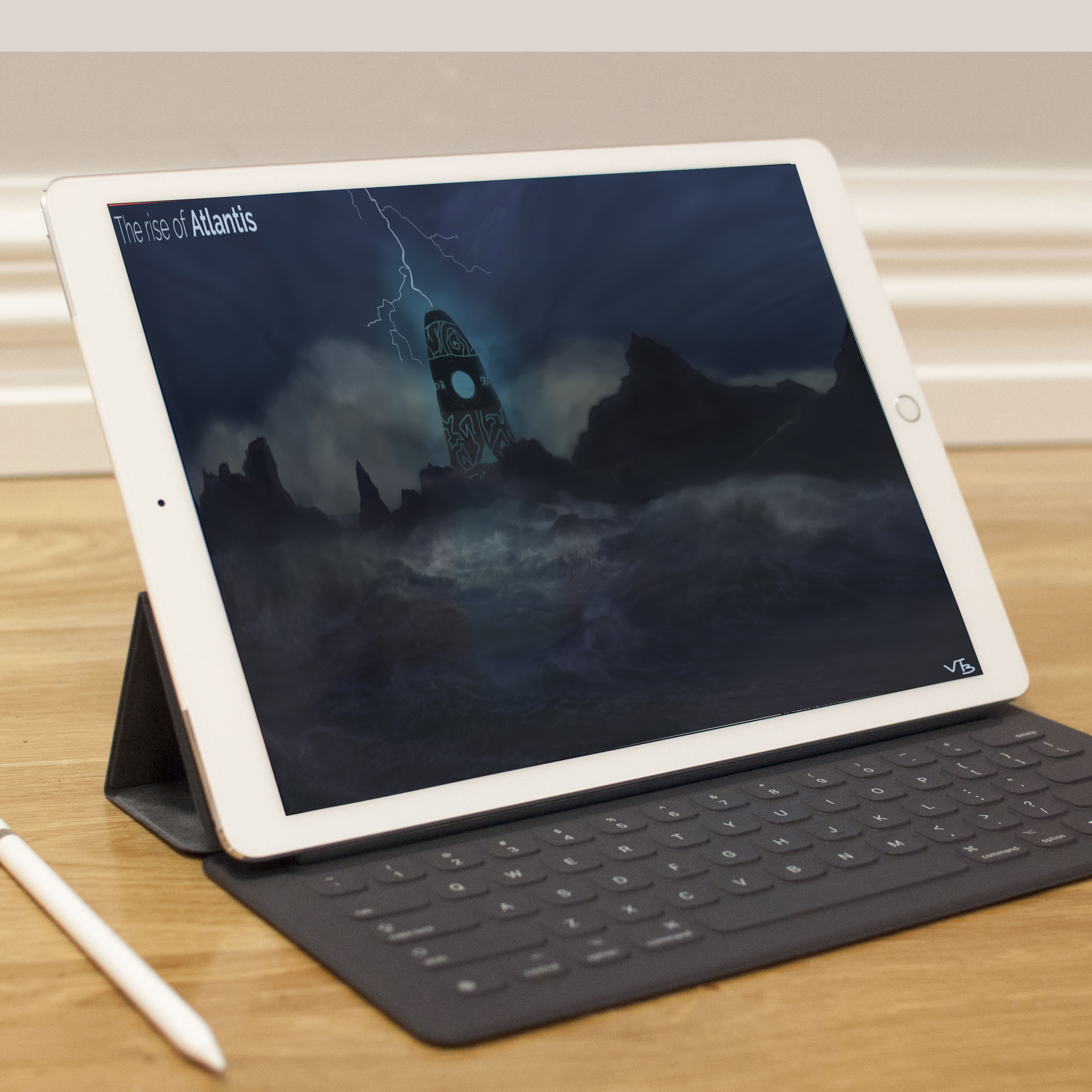
Concept Art
Photoshop
For this project I had to create concept art using Photoshop. I had to take a real image and modify it, by painting over it and giving it a surreal aspect, to the point where we could no longer recognize the original image.
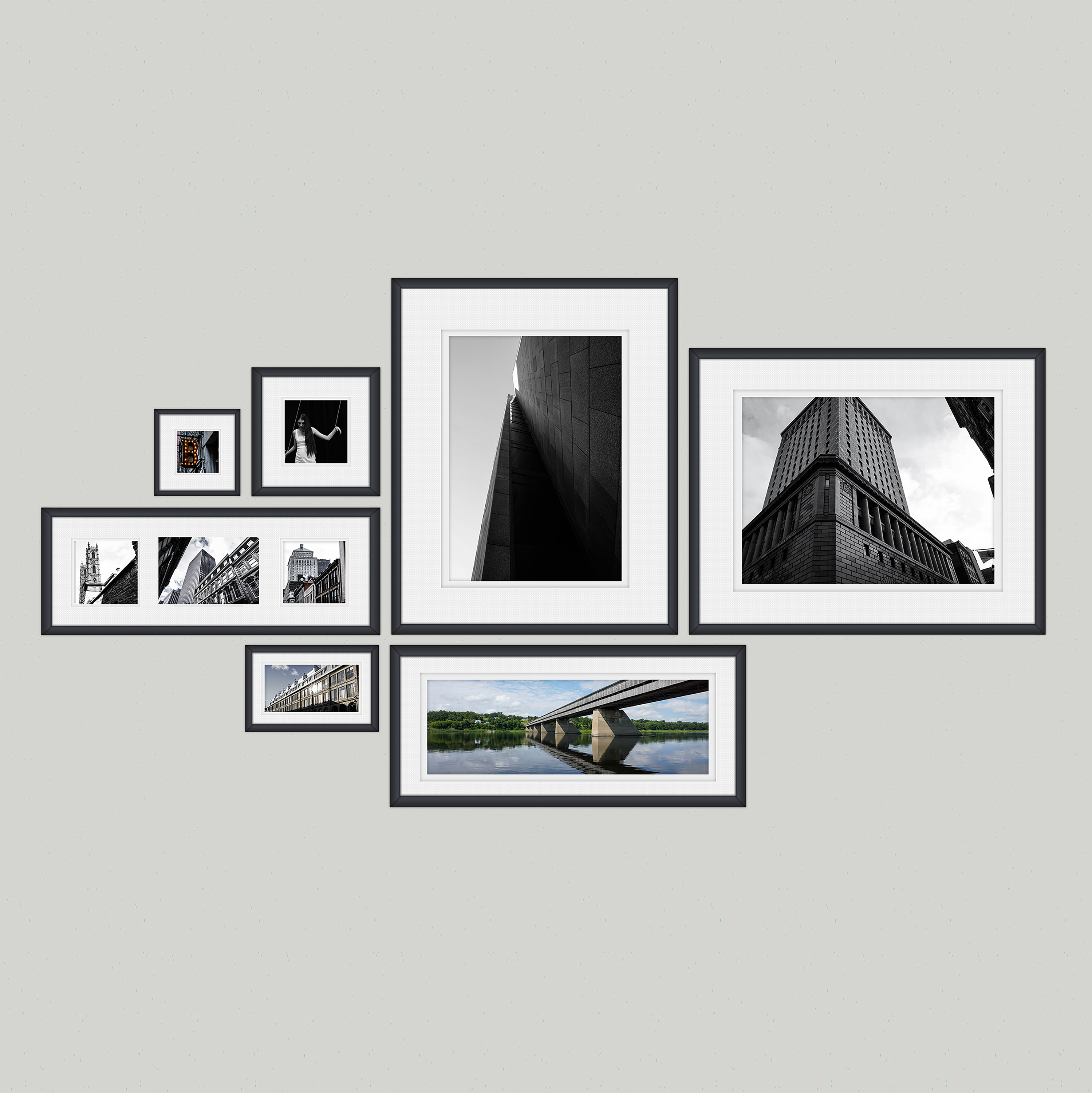
Photography
Lightroom
My goal while taking and modifying these pictures was accentuate the contrast as well as focusing on certain colors and putting more emphasis on those colors. I also tried to capture the picture from unusual angles to put focus on the structure and shape of the architecture.