MY WORK
Here you will find some pieces of work that I have done over the last few years. My goal is to keep that creative vibe active in my life, and create as often and as much as possible.
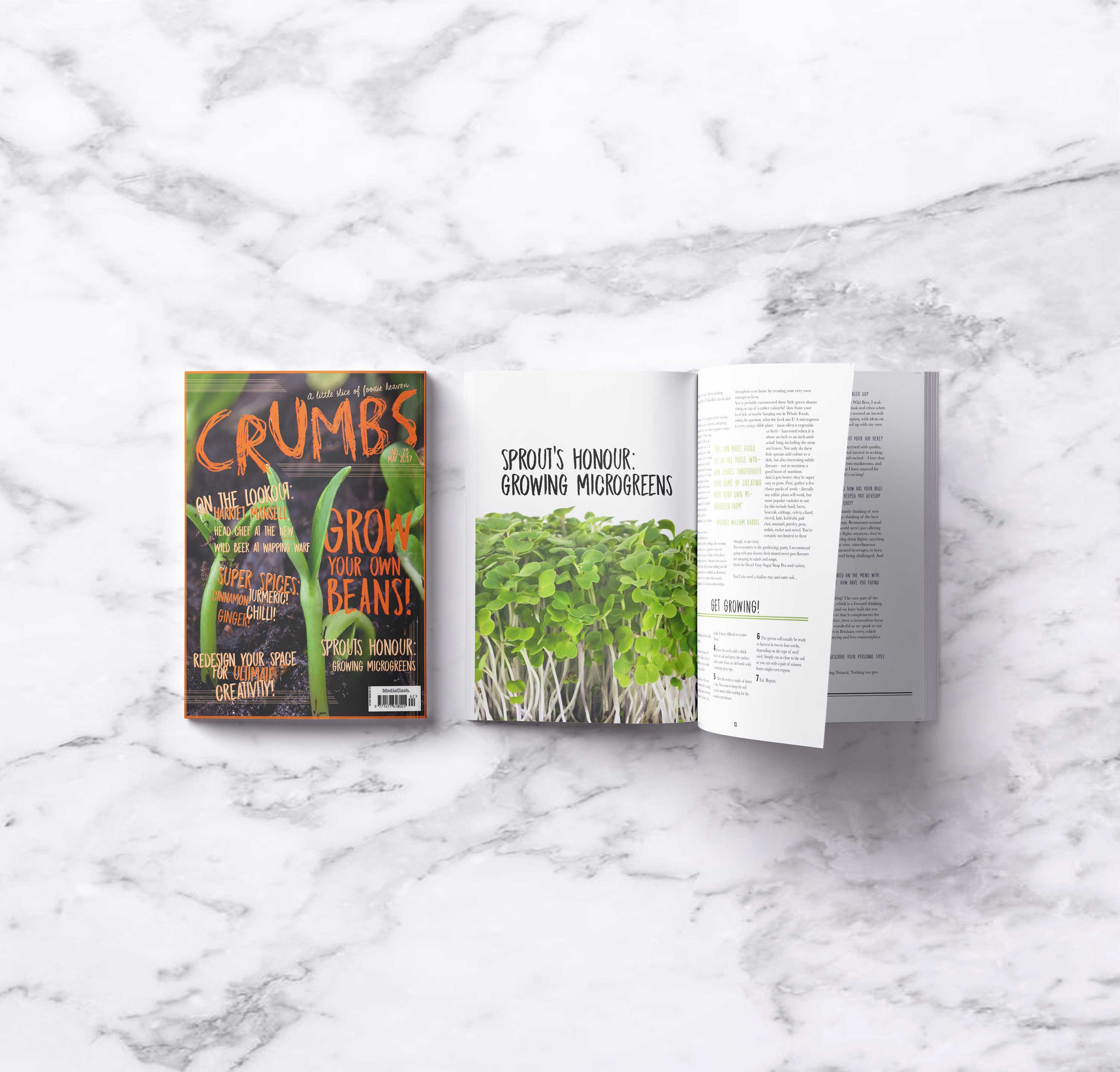
CRUMBS MAGAZINE
MAGAZINE RE-DESIGN
This project was created with the idea of emulating an existing magazine. The cover was made by inspirtation of the magazine Crumbs, however the design of the content inside the magazine were all originally thought up.
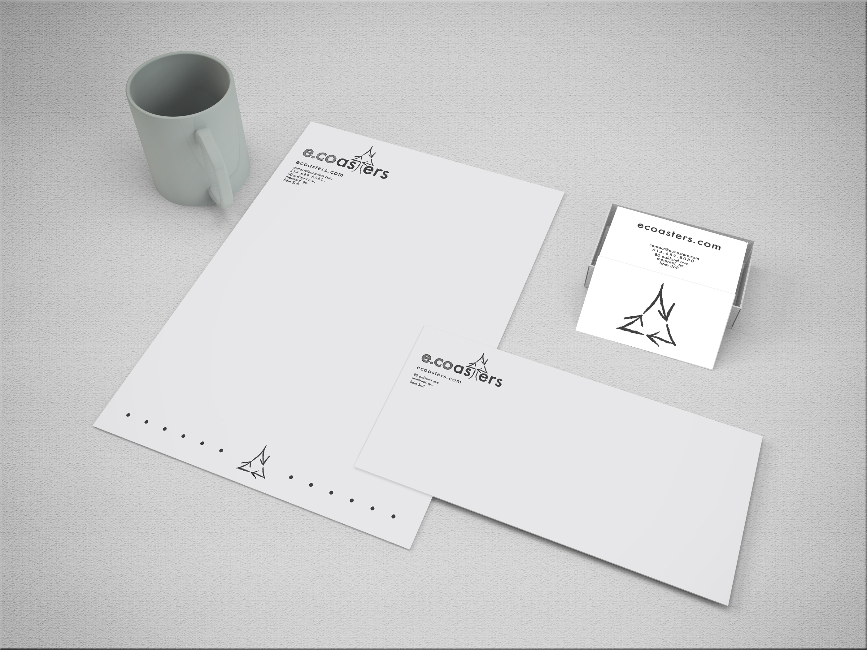
ECOASTERS
BRAND IDENTITY COLLABORATION
Ecoasters is a fictitious brand located in Montreal, Qc, Producing hand-made coasters that are also eco-friendly! That is how my team created the name Ecoasters. The idea for the logo was rooted in the companie's use of recycled materials, in an effort to reduce waste and promote environmental awareness.
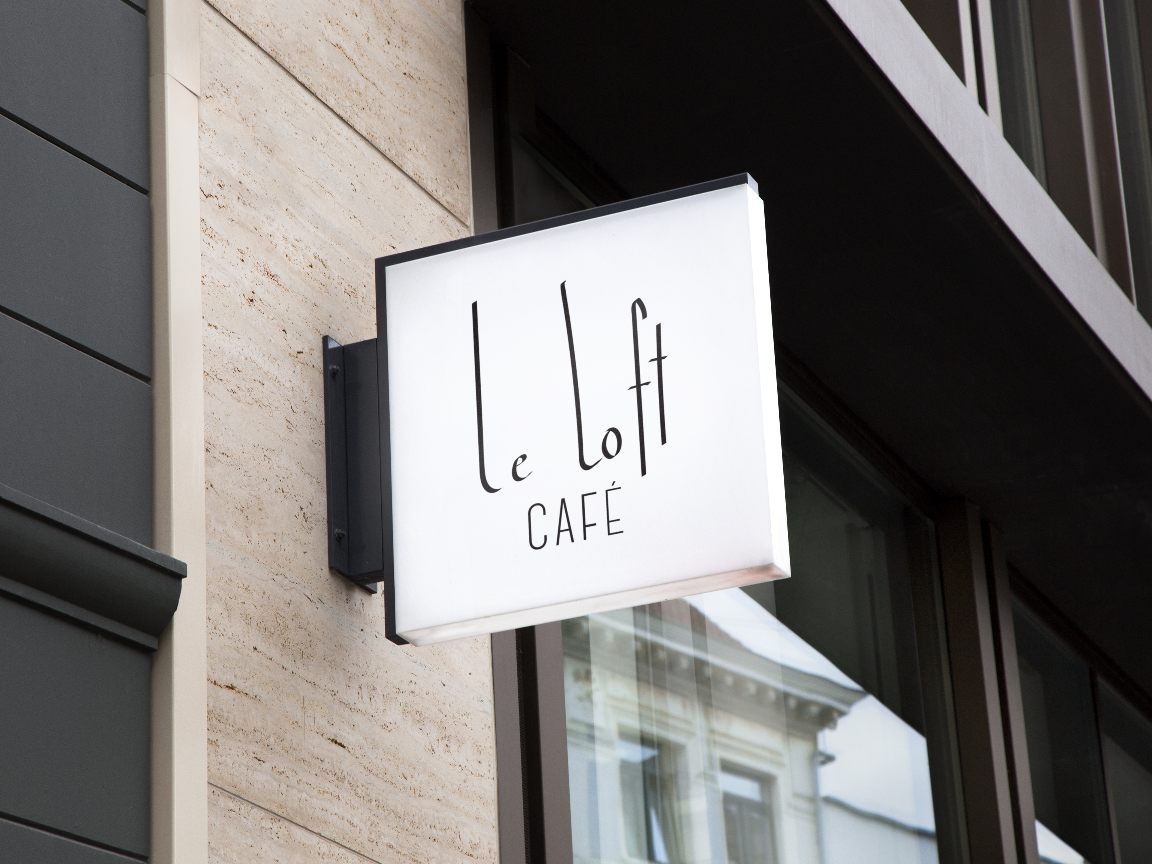
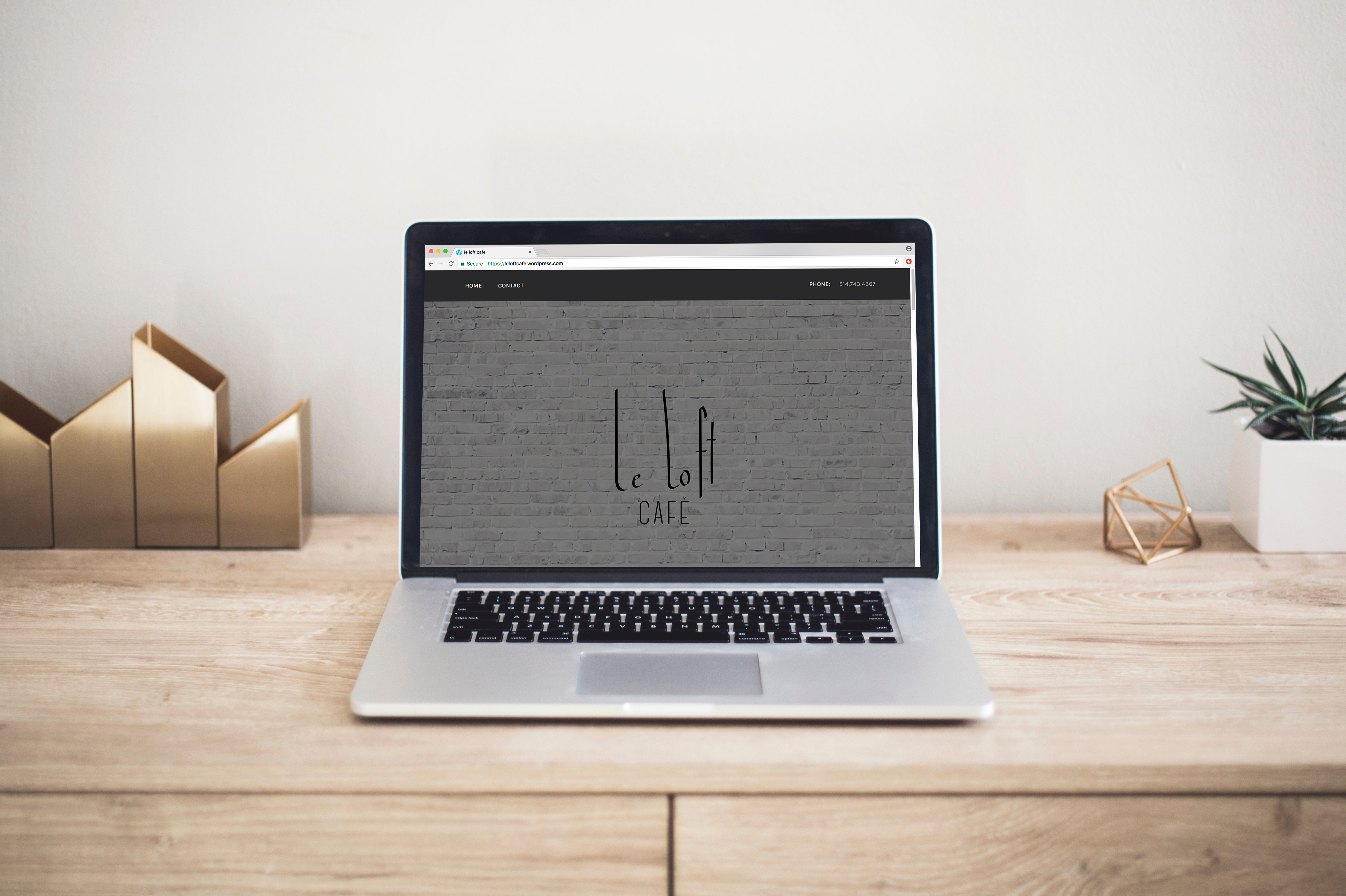
LE LOFT CAFE
BRAND LOGO AND WORDPRESS WEBSITE
Logo and wordpress website design made for an independent coffee house. The goal of the design style is to be minimalist but with an interesting look to it. I wrote out the name by hand, instead of using an existing font to be able to execute my vision.
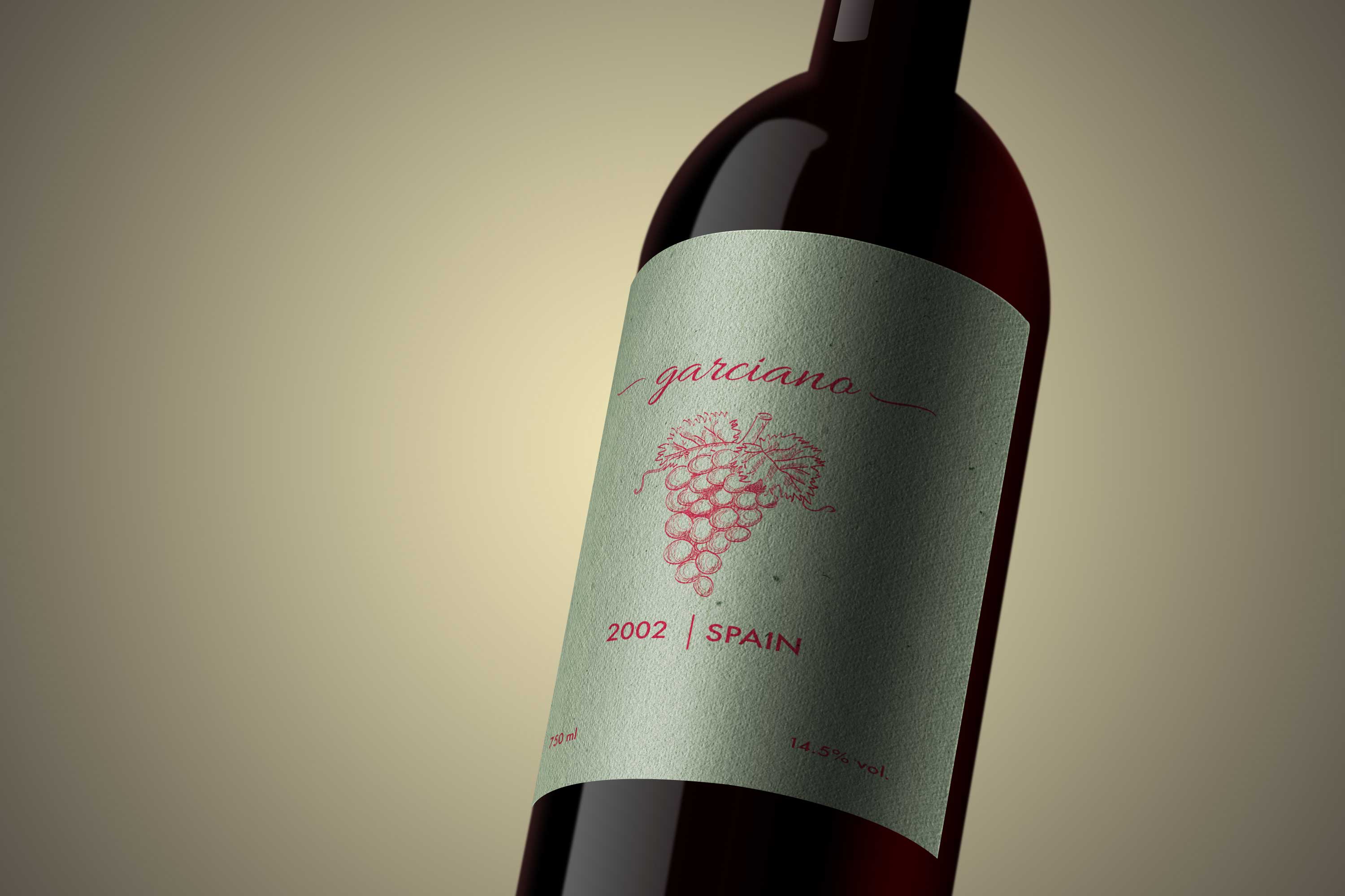
WINE BOTTLE LABEL
PACKAGING DESIGN
Wine label design created for a small family-run winery in Spain. I created something that was simple, but elegant, mirroring the taste of their wine. The grape illustration has an organic feel and gives the consumer a sense of home.
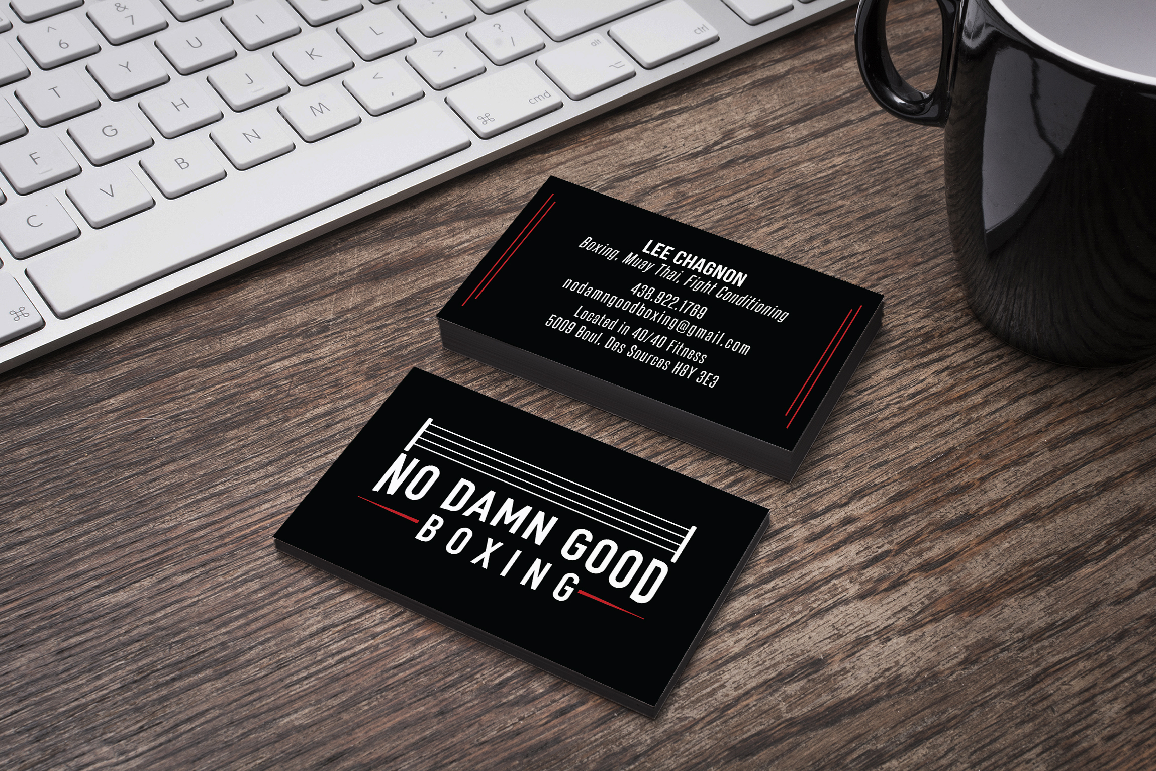
NO DAMN GOOD BOXING CLUB
BRAND LOGO
Brand identity created for an independent boxing club. The design was inspired by old school sport lettering. To make the logo more interesting, I added the boxing ring on top of it, which ties all the elements together. The red elements in the card act as a bold, yet subtle pop of colour.
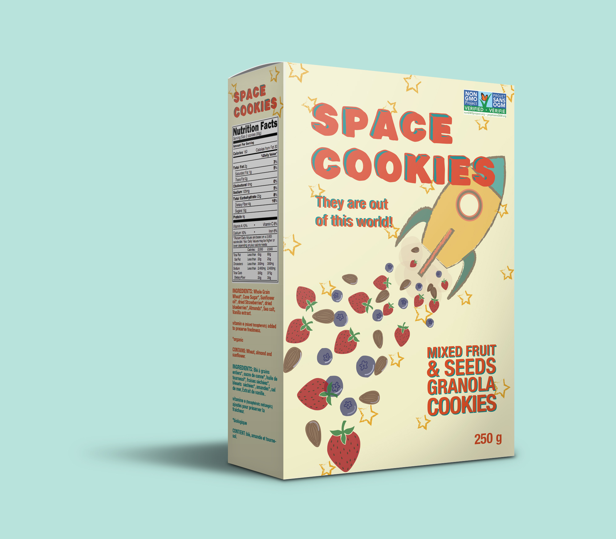
SPACE COOKIES
PACKAGING DESIGN
Packaging design targeted towards a younger audience. The fun and playful design was created to draw in their attention, along with the use of a brighter colour palette. The cookies themselves are organic and healthy, so I wanted to create a design which demonstrates that being health conscious isn't a bad thing and can be fun!
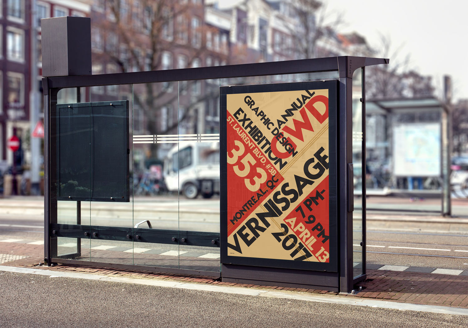
VERNISSAGE EVENT POSTER
POSTER DESIGN
Poster created for a vernissage event, designed with inspiration from Bauhaus style. This style allows the viewer to read all the elements, acquire all the information, in a non-traditional poster design. A fun way to catch the eye of a passersby.
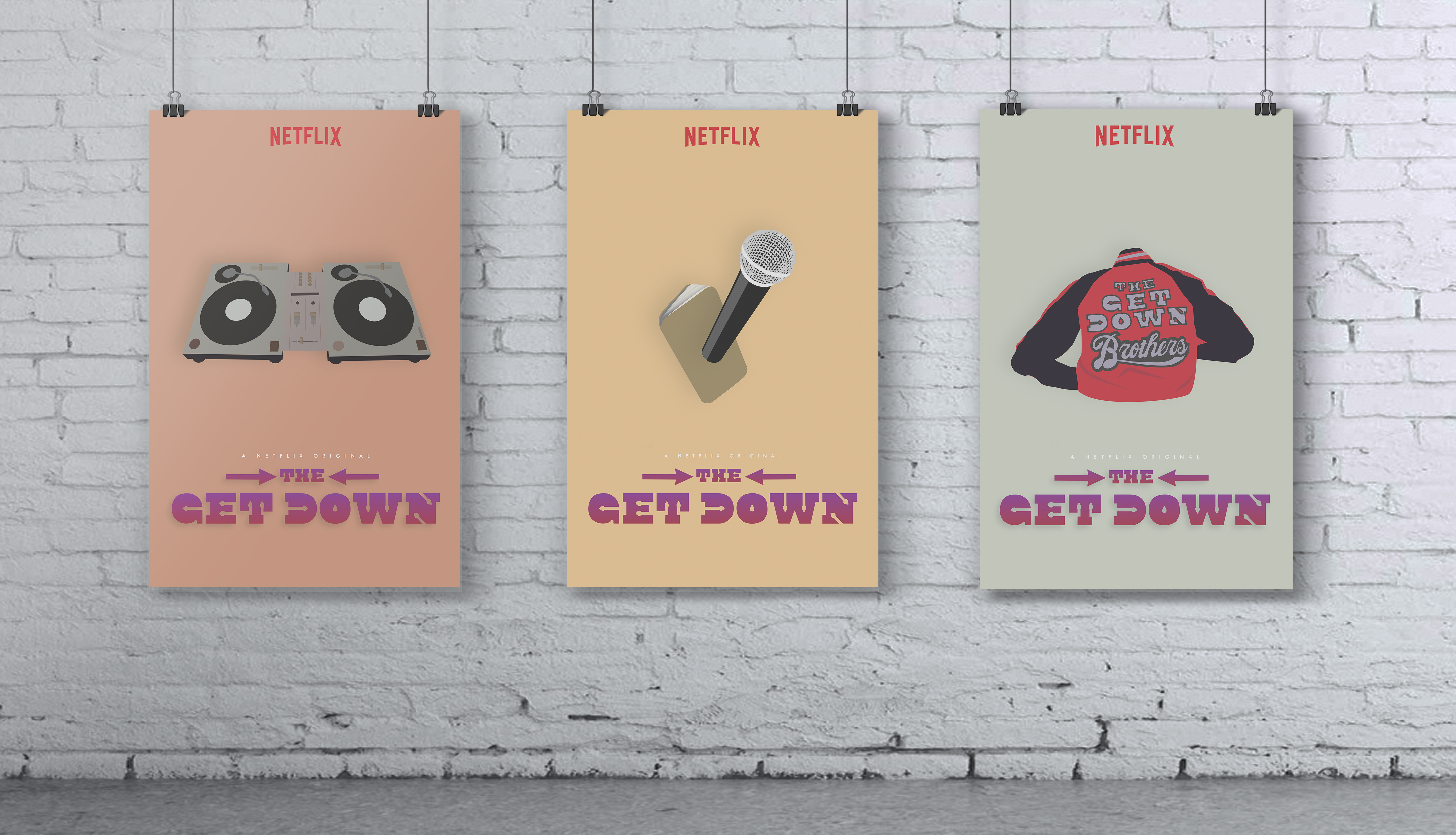
THE GET DOWN - TRIPTYCH
POSTER DESIGN
Poster design made for the Netflix orginal series "The Get Down". Every poster represents the different, but relevant elements of the show. All elements were individually illustrated using different shades, shapes and use of shadows and highlights to get the desired effect.
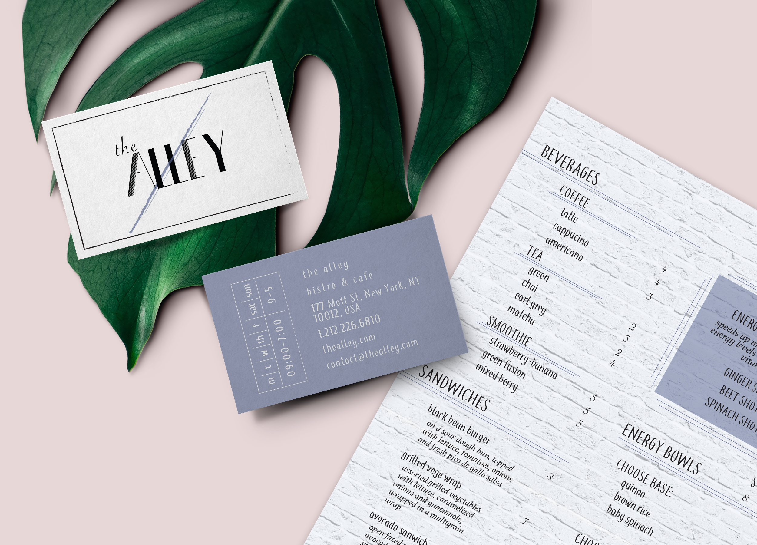
THE ALLEY
BRAND IDENTITY AND MENU DESIGN
Branding design for a New York City bistro. For their business card, I added in their business hours in an aesthetically pleasing and simple way. I chose to add that element in because of the clientele of the business, New york city natives are heavily busy people, and who has time to look up business hours?
For the menu, I created an airy aesthetic with a lot of white space and breathing room, the brick background represents the restaurant because they have that element inside their store.
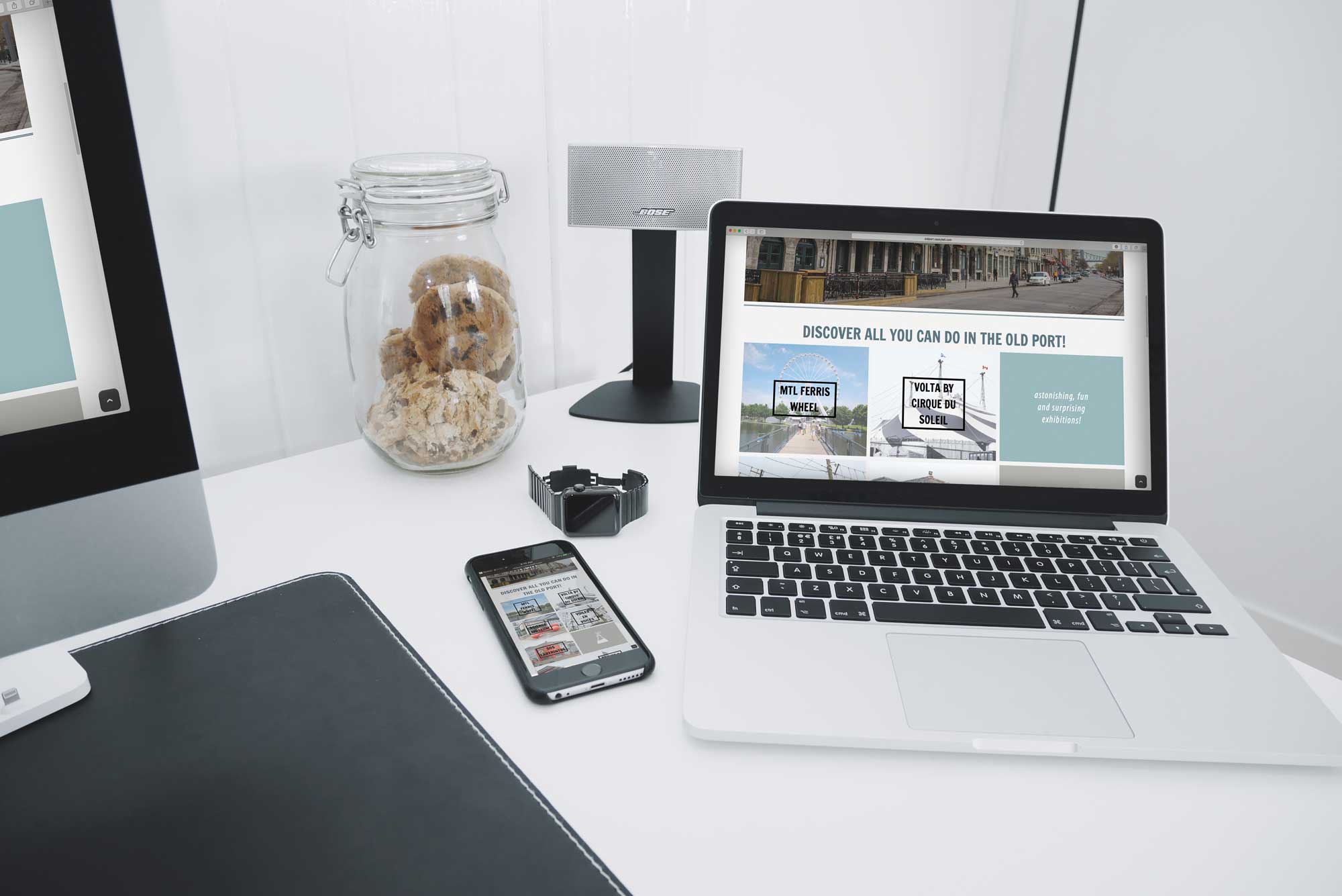
OLD PORT OF MONTREAL WEBSITE
WEBSITE REDESIGN
Website redesign created with modular design style for the Old Port of Montreal. I wanted to create something that was easy to navigate and responsive. When hovering over the boxes on the activities page, it fades to a small description of the activity, making it a quick and easy way to find things that peak your interest!
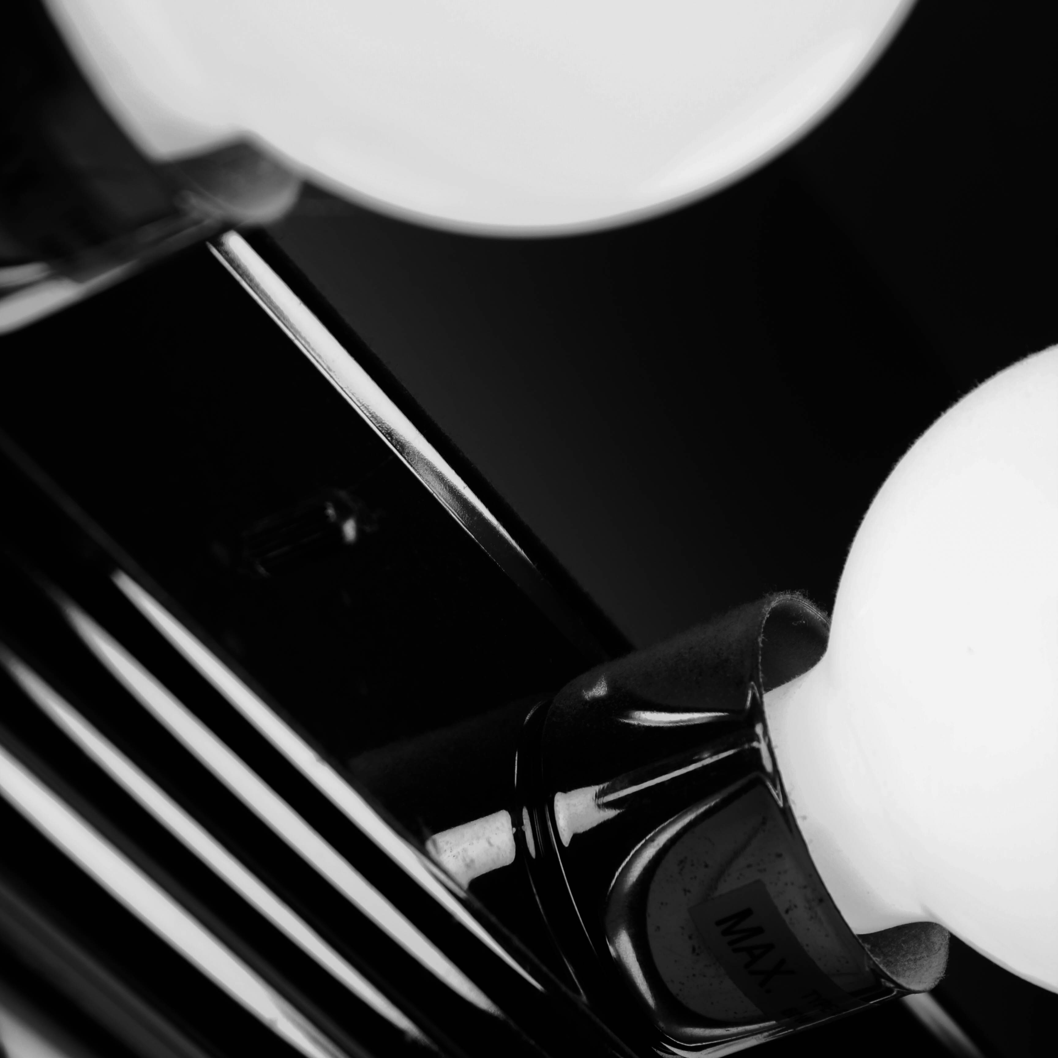
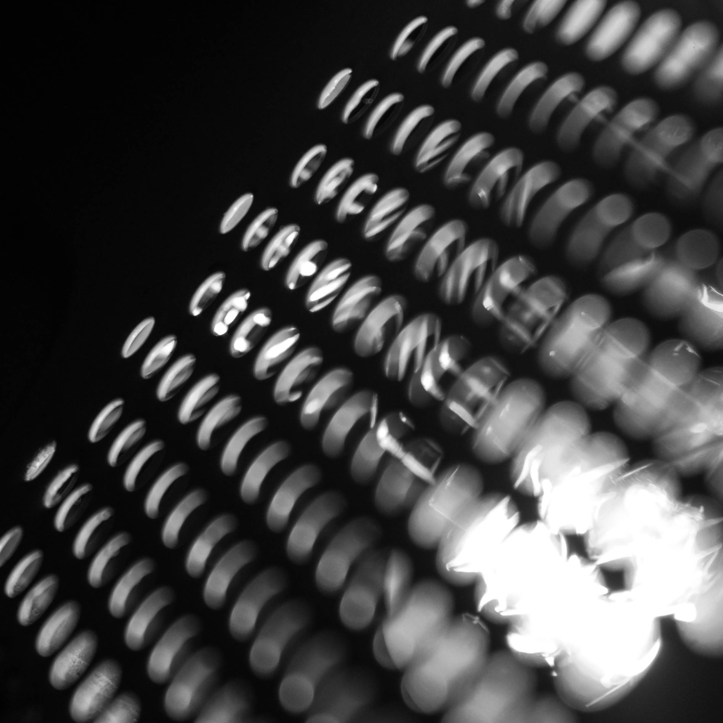
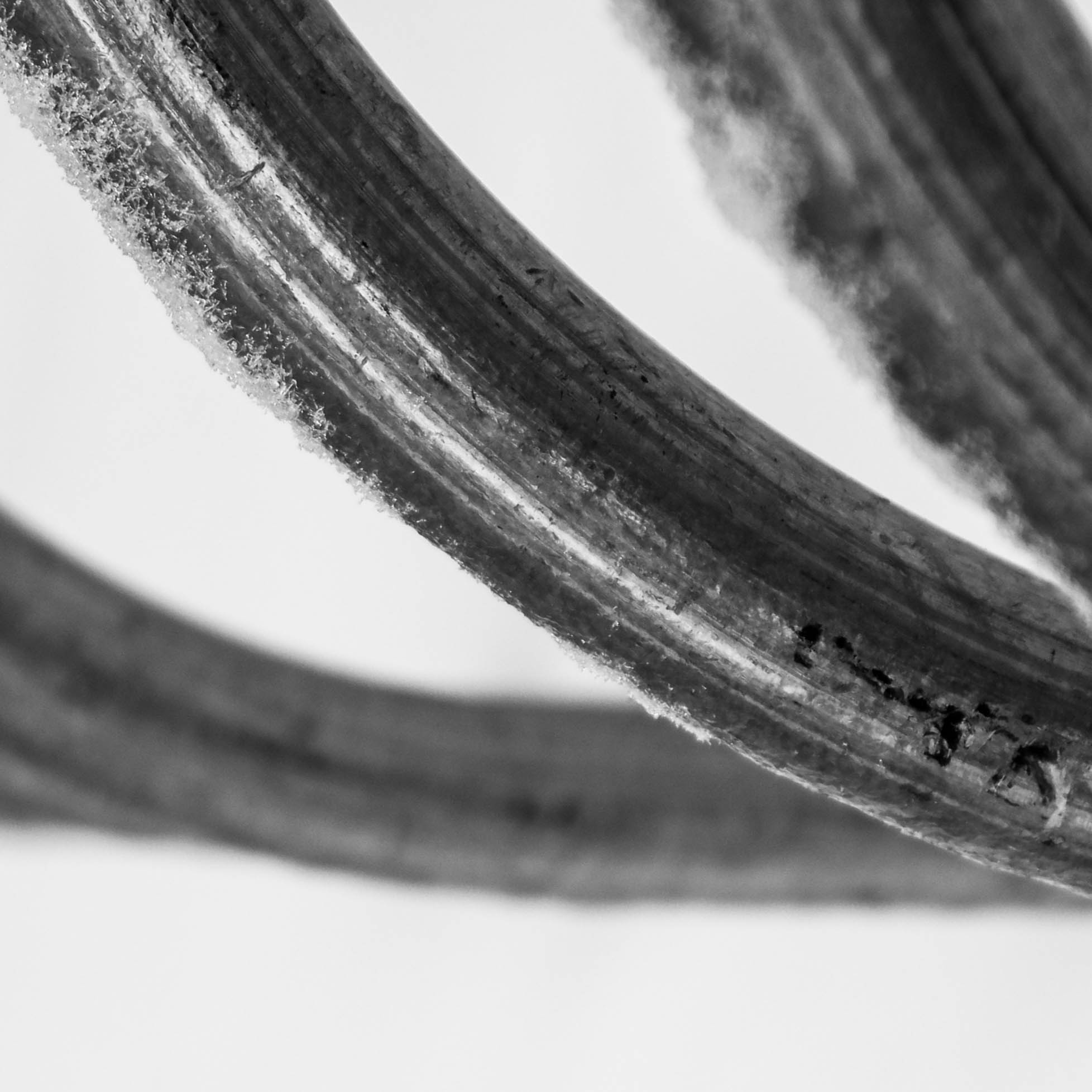
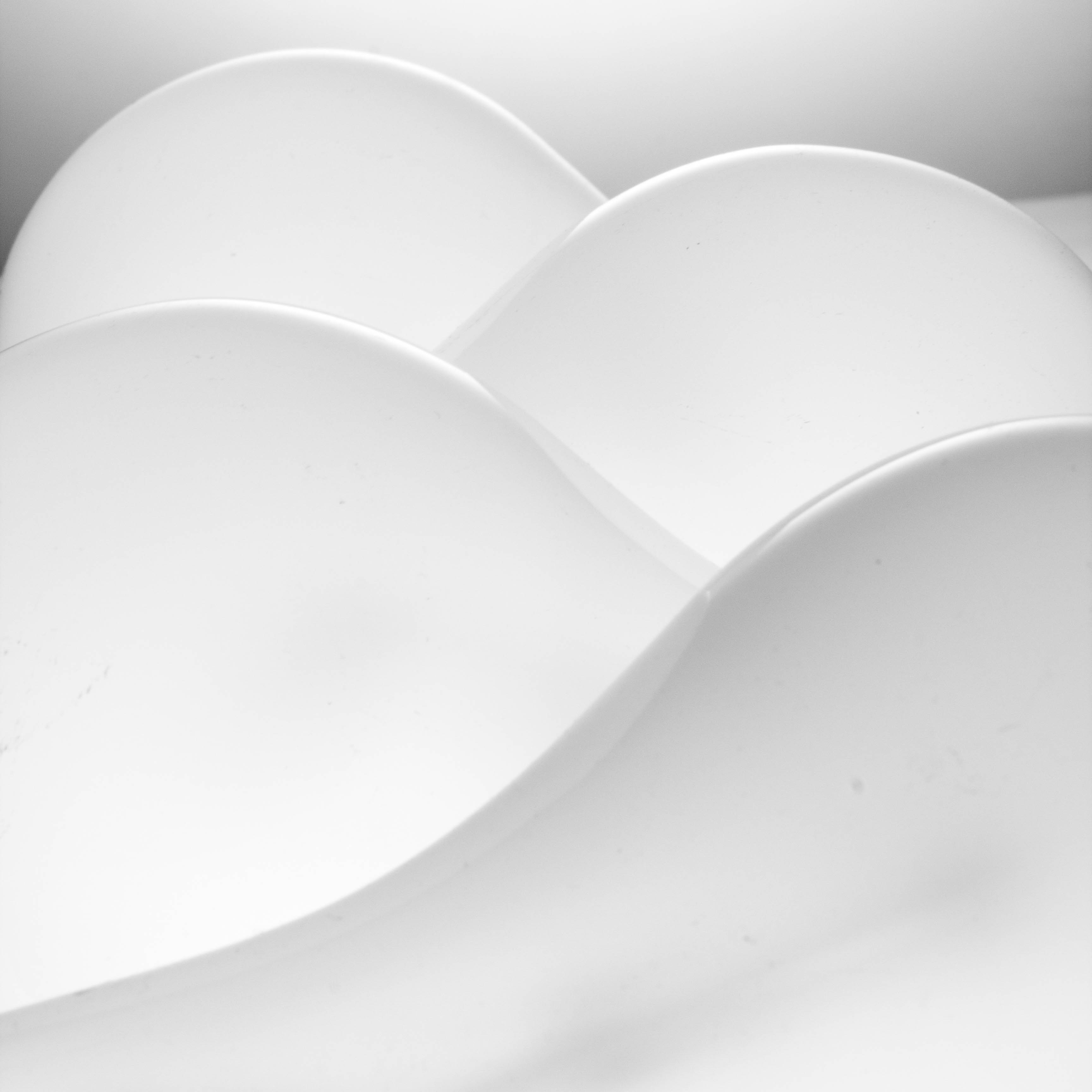
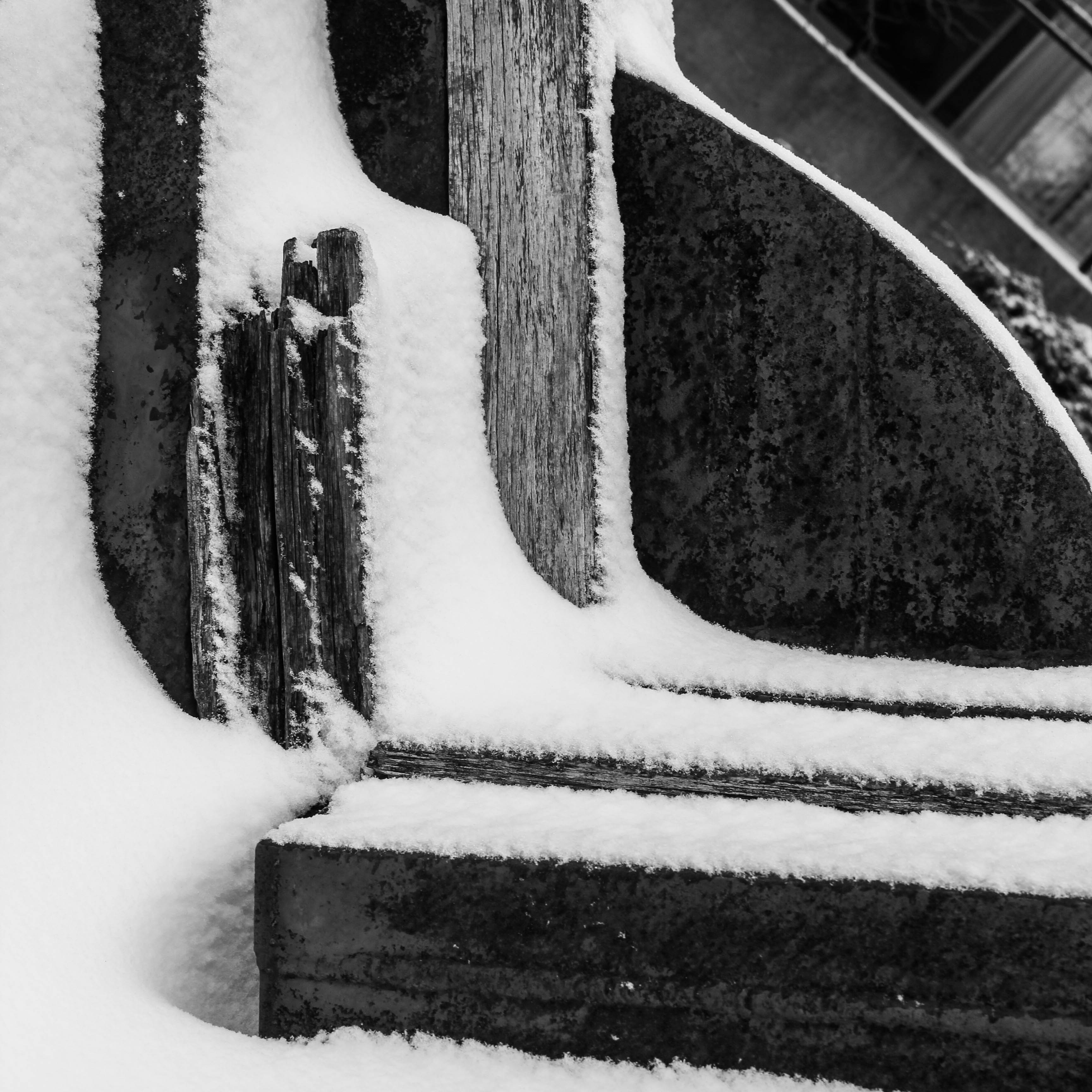
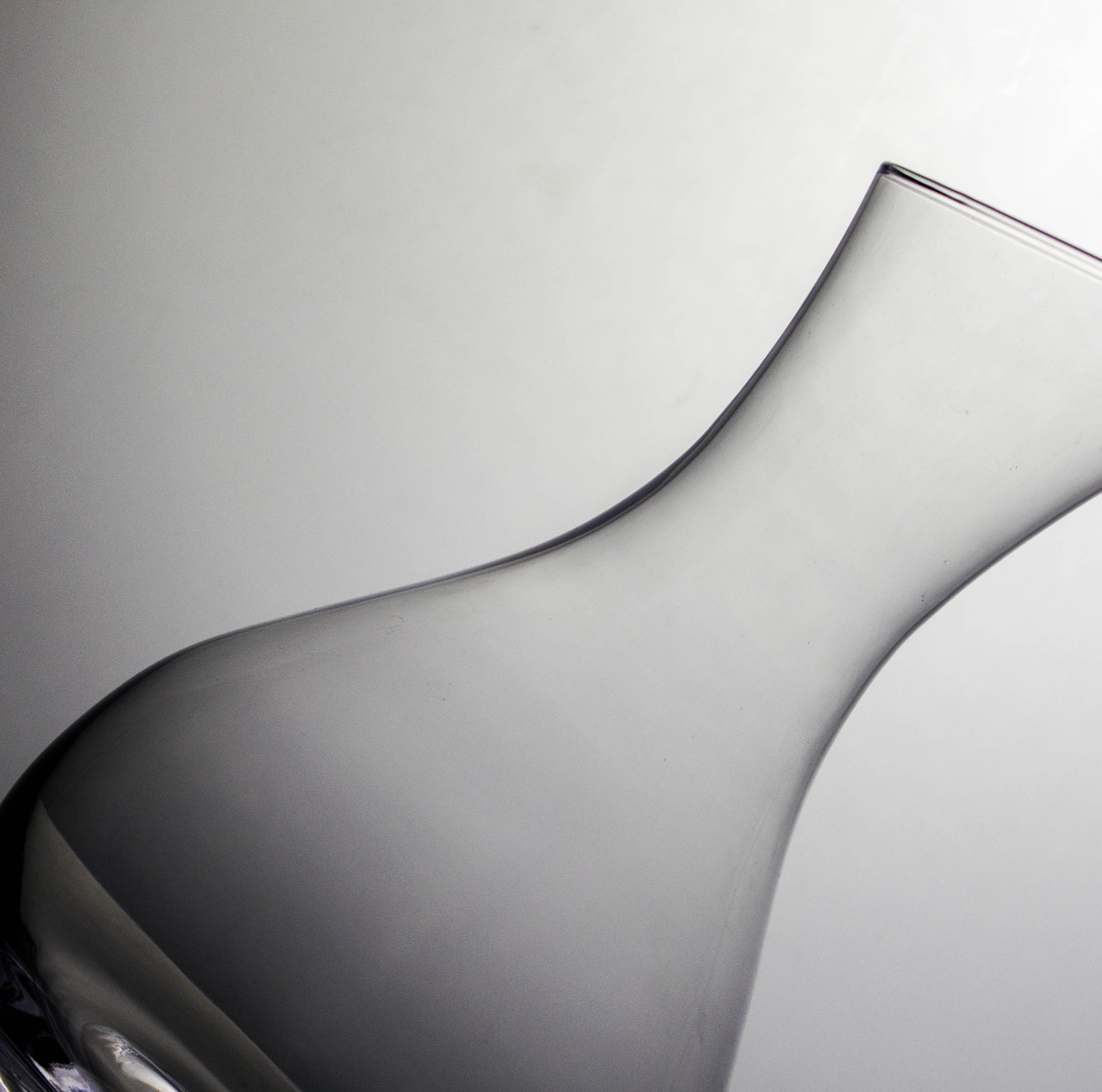
PHOTOGRAPHY
My photography style is mostly abstract and detailed. My aim is to inspire in the viewer a sense of curiosity and wonder, due to the subjects and items pictured not always being obvious. I like to give a different view to everyday objects, to see things differently.