
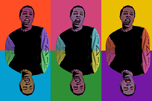
The goal behind this project was to create an andy Warhol inspired poster using an original imagine. The biggest challenge was trying to make it original and choose colors that went well together. Once I chose colors I liked, I flipped the bottom row around to make it interesting and original.

The goal behind this poster was to influence people to wash their hands around flu season and to follow a geometric design. Creating the hands, faucet and water was the most challenging part. Another challenge was trying to make an interesting poster when the subject was boring. I achieved this by creating an interesting image and using bold typography.
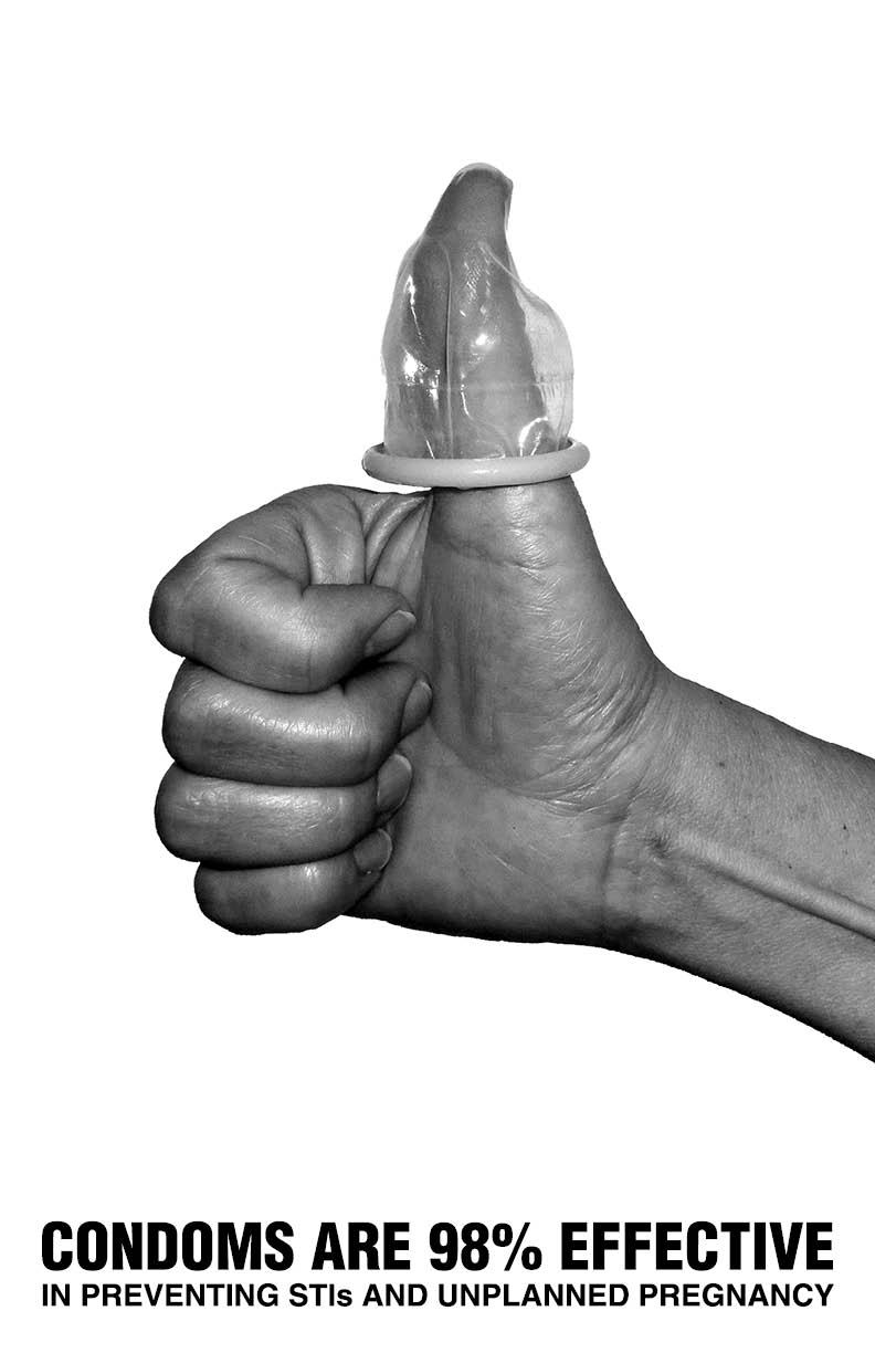
For our awareness poster, we were asked to create a piece supporting a social awareness cause. When it came to this project, I wanted to create something with a huge graphic and minimal typography. I achieved this by using an original black&white image that speaks for itself and then inserting an interesting fact at the bottom. This poster was created in Photoshop.
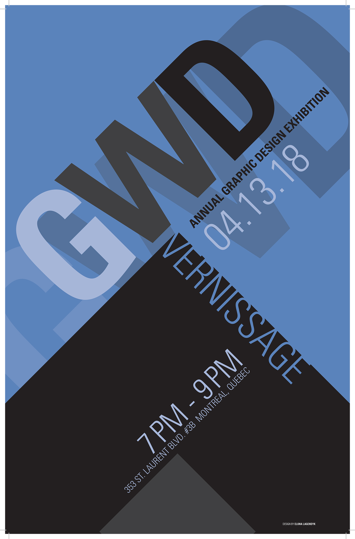
Every year, the GWD program has a vernissage showcasing the students art work created over the years. This year, we were asked to create a Swiss design poster using only typography and shapes, no images. This was one of my most challenging projects due to us only being able to use typography while trying to create something original and interesting.
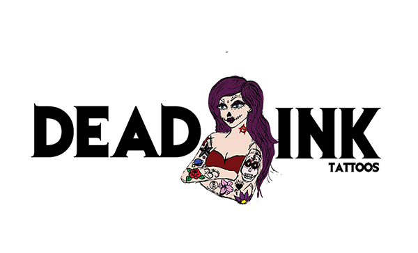
For the Dead Ink tattoo logo, I was going for a sketchy dark look. I wanted it to give off the scary feel you get when looking at a tattoo shop. Hand drawing the woman in the logo was the biggest challenge. Luckily she was small, so it required less detail which made the process a lot easier.
For the vape queen logo, I wanted to create a logo that was clean and readable for a vape shop. The process was fairly easy since I had the idea of incorporating the quitting symbol in the Q from the beginning. The biggest challenge was finding a font that was simple yet interesting.
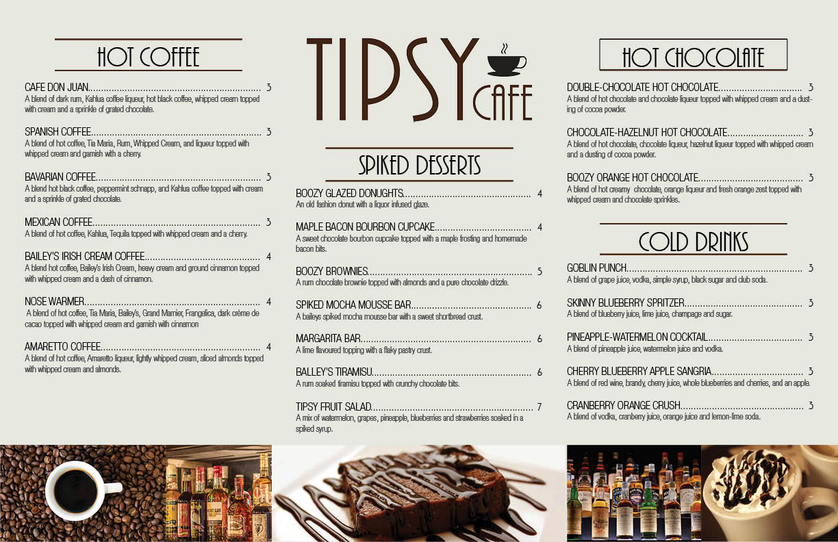
For this project, we were asked to invite a food shop and create the menu for it. I chose a coffee shop since I am a huge coffee lover. Shortly after choosing my subject, I realised that coffee shops was a common topic, which is why I made it a coffee shop that served everything mixed with alcohol. The goal behind the tipsy café menu was to create a modern menu that is easily readable. This project was created using Indesign.
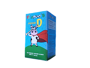
For this packaging project, we were asked to create a children’s package. I chose to make a package for vitamin d vitamins. Since it’s designed for children, I wanted to create something playful and colorful. I achieved this by creating a superhero cow that was posed to emphasise bone strength and using bright colors to attract a children’s eye. This package was created in Illustrator.
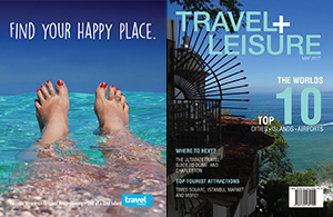
When it came to the magazine project, we were asked to re-design the magazine front and back cover of our choice. I chose travel+leisure as traveling is one of my favourite things to do and I had many original images that I could use as the cover. By using clean fonts and simple colors, it brought the spread together. This project was created using Indesign.
Copyright © Elona Lagendyk 2017