My artwork
Sweet Bites cookie Box
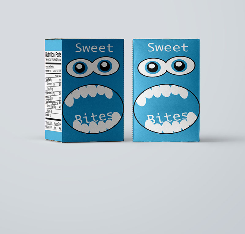
The purpose of this Cookie box was to design a box for children. Using Photoshop, and illustrator the design was created. Associatiing the blue and white colors, because often time those colors are the first ones the baby or child will be attracted to. Both appealing to children and parents (the buyers).
Women's Health Magazine
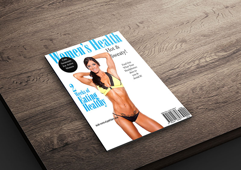
The concept of this work was to represent a similar look to the chosen magazine, while giving it a simpler look. The design solves the problem, because it is easy and friendly to read and interesting to look at. The main thing I wanted to give out as a message to the viewer was a nice simple look that everyone can enjoy.
Phoenix Tea Website
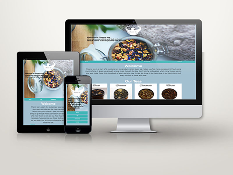
The concept of the website was to give a feeling of cold, since the product sold is hot drinks. Creating a website easy to follow and going straight to the main idea; which is to sell our product.
Phoenix Tea Business Card
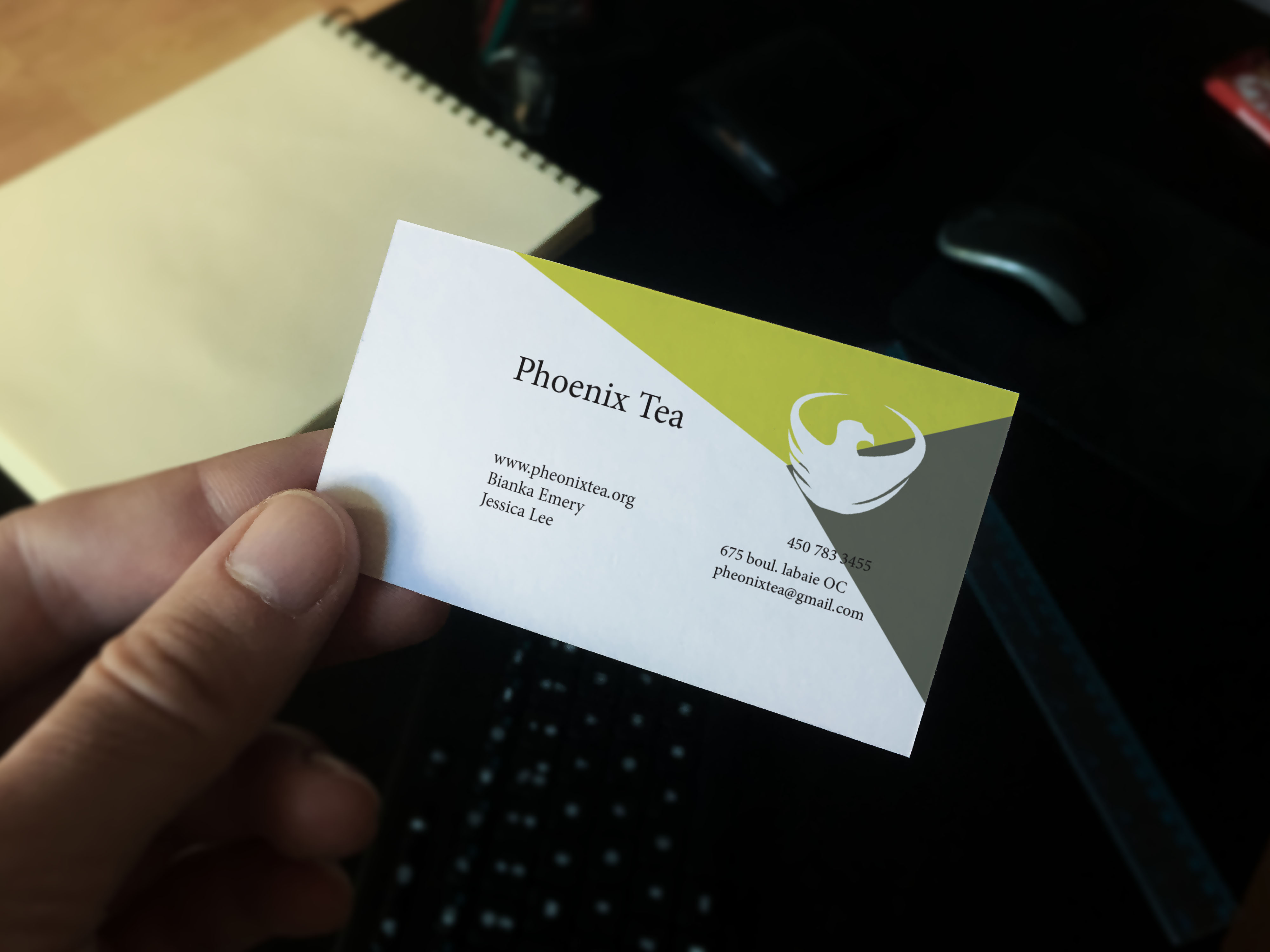
Representing the color of the tea and to focus more on the impact of logo and color. Simple readable message. The concept at first was only in black and white, but then it looked very dark and not what I wanted to give out as impression, so changed it to the color of our main tea(green).
Phoenix Tea Logo
The concept of the logo is essentially the phoenix bird but also a tea cup. Creating a logo that is easy to get what I’m trying to sell even without reading further more information. The most important part of this concept was to create a logo that really represents the company chosen.
Eblast
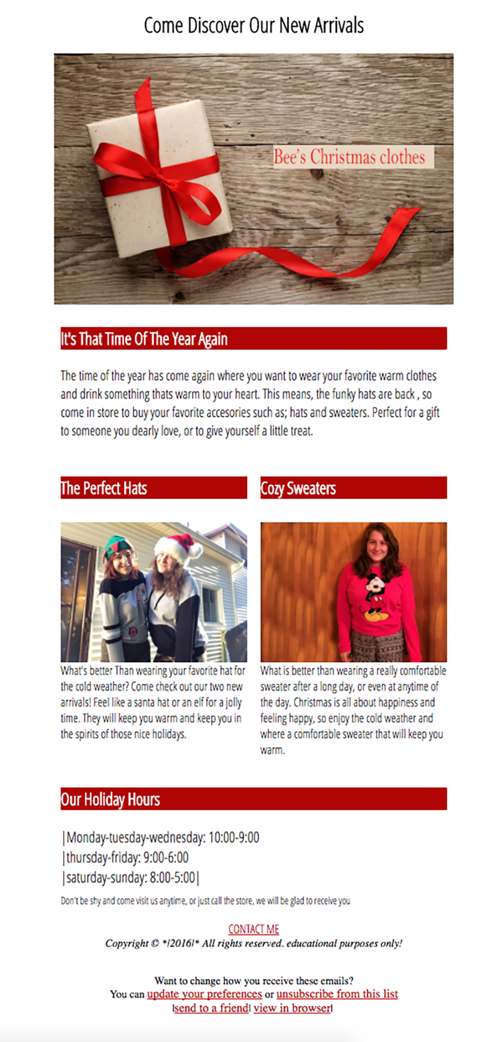
The purpose of the newsletter was to inform people of the clothes we sell. Making it simple to read so that when people received it on their emails, they didn’t have to read very long. The color red was to represent Christmas theme, since it was for holiday purposes.
Flying Creamery Brochure
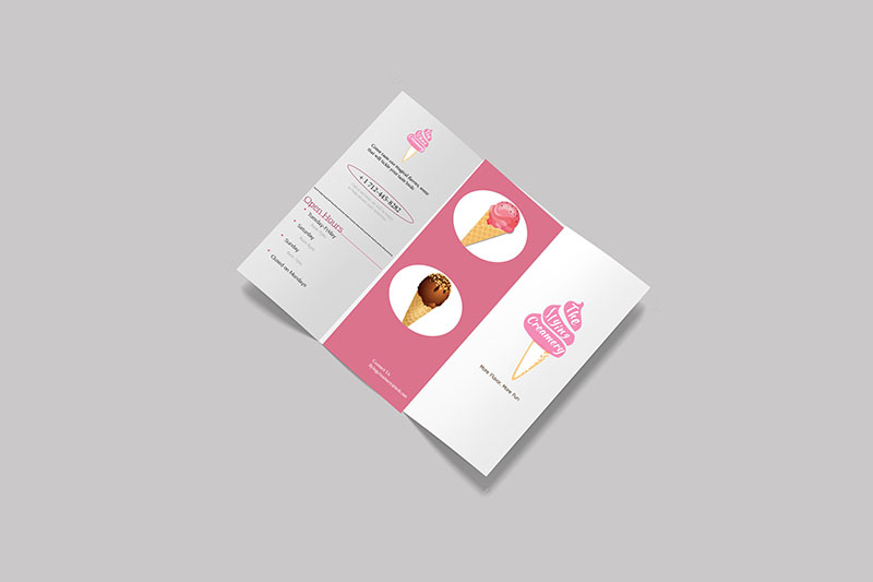
This flying creamery was a tri-fold brochure to display the different flavours ice cream and different desserts I did. The design was a simple color palettes of pink and also very easy to navigate in the brochure, to find exactly what you want to order. The design solves the problem because it’s clean, simple and easy to read.
Photobook
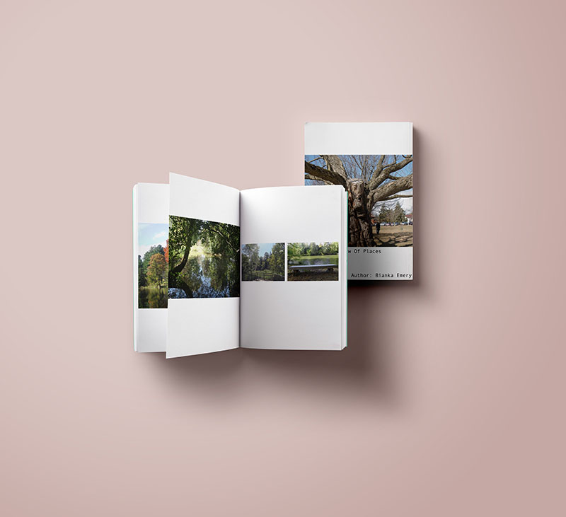
The concept of the photobook was to give a sense of nature to the viewers and also to feel all the places and experience i had. The concept was easy one full picture and one bi-pitch, easy to see and analyse images but also very fun to look at. this concept if often used to diversify the viewer's eye to just looking at one type of image.
Awareness Poster
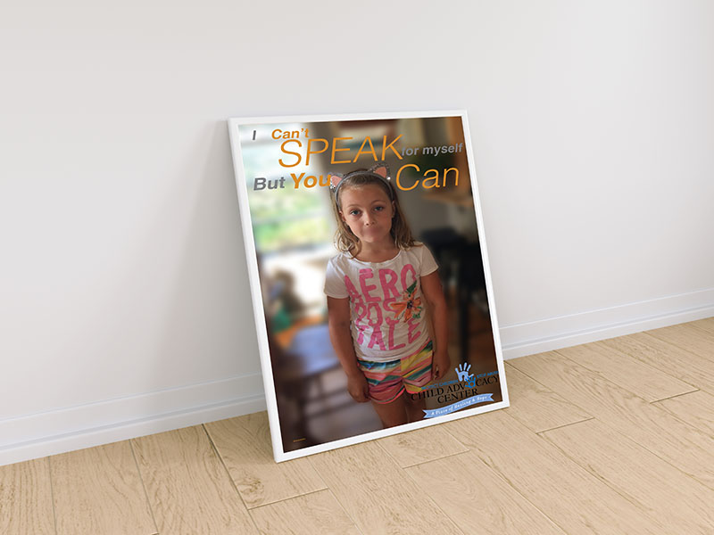
Using Illustrator, photoshop and indesign the awareness poster was for child abuse. The message was to give out a clear message so that the viewer would somehow understand how it is to be in that situation
Movie Poster
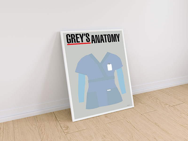
The goal for this design was to convey the key element of a tv show or movie, and to show the viewer what that movie or TV show is about. The look was very simple and using minimalist style and vector helped to convey that message.