Thank you for checking out my portfolio. Always feel free to contact me if theres anything you would like me to design with you!
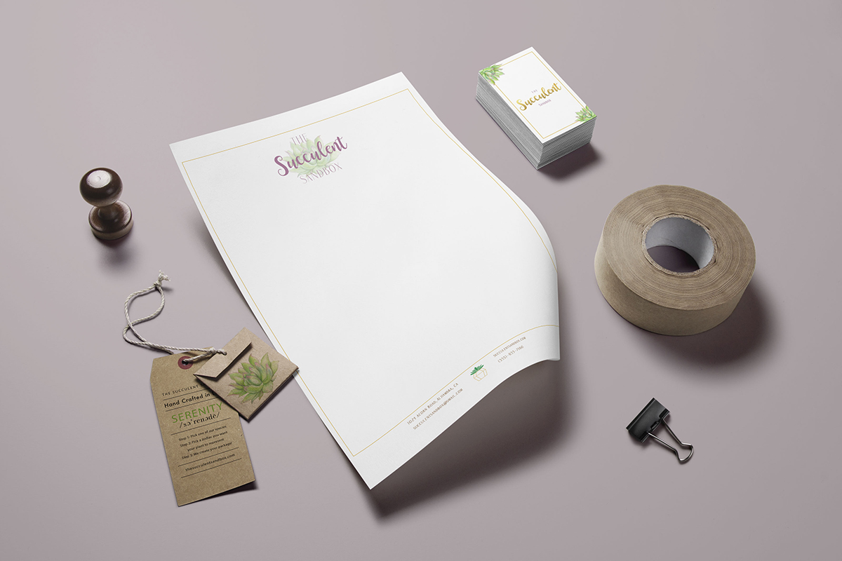
Brand identity for a succulent nursery based in California
The Succulent Sandbox is a brand identity created for a ficticious plant and succulent nursery. The main concept was to create a zodiac to connect with the consumers. With the plant or succulent chosen, a zodiac tag is assigned. If the consumer feels a lack of serenity, he/she could choose that tag.
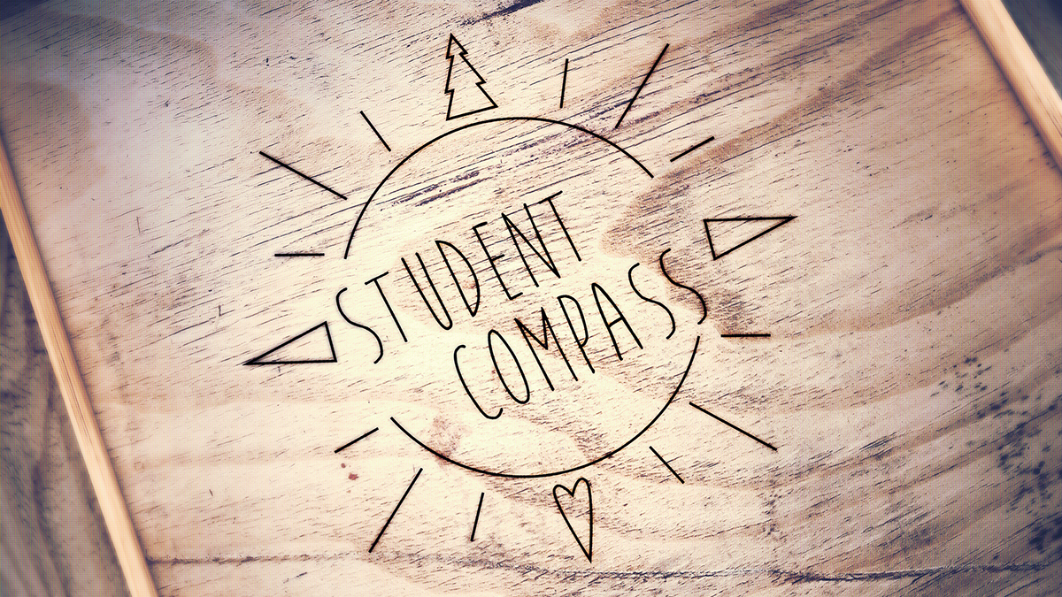
Brand identity for a non-profit organization
Student Compass is a non-profit hiking group brand identity. I created this concept because there is a lot of scientific research that proves hiking can help with mental illness. This is the logo I created to represent a compass and nature all in one.
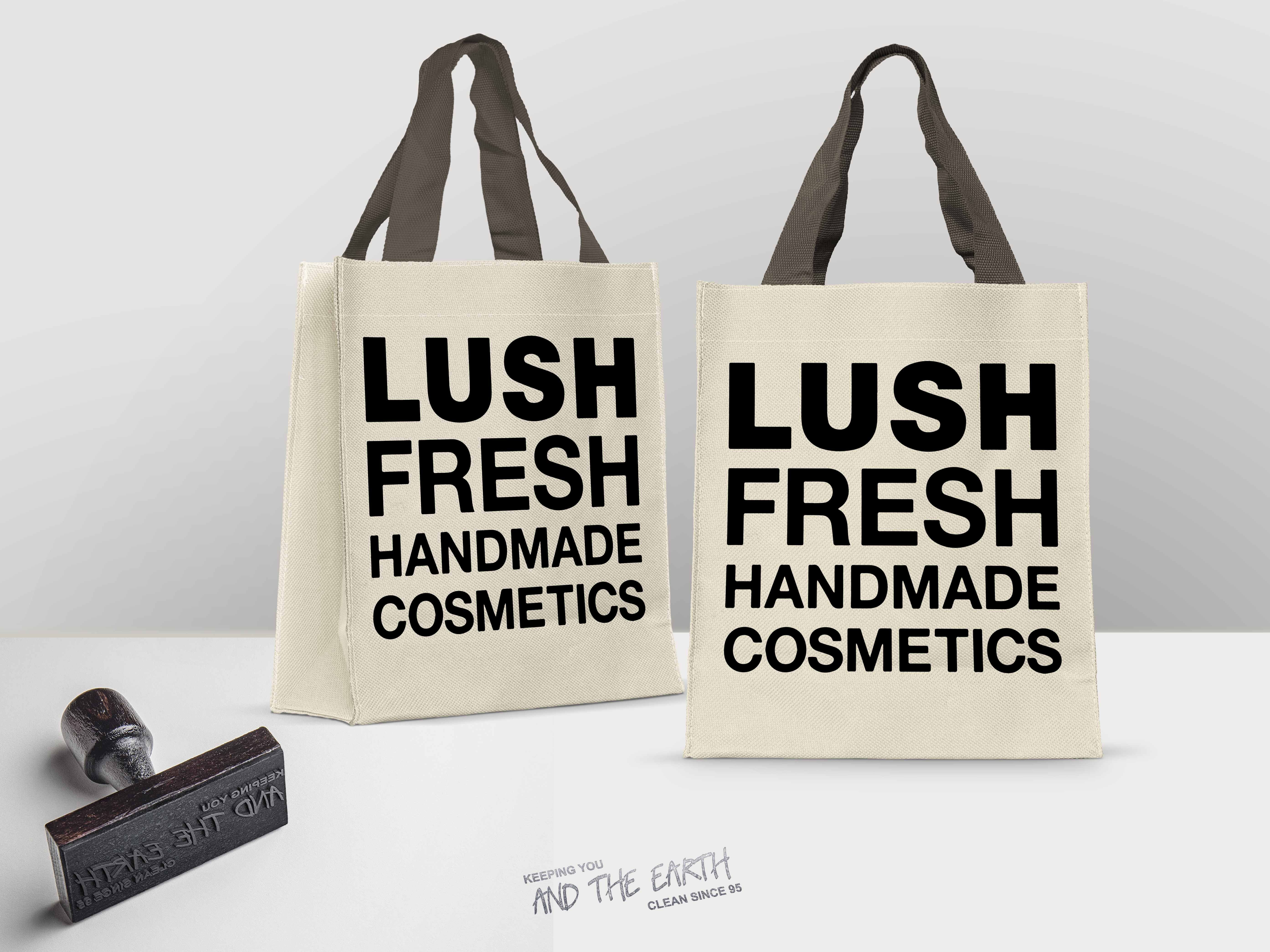
Packaging Redesign
This packaging was redesigned for Lush to enhance the eco-consciousness of consumers around the world. My goal was to incorporate the reusable bags that consumers are becoming more and more familiar with. Every time the consumer shops with the reusable bag, they get a stamp. When 10 stamps are obtained, they recieve a free product.
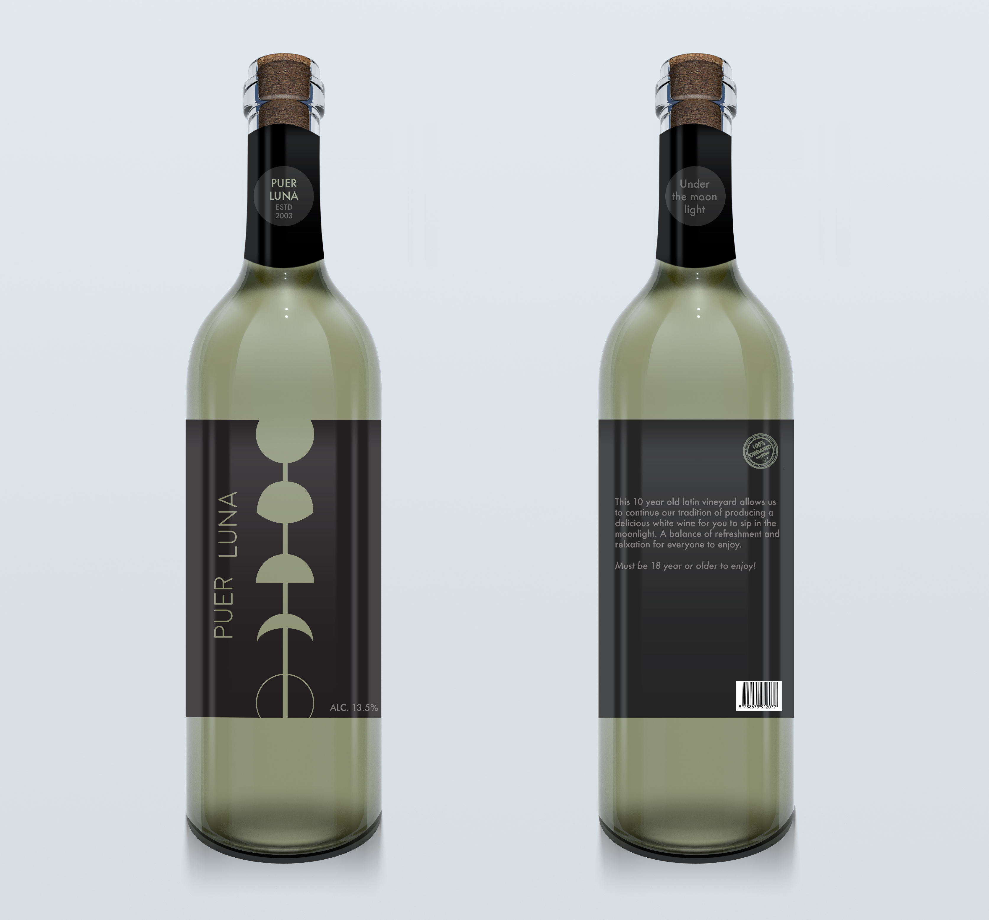
Label design for a wine bottle
Label design for a wine Puer Luna. The design refers to the phases of the moon. The full moon at the top represents the full bottle of wine while the new moon at the bottom represents an empty bottle. The die cut was utilized to allow consumers to see how much wine is remaining. Puer Luna means "moon child" in Latin.
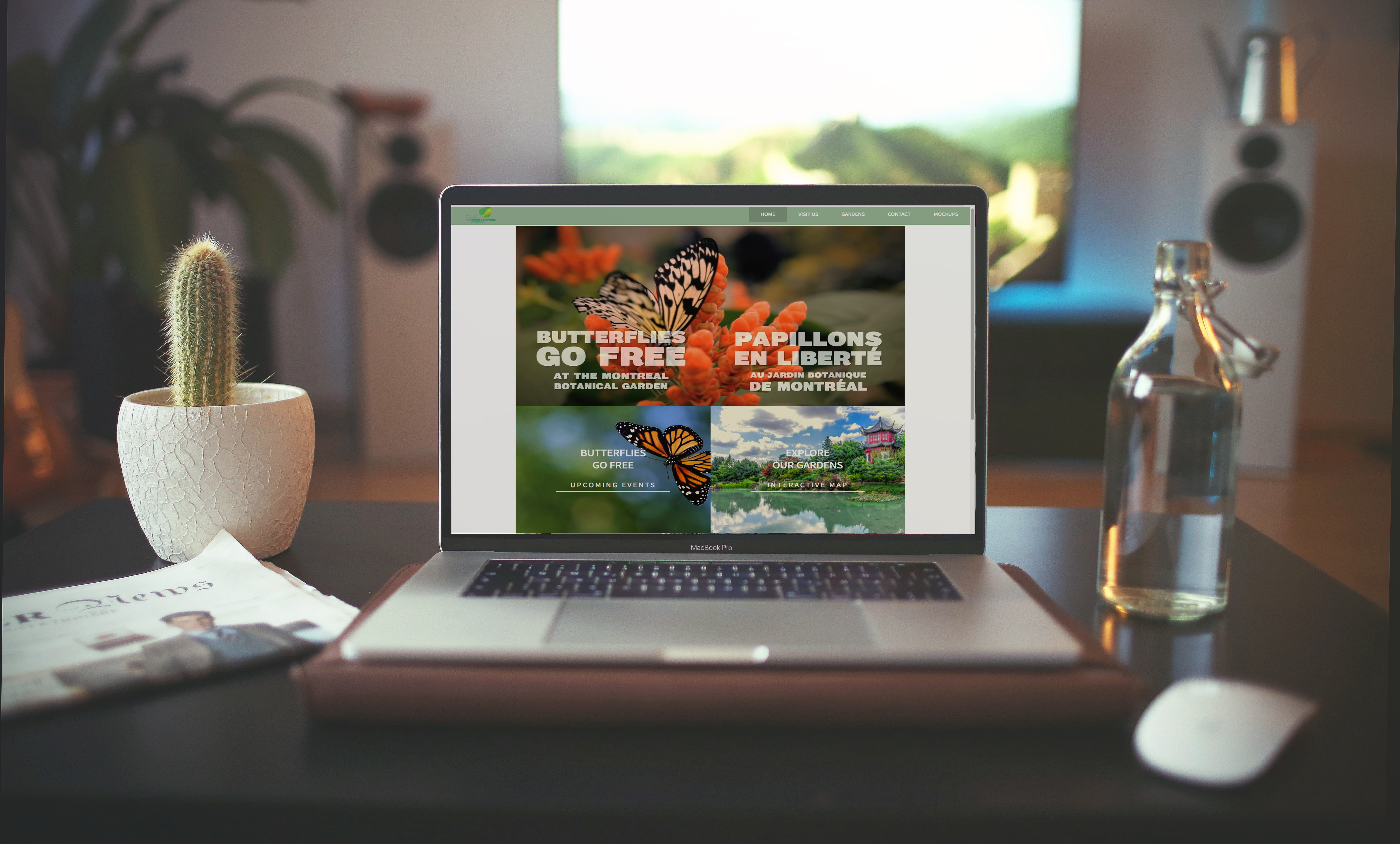
Website redesign for a Montreal tourist attraction.
This is my redesign of the Montreal Botanical Gardens web page. I went for a modular layout to make it more visual but remaining user-friendly.
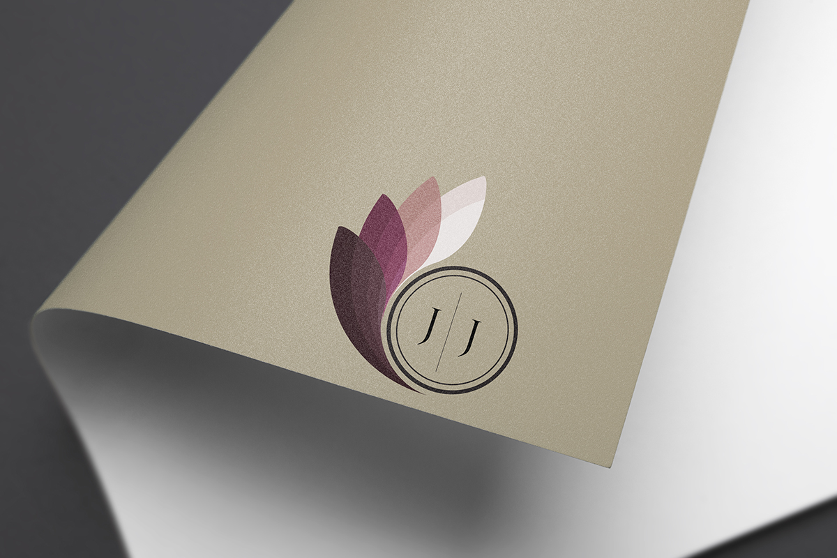
Logo created in 2015 for a personal brand
This was the first logo I created for myself in my first year of Graphic and Web design. I went for the burgundy, yet neutral colours because I have a minimal style.
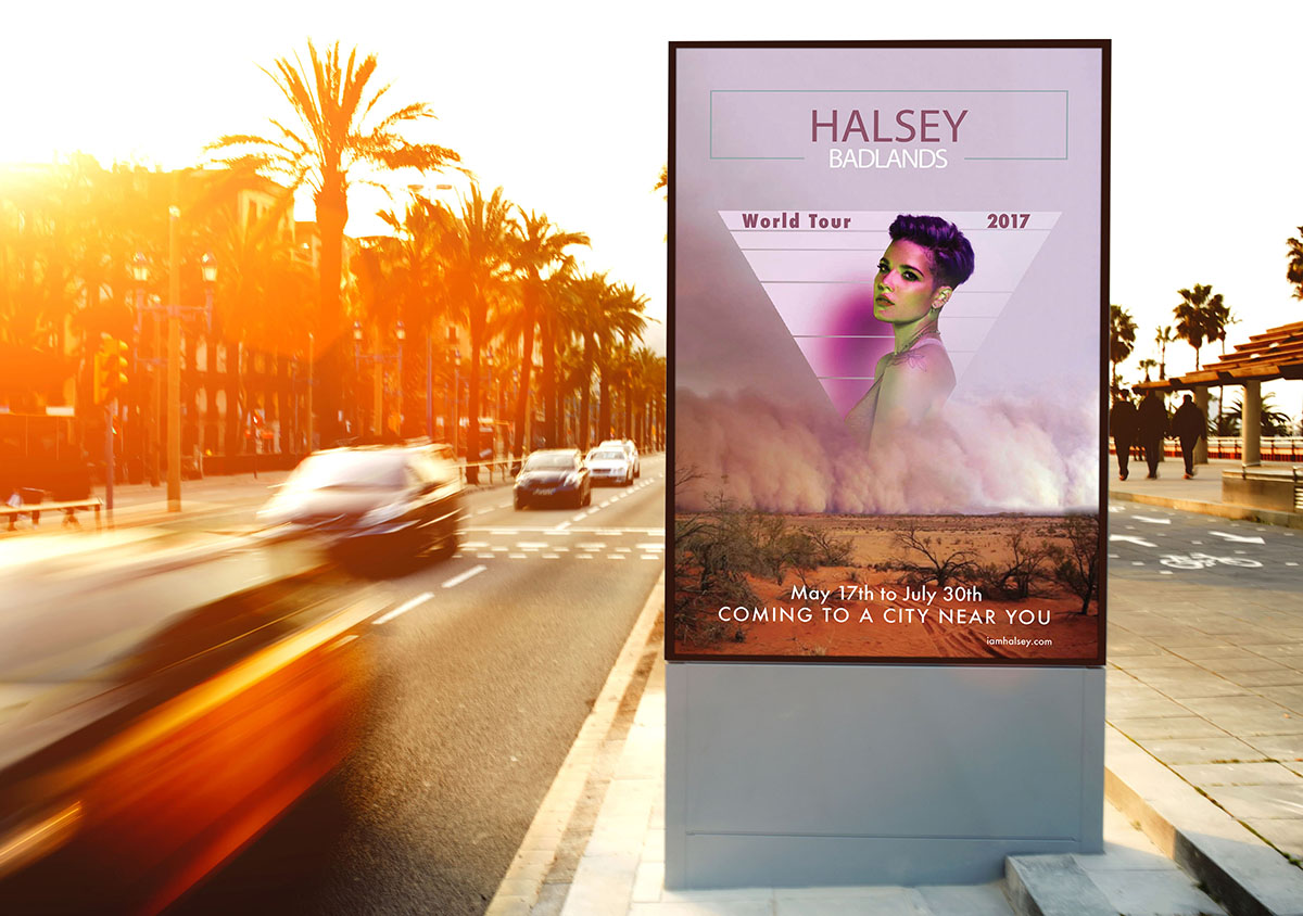
Concert poster designed to give a sense of summer and warmth
This poster is for an american singer/songwritter Halsey. My main objective was to give the viewers a sense of summer and heat. I used the triangular shape to convey her style of edgyness.
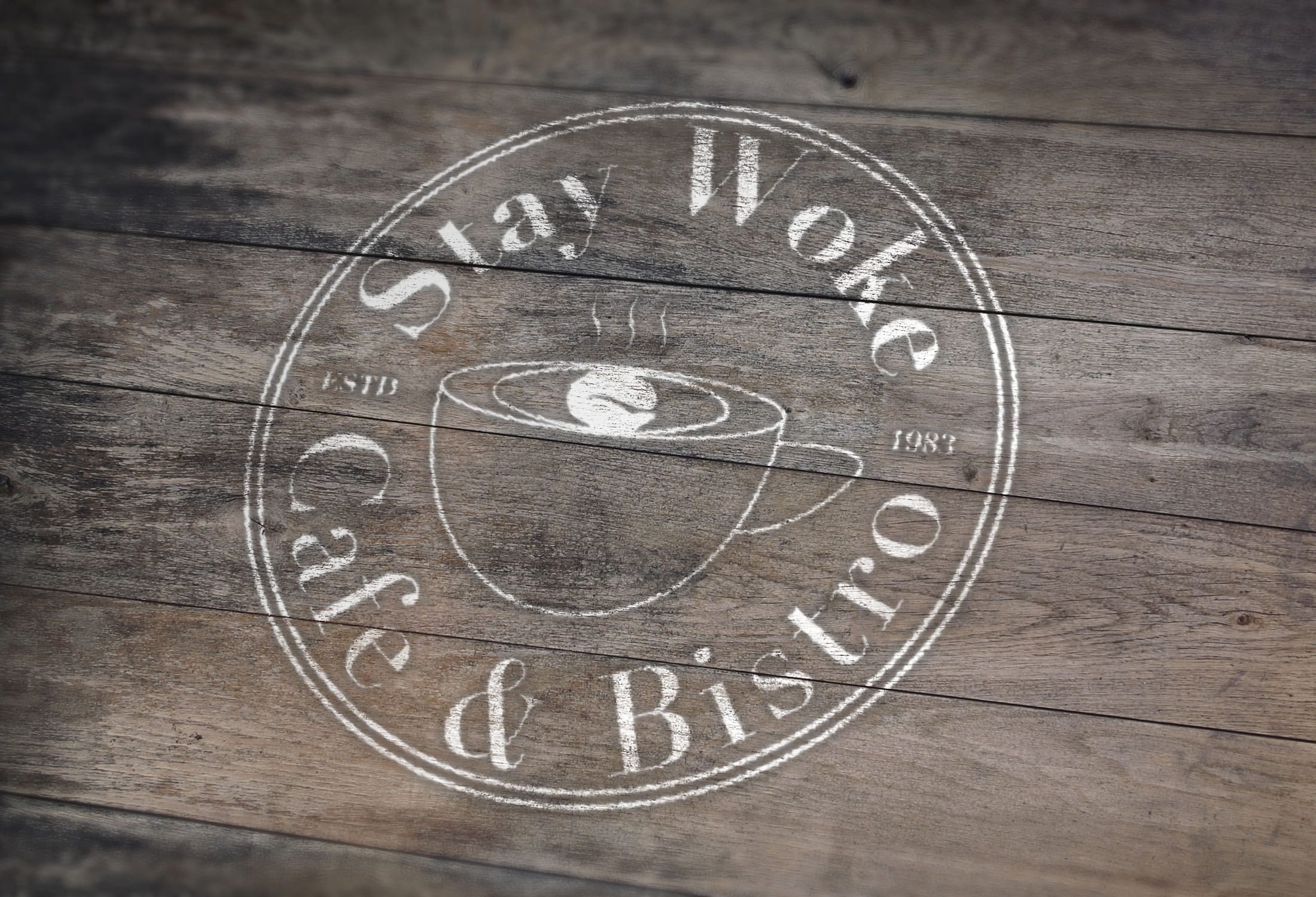
Logo design for a coffee shop
I made this logo with the intention on attracting the hipster generation since it is something that they identify with. Stay Woke is an expressiong commonly used amoungst the younger generations. It refers to keeping informed of the things going on around you. This name also works considerting caffeine keeps you woke.
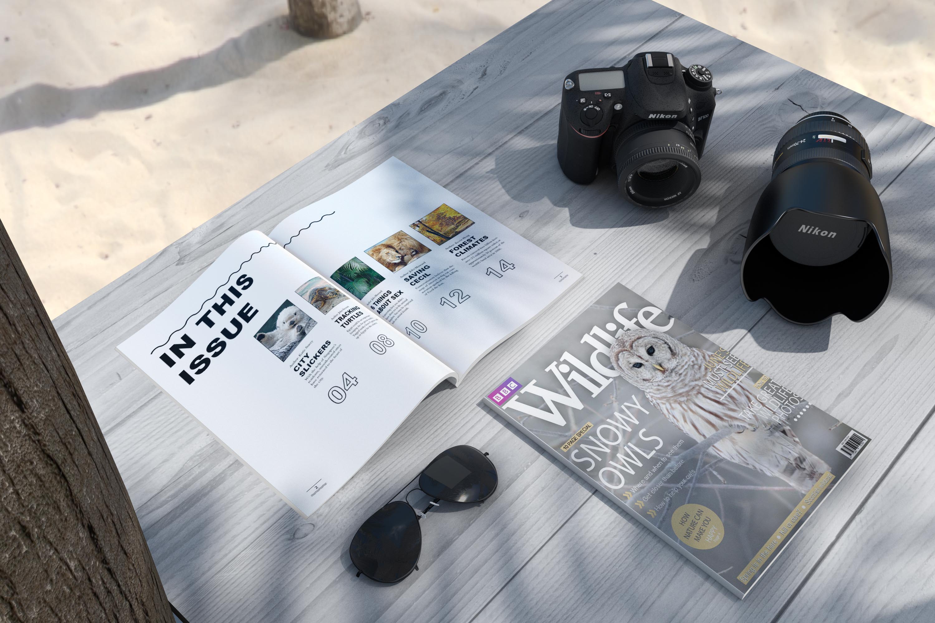
Magazine redesign for BBC Wildlife
This cover redesign was made to look similar to the original BBC Wildlife magazine while the interior was made to be a completely new style and approach. I made the inside a lot more minimal, but still very imformative like the original.
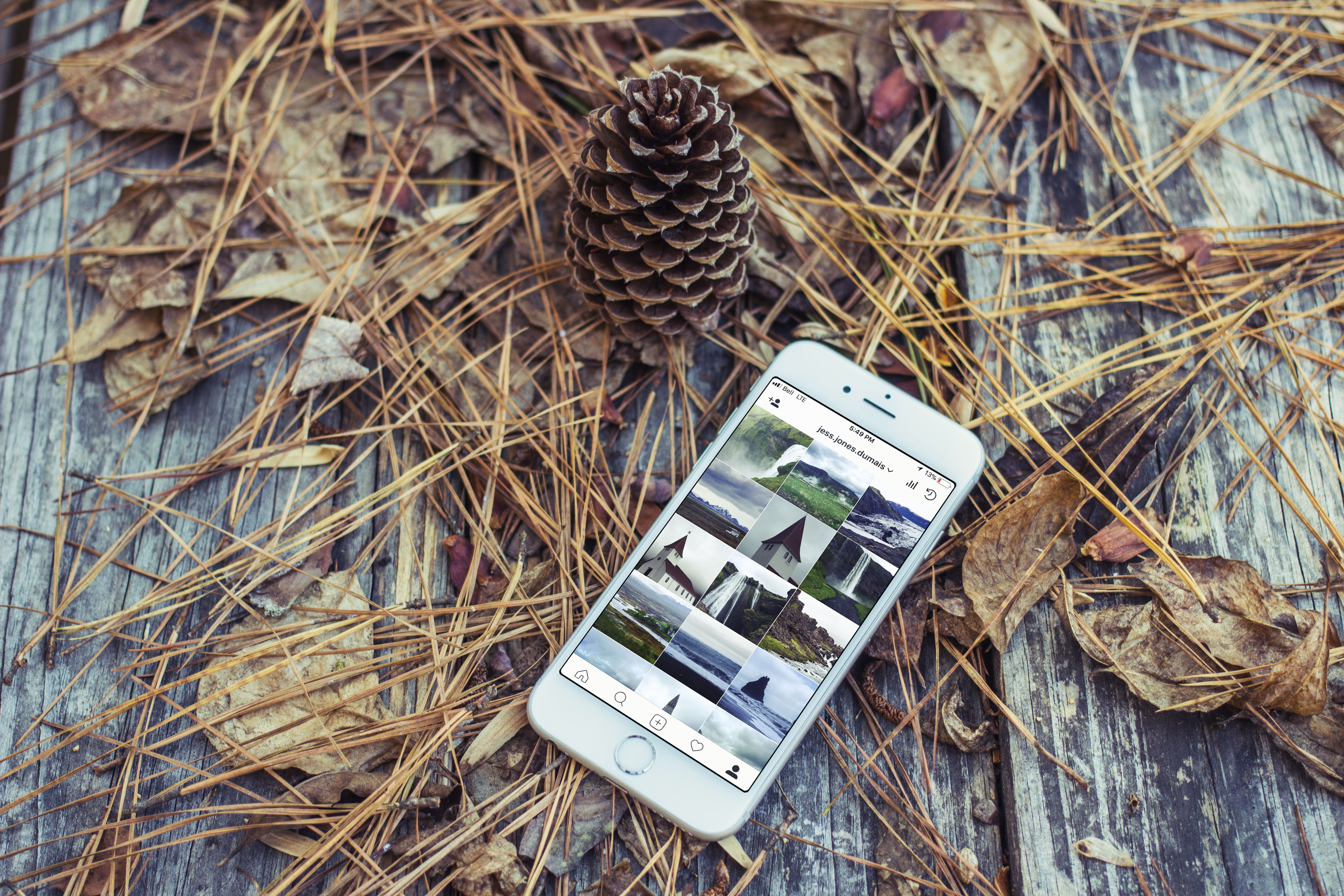
Photography
I started getting into photography when my family bought me a camera in high school. I never took it seriously until I got older and began to travel and look for the beautiful things life has to offer us. I am a nature enthusiast, which is conveyed though my photography.