
PORTFOLIO
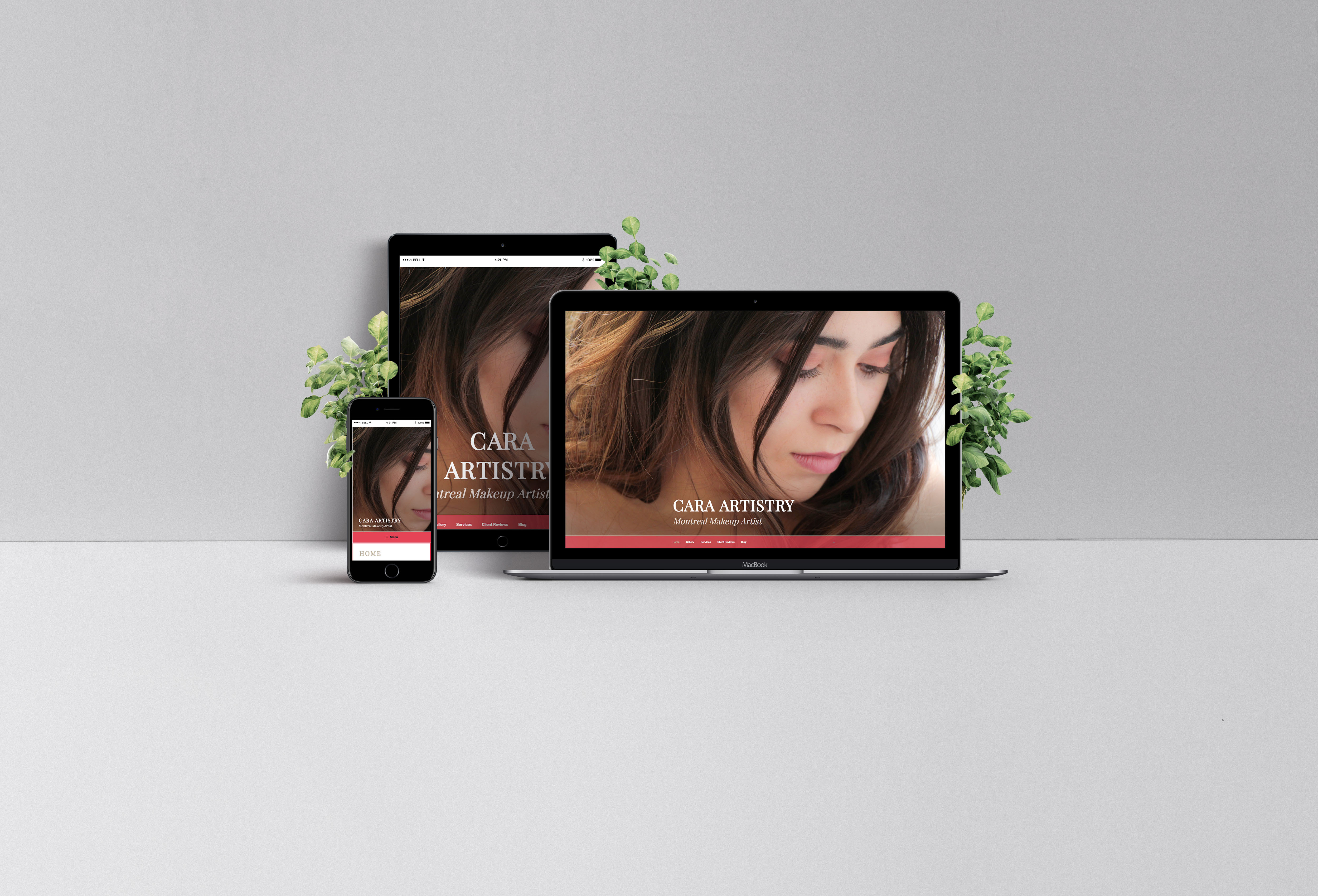
CARA ARTISTRY WORDPRESS WEBSITE / WINTER 2017
A natural makeup artist’s website to provide services and examples of her work.
The site was designed by customizing the Twenty-Seventeen theme using a child theme. All photographs and styles are meant to represent the makeup artist’s working style, natural makeup. Therefore, the site is feminine and minimalistic.
VISIT
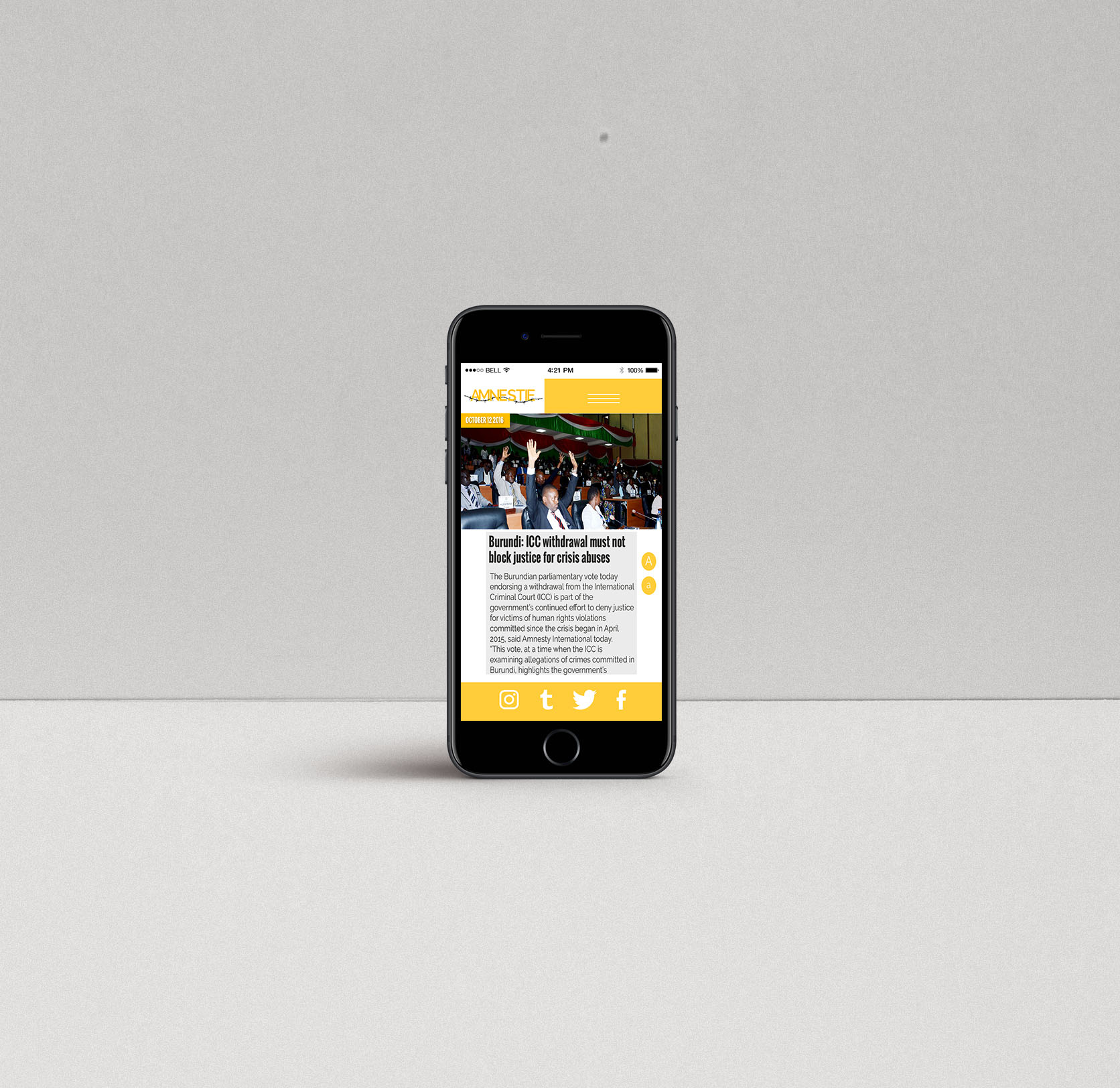
AMNESTY MOBILE DESIGN 2016
The project’s aim was to redesign a non-profit organization’s website for desktop and mobile. The task was given to teams of two. As a result, my team member and I had make sure our designs were cohesive and seamless while respecting the organization’s visual identity.
GOOGLE MATERIAL DESIGN TUMBLR ICON / FALL 2015
An icon made in Illustrator for Tumblr using the rules of Google Material Design. From the color, the letter, the degree of the rounded corners and the shadows, I used Google’s Material Design style guide in order to create it.
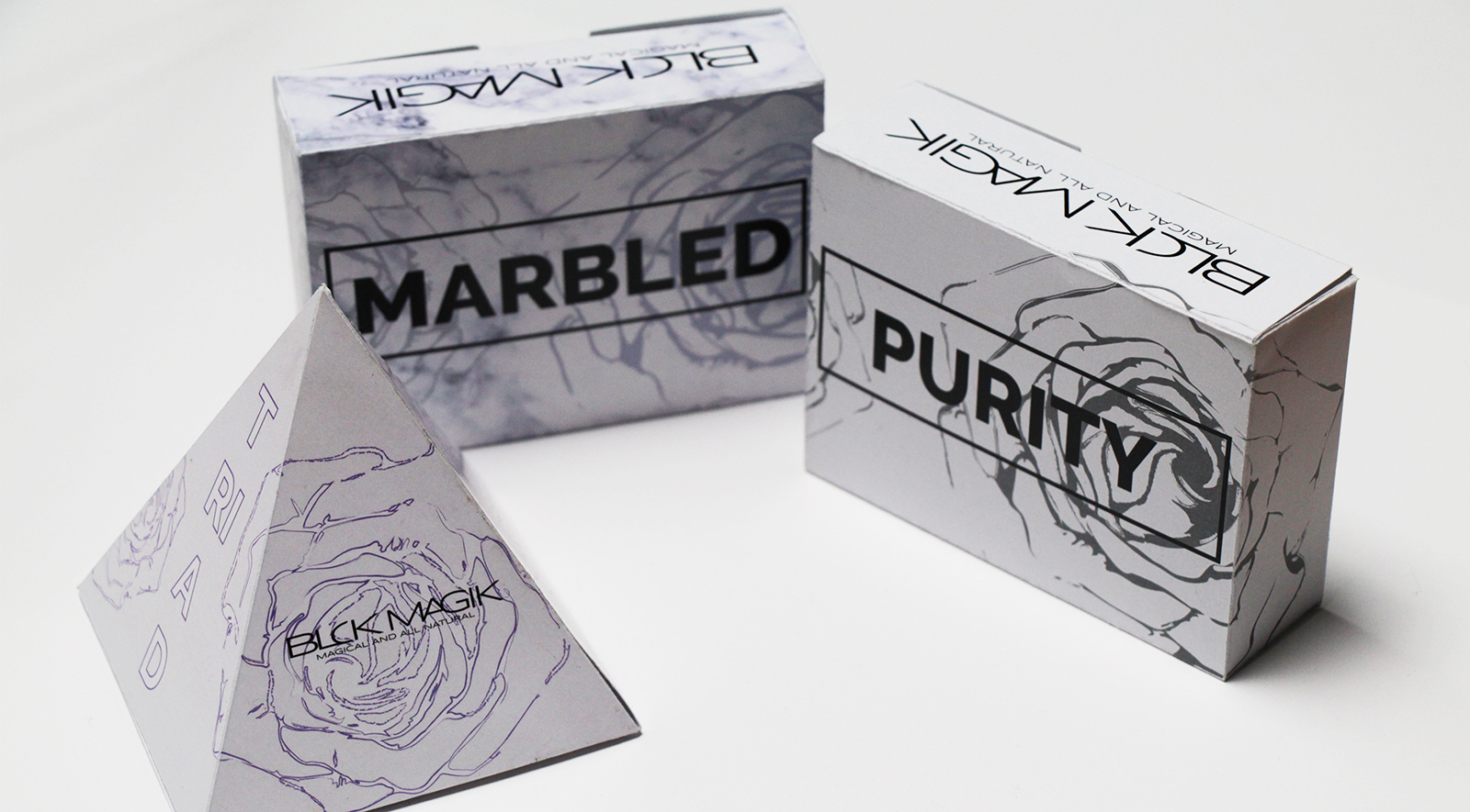
BLCKMAGIK PACKAGING / FALL 2016
Packaging design for specific soaps of the BLCKMAGIK bath and beauty brand. The goal was for each soap to have their own unique box to reflect their specific qualities, uses, scents and to create a strong associative image to the brand. As a result, the boxes mirrors the individual characteristics of the products by integrating them into the design.

YKEO SPACE 15 / WINTER 2016
A brochure with unusual folds inspired by the concepts of Ikea’s Space 10 future living lab in Copenhagen, Denmark. The main concept of this brochure was creating more space in a given area. Therefore, to recreate that concept, the brochure has multiple folds to mimic the created containing information.
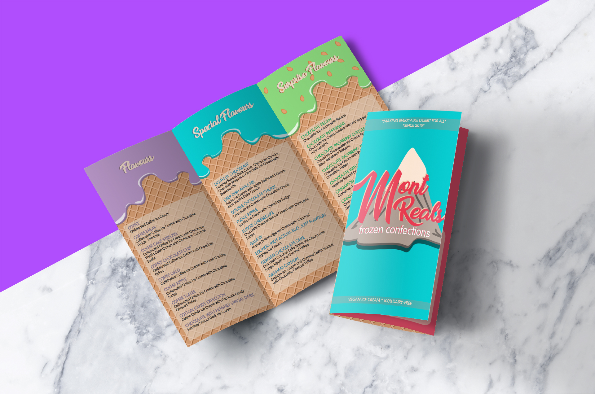
MONT REAL ICE-CREAM SHOP / WINTER 2017
A simplistic, yet fun and effective environmentally friendly menu and business card for an Ice-cream shop company. The menu is suppose to reflect the company’s playfulness as well as their familial value in the most simplistic way possible. The end result of the design defined by using bright and bold colors to reflect playfulness as well as custom round shape illustrations to give a more personal and approachable touch.
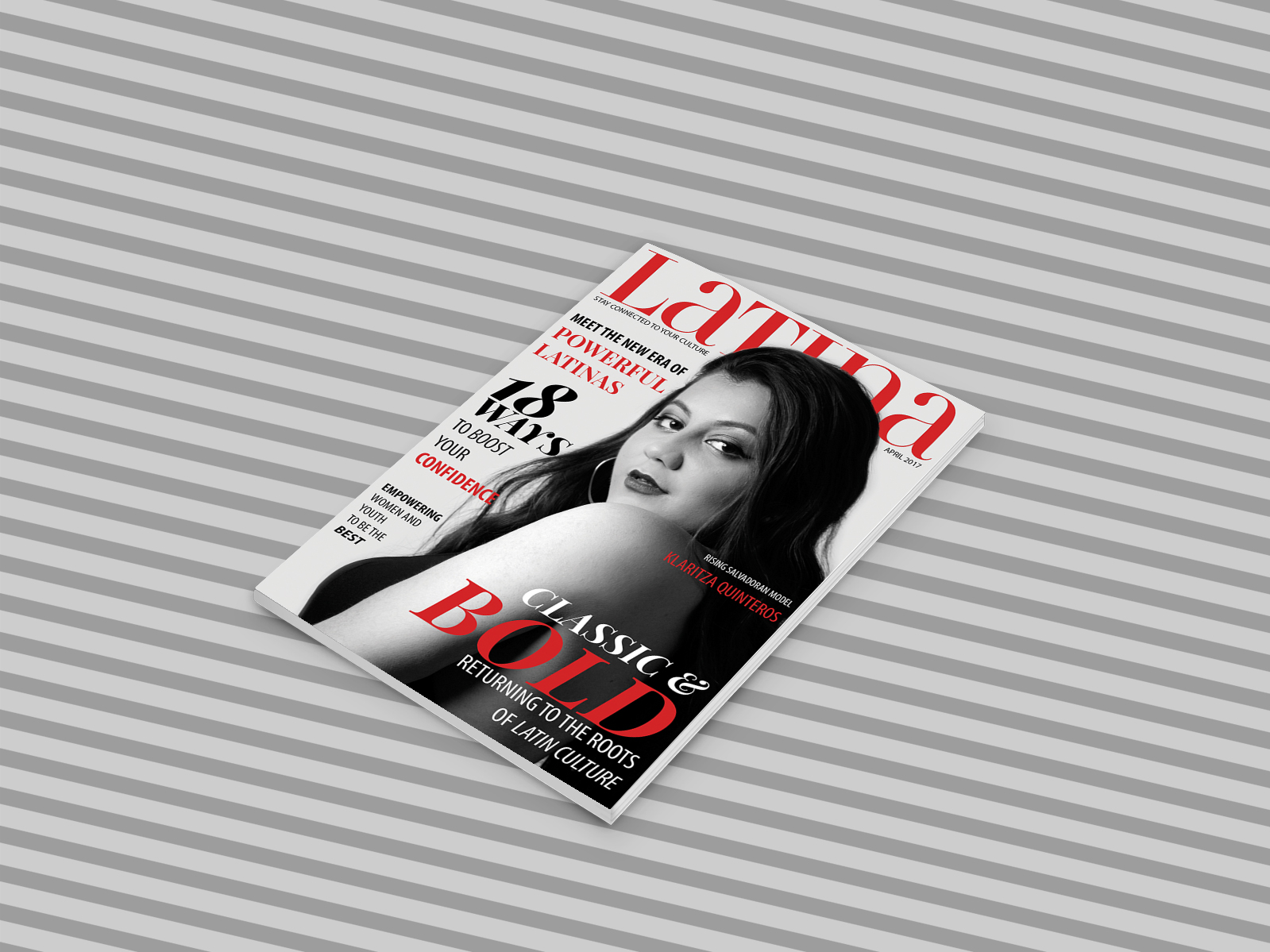
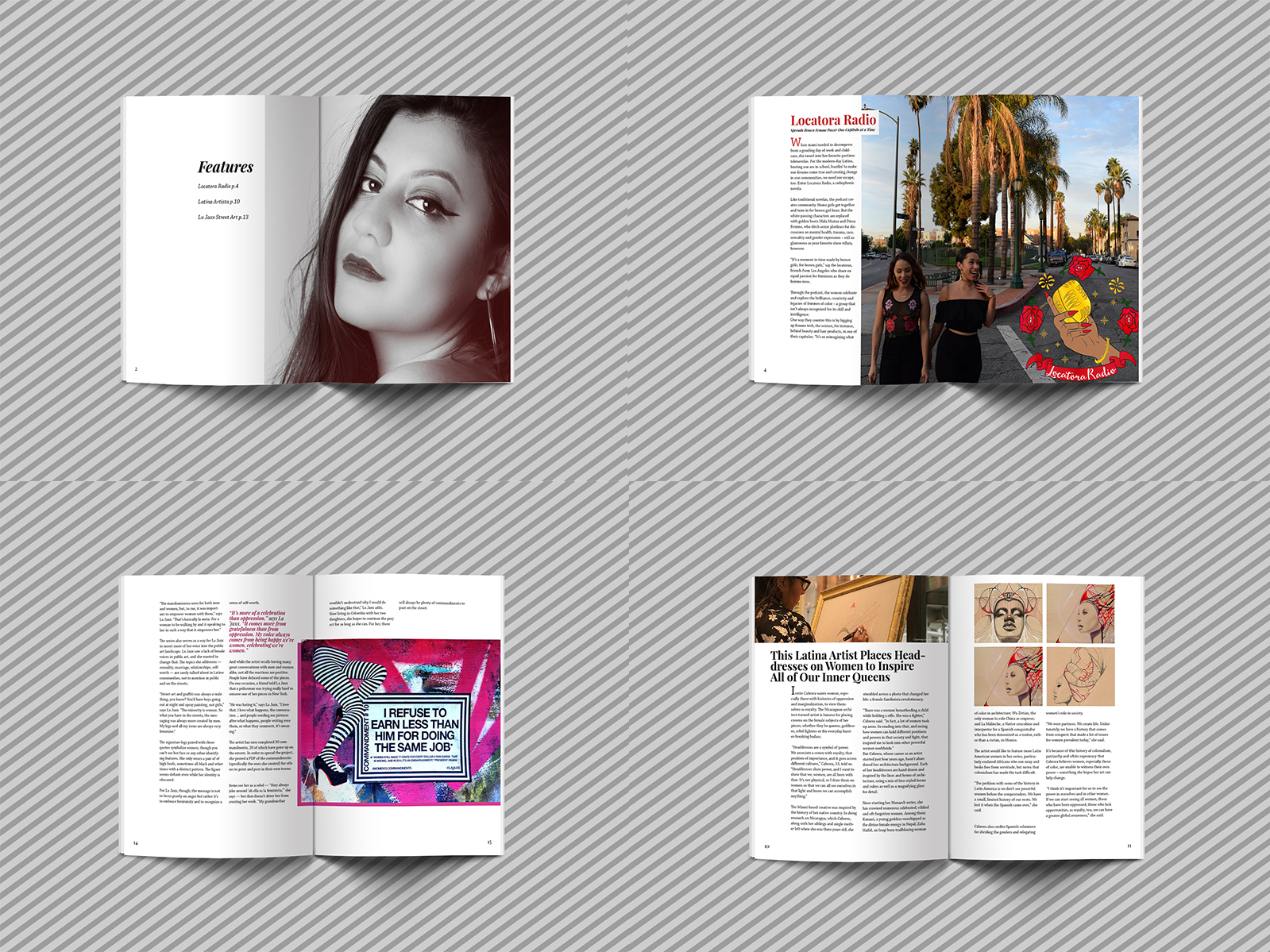
LATINA MAGAZINE MAGAZINE SPREAD / WINTER 2017
A project created in InDesign that consists of re-designing a magazine layout of your choice. The layout was made to emphasize only the important elements of the magazine (articles and photos), hence the minimalist inspired layout.
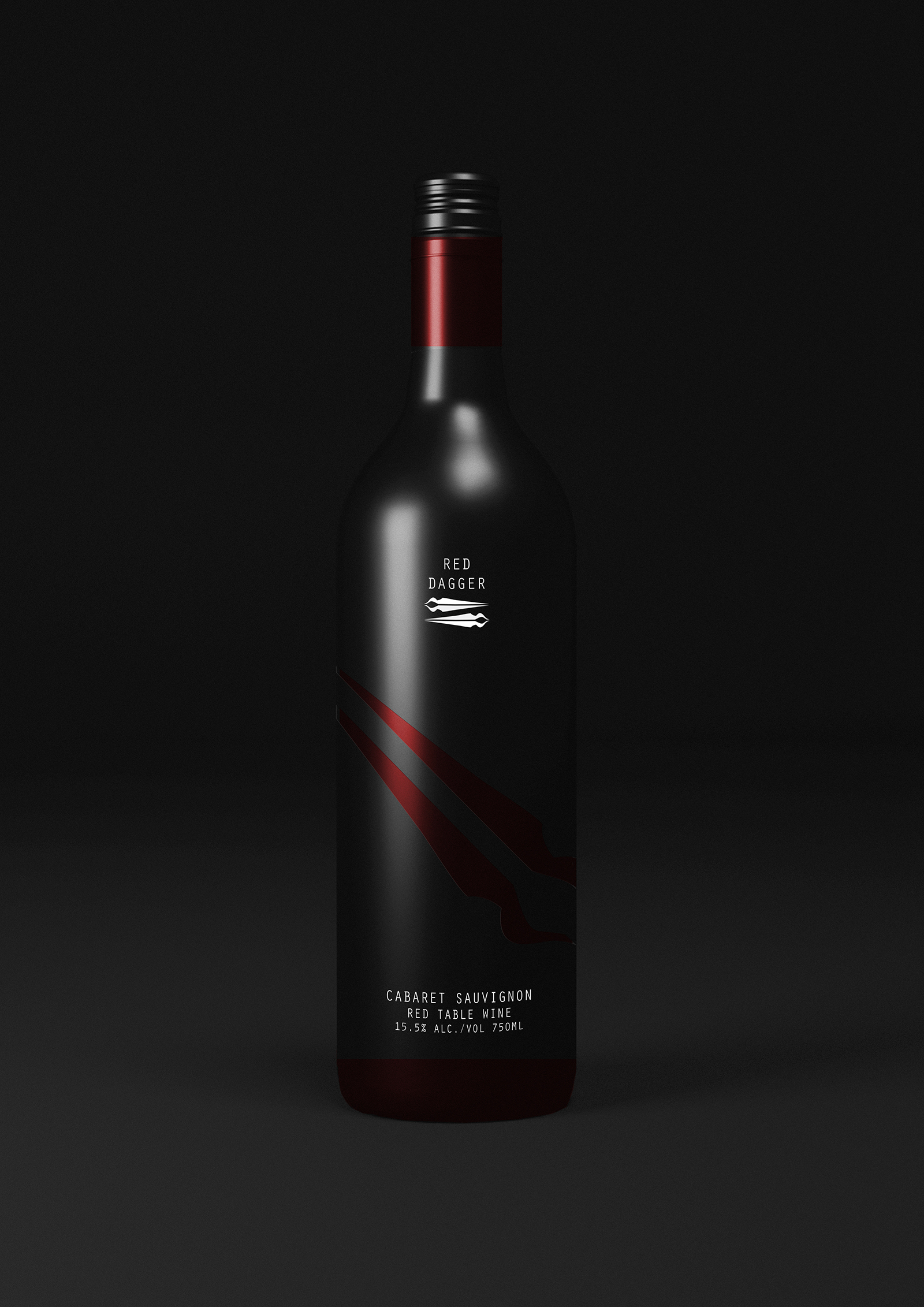
RED DAGGER WINE BOTTLE DESIGN / FALL 2017
A packaging design meant for a Cabernet Sauvignon wine bottle. Inspired by the sharp taste and red color of the Cabernet Sauvignon wine, the design includes a red dagger as the point of recognition for the brand. The clean and modern look is mainly to attract adults who are 21 and over as well as establishing a strong visual identity for the company.
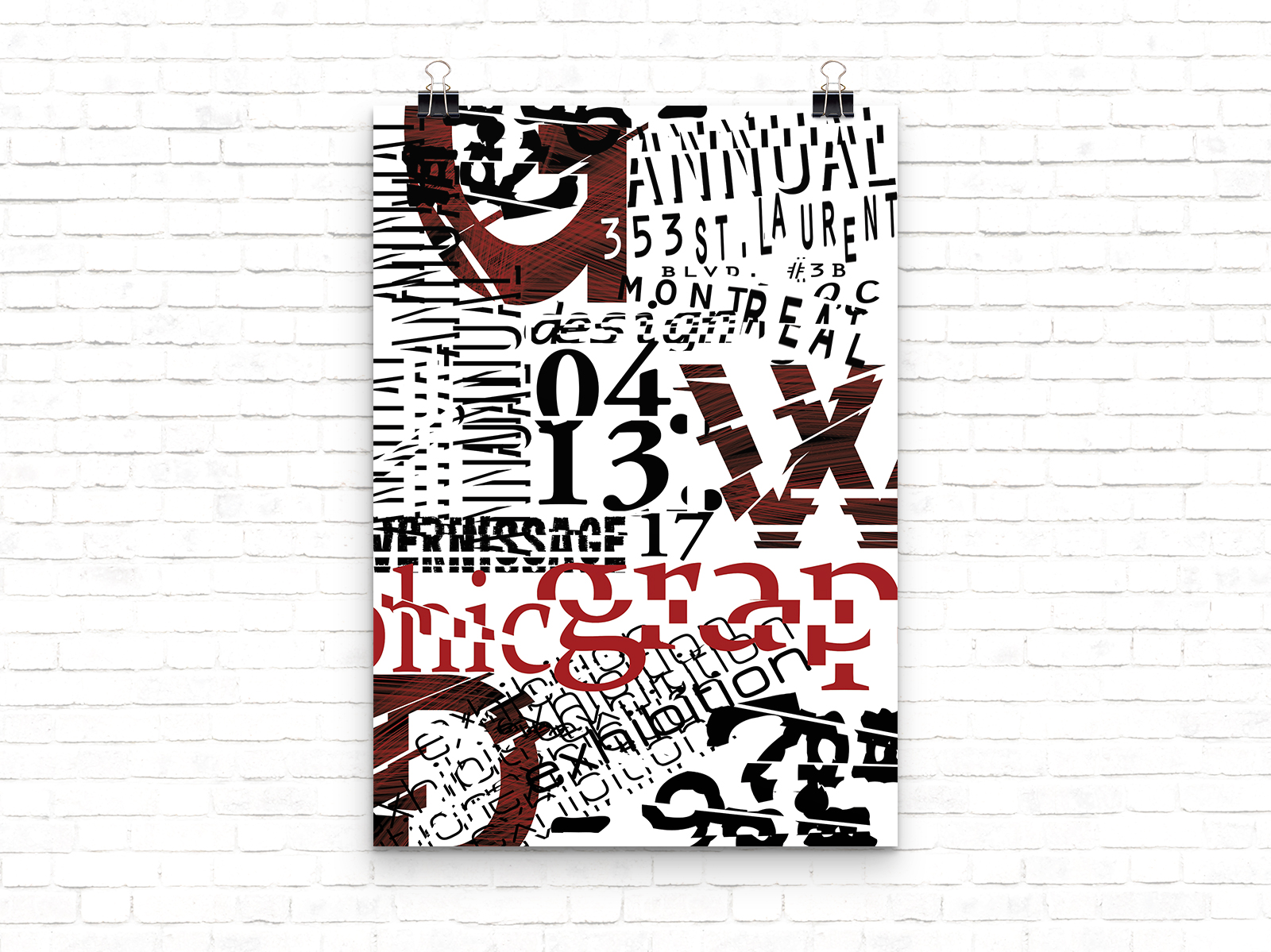
ANNUAL GRAPHIC DESIGN EXHIBITION POSTER / FALL 2017
A typographic poster design inviting guests to the annual graphic design vernissage. It is inspired by the Abstract Expressionist Movement. David Carson, the king of deconstructed letters and typography rule breaker, is the main style portrayed in the poster to evoke emotion and curiosity from people.
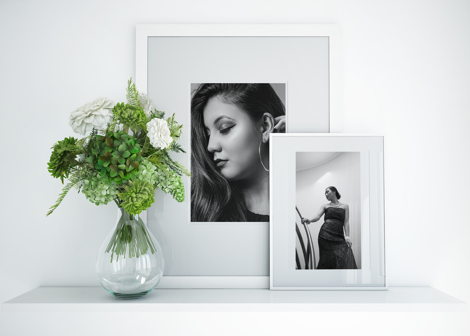
PHOTOGRAPHY
A selection of lightly re-touched portraits made to use in different projects.
Cara Artistry with Kinda Harb. Portraits made to focus on the makeup for a makeup artist’s website. Therefore, they are bright and soft to reflect the makeup artist’s makeup style.
Latina Magazine with Klaritza Quinteros. Portraits were shot to focus on a young woman of Latin descent for a magazine that highlights the Latino culture.
Pre-Cotillion Portraits with Irene Bulaon. These portraits were shot to commemorate Irene’s coming of age party. The photos were used at the party as well as in some of her birthday décor.