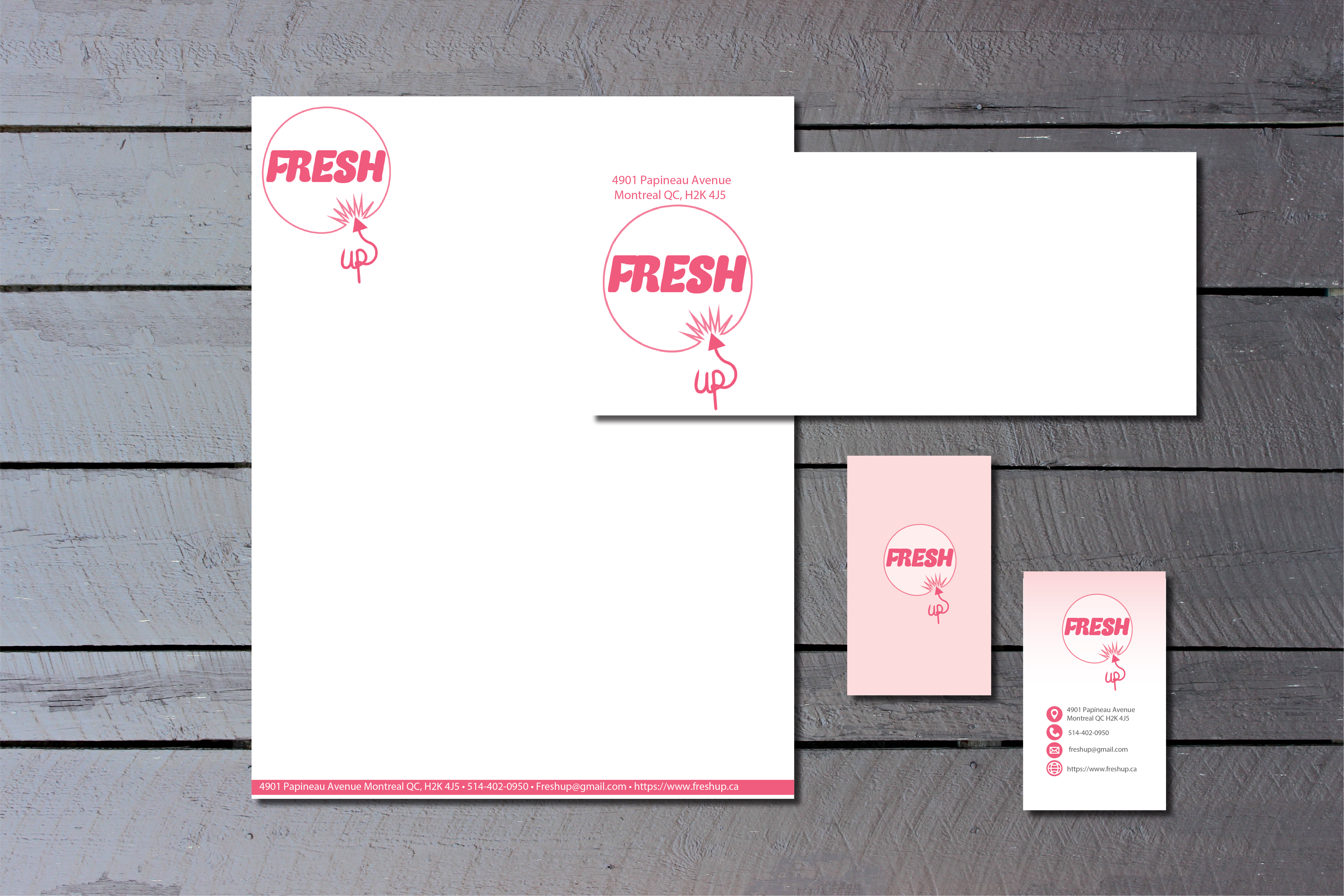
Fresh Up Stationery set
Fresh up is a fictional made up company that specializes in natural beauty products. The brand is seasonal subscription box that delivers at your doorstep and gives you natural body and face products. The design behind the logo is bubble being popped and the name is fresh up because the brands products are always using the freshest products.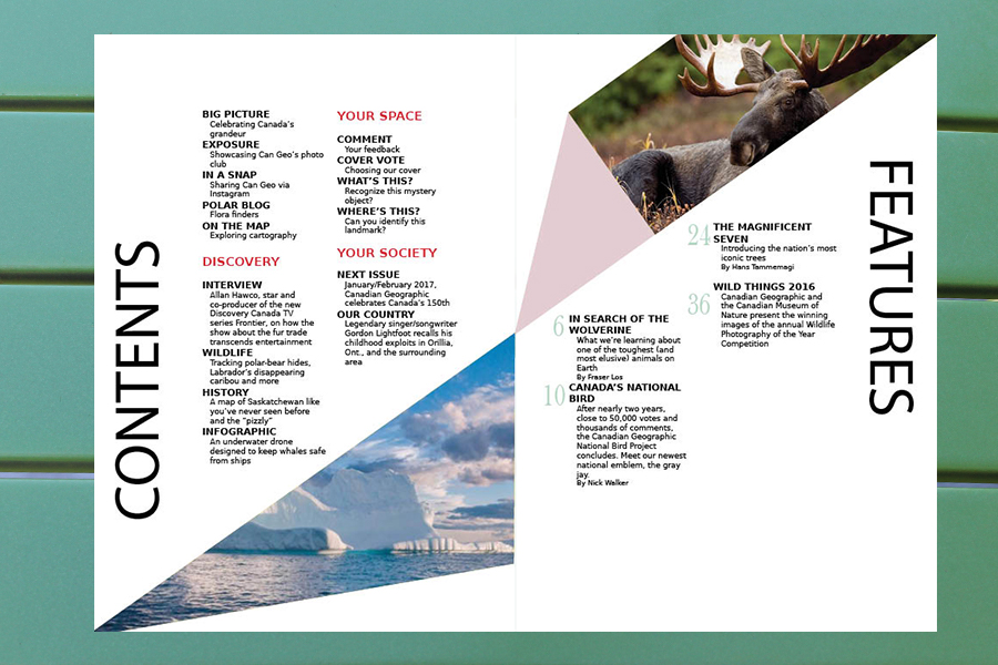
Magazine table of content spread
This magazine cover is a different design approach to canadian geographic. Throughout the inside of the magazine it is constructed using the van de graaf diagram, all the pages are followed using this grid making a unique magazine look.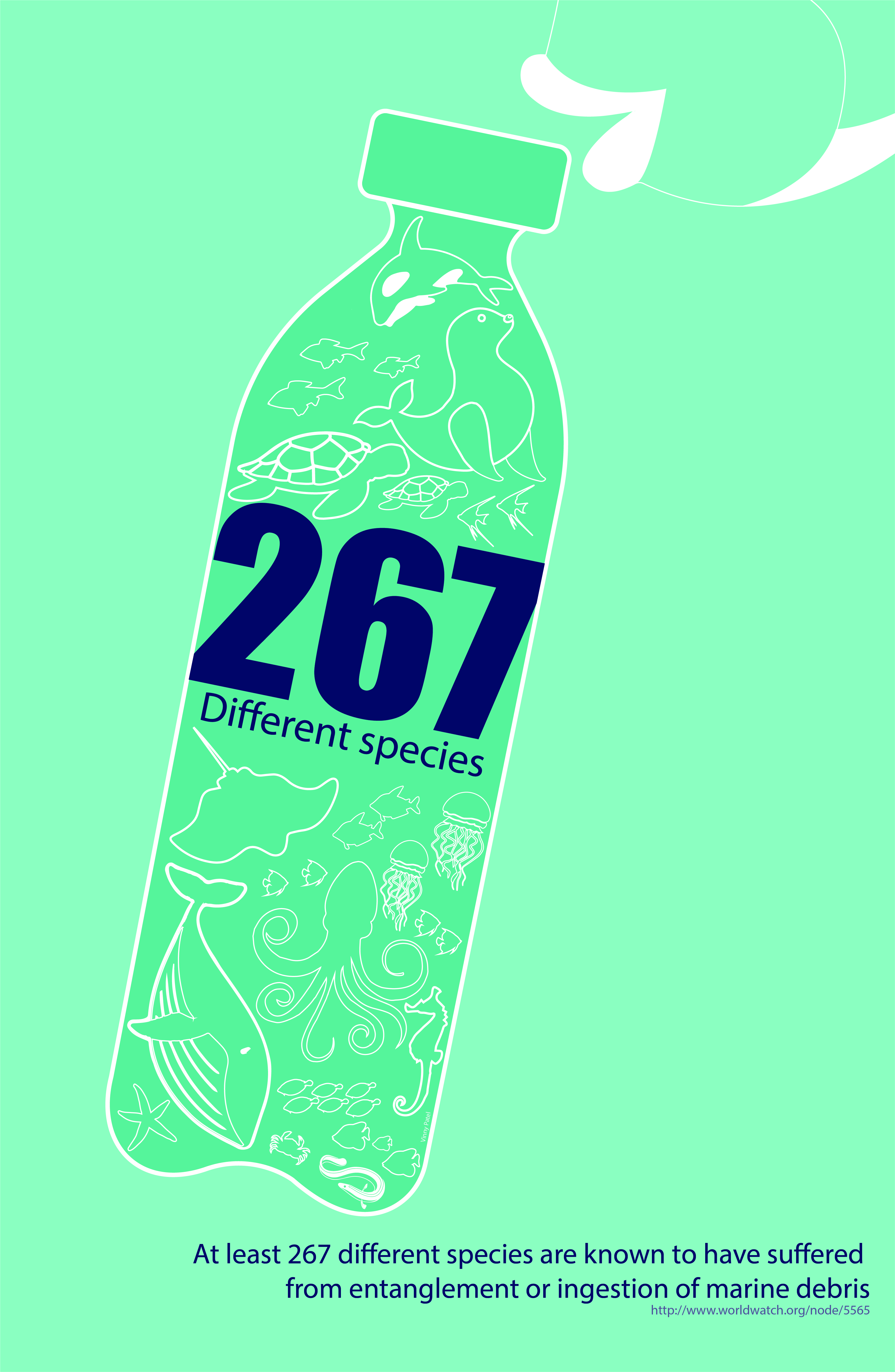
Awarness Poster
Awarness poster to bring awarness to the marine life in the ocean.
Long Weekend Vibez Album Cover
Album cover for a mixtape with double exposure typography. The background image is a sunset beach vector that is inspired from a tropical island. The colours picked are very clean and simple that reflect the end of summer and going into fall.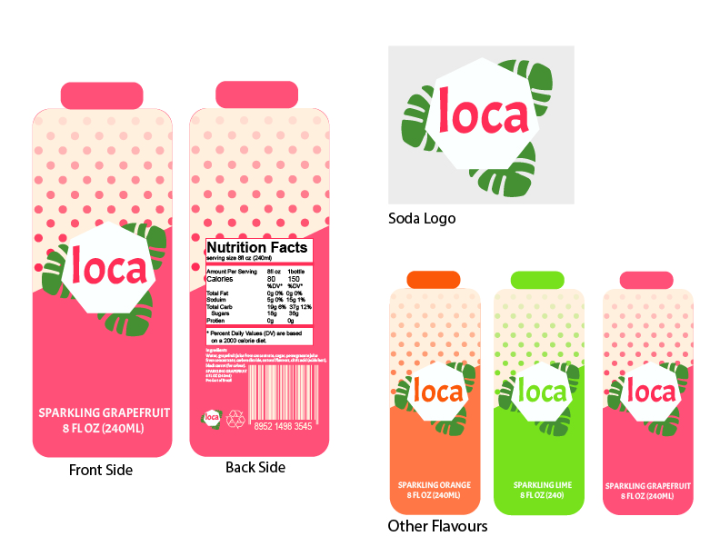
Loca soda company
Fictional soda company called loca. Colours inspired by caribbean island during carnival time, the concept behind this soda company is a fun refreshing fizzy drink that is enjoyed at the beach. Each flavour has a corresponding color that the bottle represents.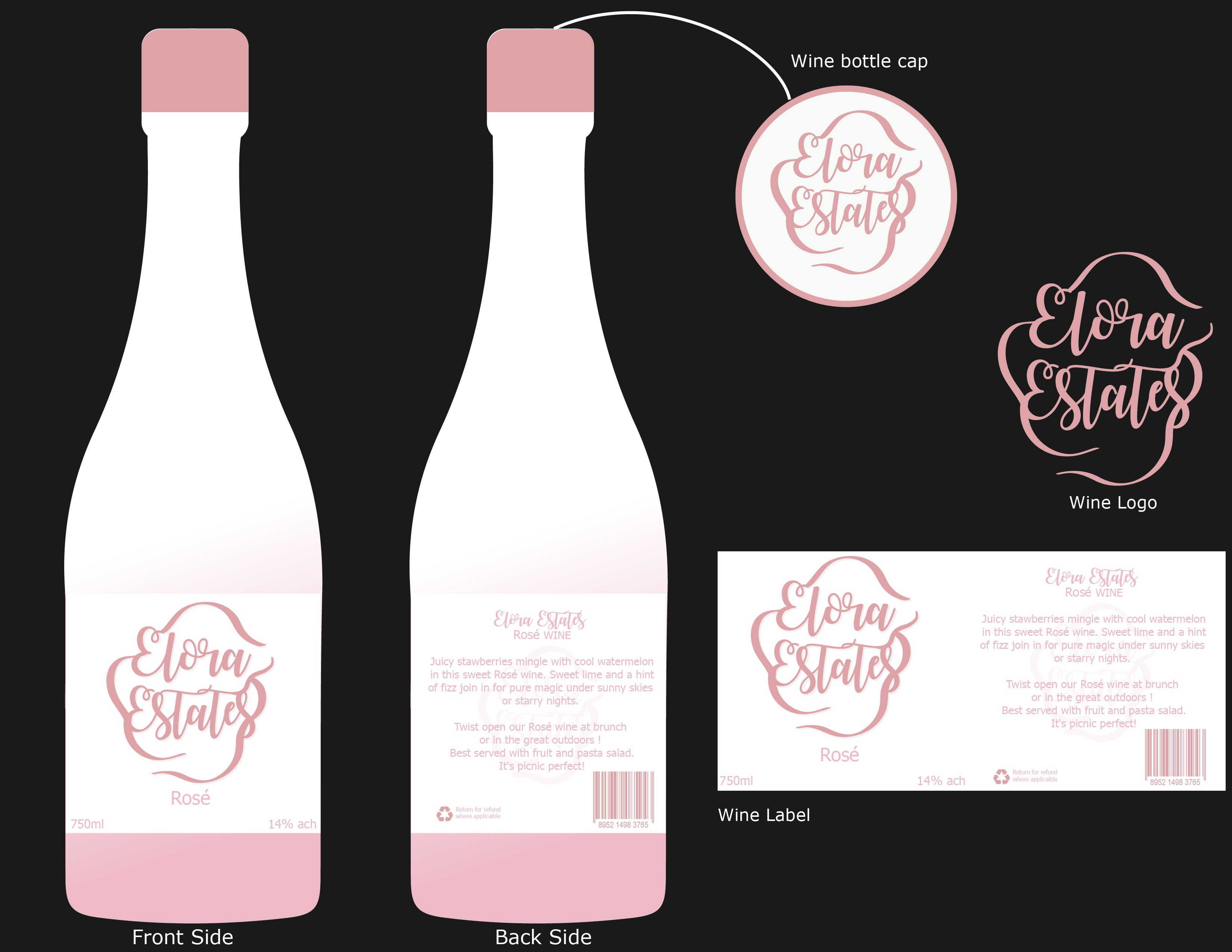
Elora Estates
Fictional rose wine company that has a elegant yet sophisticated label. The wine label presents a simple design that is characterized by a feminine look, with design elements borrowed from various champange companies.The Secret Tea Garden
Fictional high tea cafe menu and business card The restaurant I created was a high tea cafe called “The Secret Tea Garden”, which specializes in homemade tea and baked goods. I wanted to create a bright pastel theme with just a touch of spring flowers