"Honey mini clusters" - a packaging design for school snacks
- Programs used: Illustrator, InDesign, Photoshop
- Size: 16” x 12”
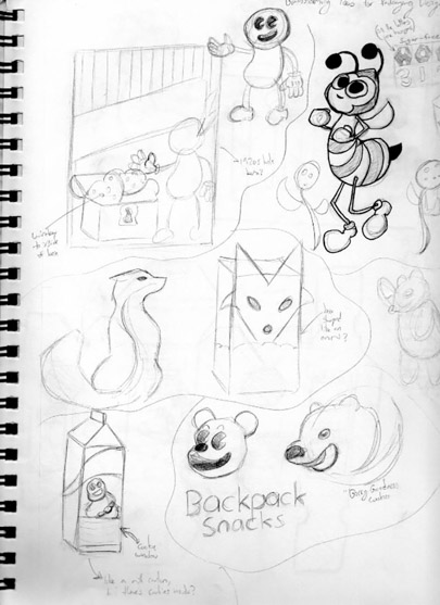
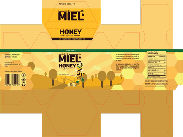
When creating the packaging for these “Honey mini-clusters”, my challenge was to create a design that would appeal to health-conscious parents of young children, while drawing the attention of children themselves.

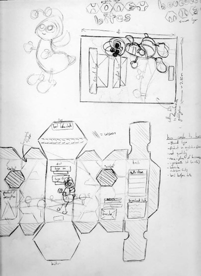
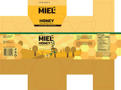
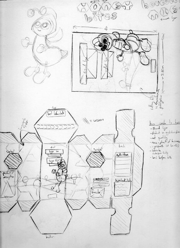
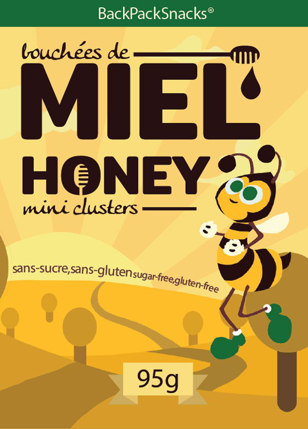
After some sketches, I settled on a design for a hexagonal-box that would feature a minimalist monochromatic sprawling countryside, communicating the honey clusters’ healthy, organic-sourcing and nutritional value to parents, while a friendly cartoon honeybee would adorn the front of the box, attracting kids’ attention.
To complement this, I used a warm, soothing yellow palette representative of honey, with green accents to reinforce the healthy aspect. For the type, I used an unassuming rounded sans-serif font, further increasing the packaging’s friendliness-factor.
 Return to Main Portfolio
