Design Pieces
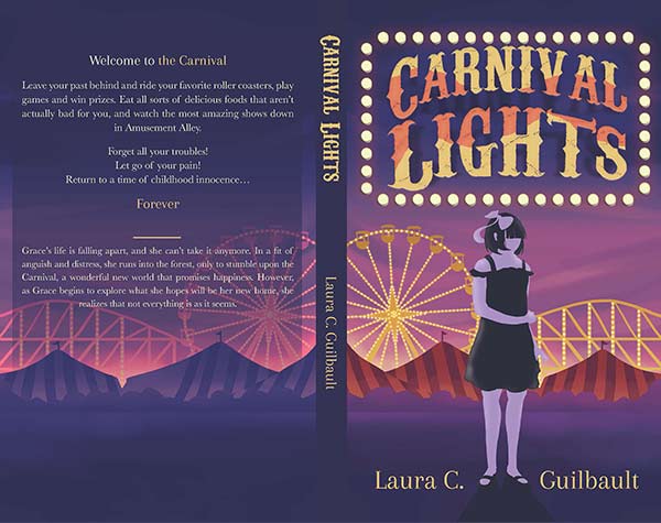
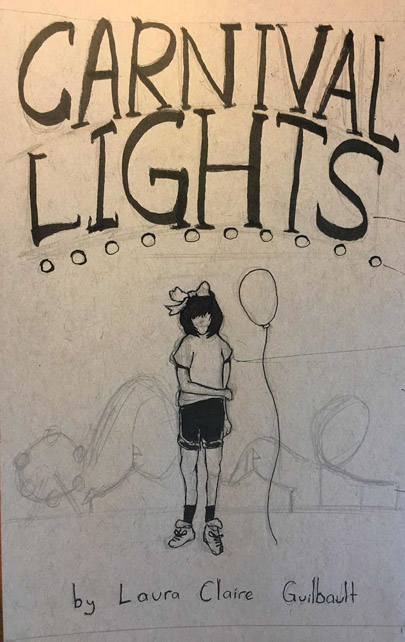
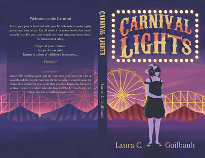
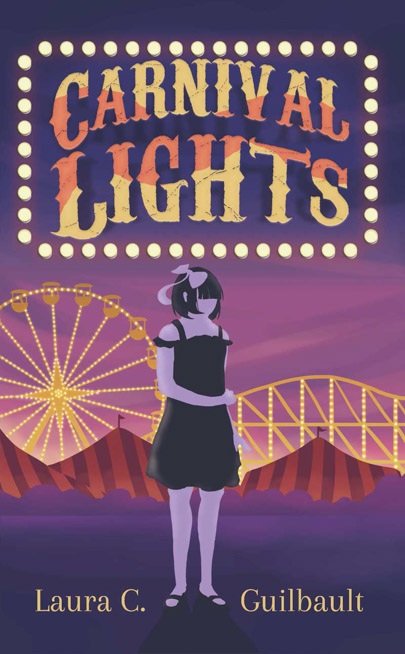
"Carnival Lights" - a commissioned book cover
- Programs used: Photoshop, InDesign
- Size: 10.72 x 8.25"
"Carnival Lights" - a commissioned book cover
- Programs used: Photoshop, InDesign
- Size: 10.72 x 8.25"
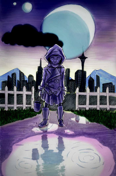
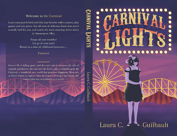
When my sister sought to publish her first book, I endeavoured to design a cover that would best represent her vision for the story.
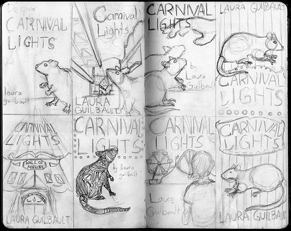
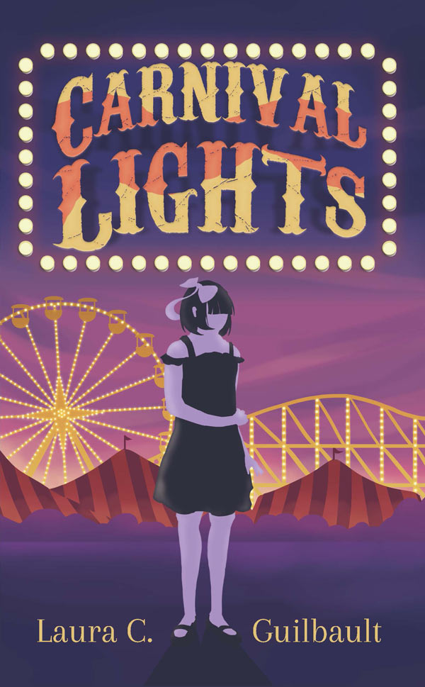
After going through several drafts exploring different aspects of the novel, we settled on a stylized minimalist illustration of her main character, Grace, in front of a distanced view of a carnival. To reflect the story’s decidedly mysterious and eerie tone, I created a surreal color scheme, complete with a carnivalesque marquee.

I also helped her through the publishing process, laying out the book’s pages in InDesign, prepping the novel for print, and adapting the novel into eBook format for publication on Kindle.

Beverage labels - set of 3 labels for 3 types of drinks
- Programs used: Illustrator, Photoshop, Medibang Paint Pro, InDesign
- Sizes: 7.38 x 3.13", 11 x 4", 9.25 x 5"
Beverage Labels - a set of 3 labels for 3 types of drinks
- Programs used: Illustrator, Photoshop, Medibang Paint Pro, InDesign
- Sizes: 7.38 x 3.13", 11 x 4", 9.25 x 5"
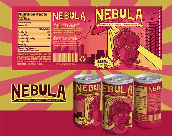
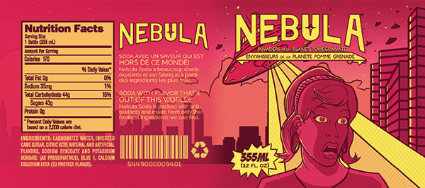
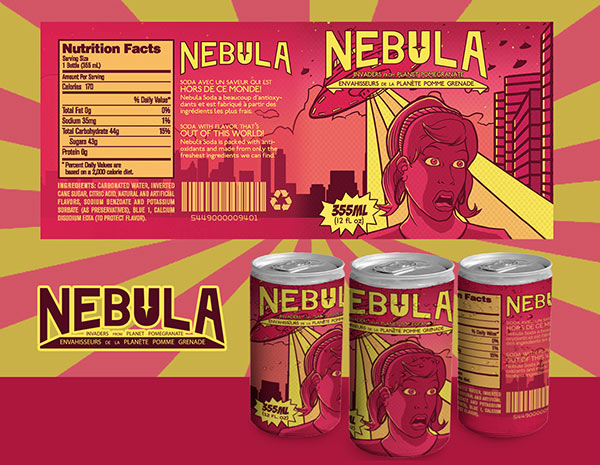
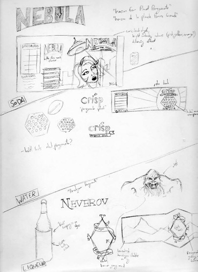
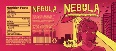
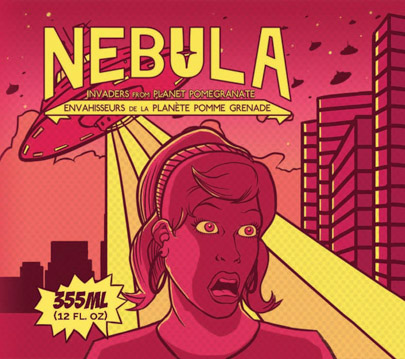
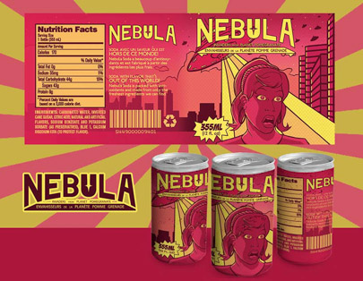
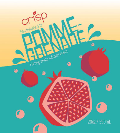
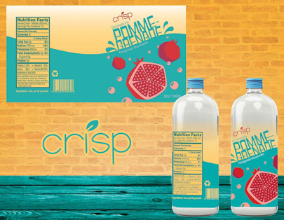
Given the task of creating 3 varieties of beverage labels with the same flavour (pomegranate), I sought to design brands that would stand out as unique and visually interesting on the supermarket shelves.

With the first label, “Nebula Soda”, I chose to adapt the whimsical theme of a retro sci-fi movie poster, combined with a nostalgic comic-book art-style. Complementing this theme and the soda’s flavour, I chose an energetic pink-red and yellow color scheme. The flavor, I dubbed “Invasion from Planet Pomegranate”.

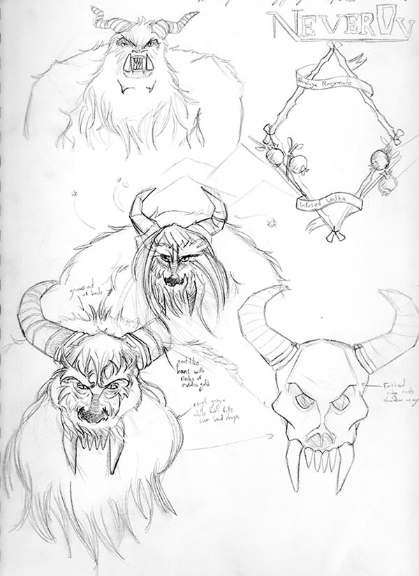
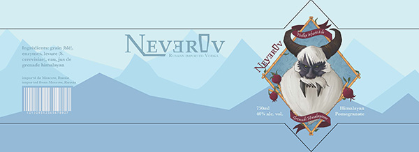
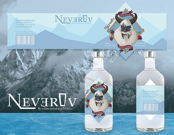
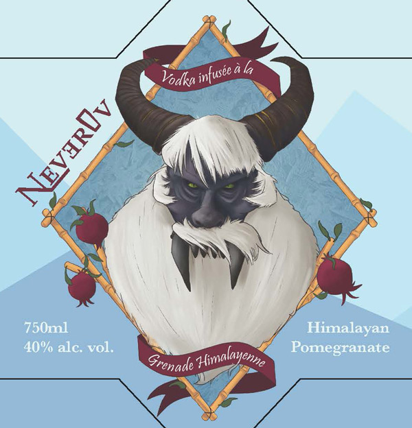
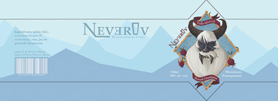
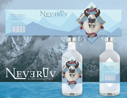
For “Neverov Himalayan Pomegranate-infused Vodka”, I aimed for a more adult-oriented brand identity, while maintaining a certain element of imagination. I came up with the idea for a brand of spirits with illustrations of famous monsters on the front label, based on the spirit’s ingredients’ sourcing. For this Himalayan Pomegranate Vodka, I illustrated a yeti, set against an understated label featuring minimalist mountain silhouettes.
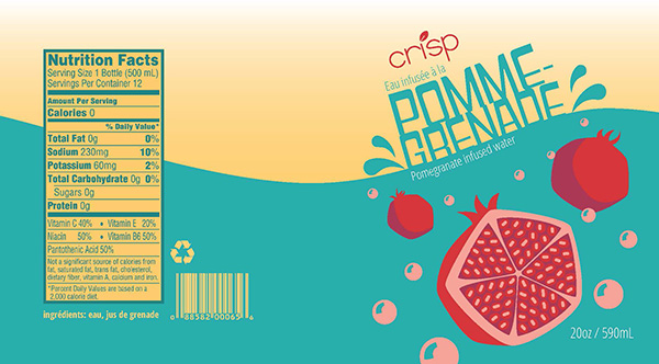
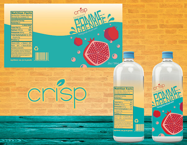
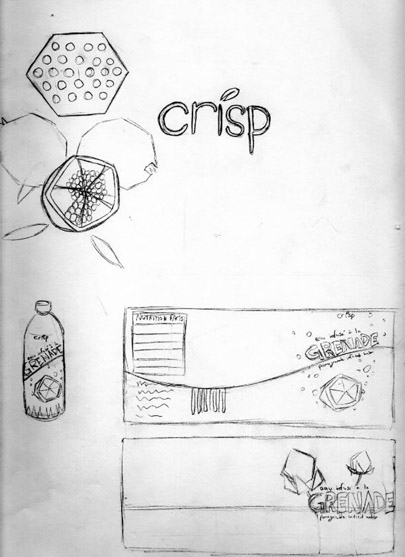
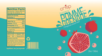
When it came to “Crisp” Pomegranate-infused water’s label, I again took an approach inspired by retro design, this time drawing inspiration from the colorful contrasting tones of 1920s advertisements. While the punchy color palette draws attention, the more modern logo and lettering ties the design to the present, creating an appealing throwback.




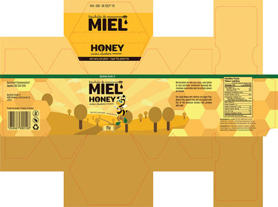
"Honey mini clusters" - a packaging design for school snacks
- Programs used: Illustrator, InDesign, Photoshop
- Size: 16” x 12”
"Honey mini clusters" - a packaging design for school snacks
- Programs used: Illustrator, InDesign, Photoshop
- Size: 16” x 12”
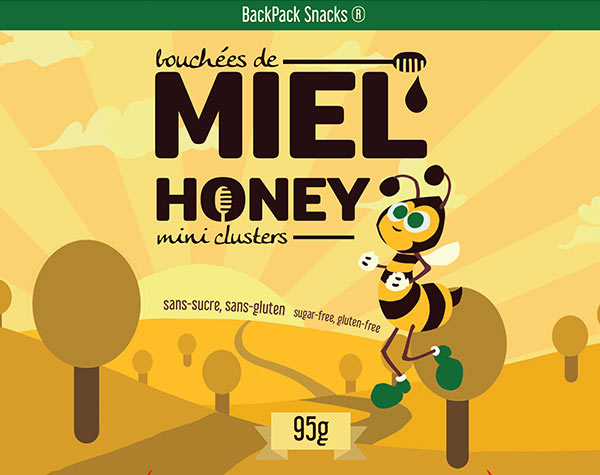
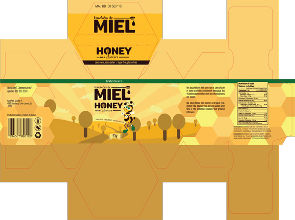
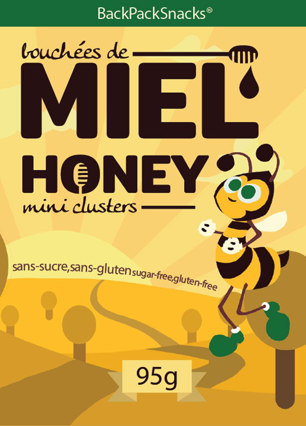
When creating the packaging for these “Honey mini-clusters”, my challenge was to create a design that would appeal to health-conscious parents of young children, while drawing the attention of children themselves.

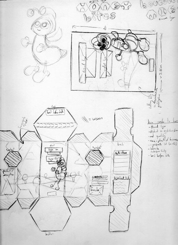
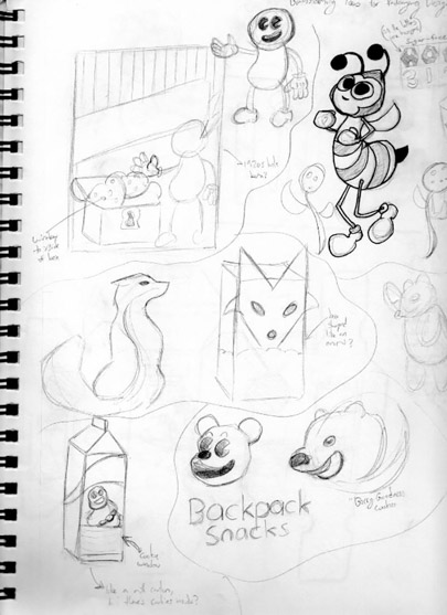
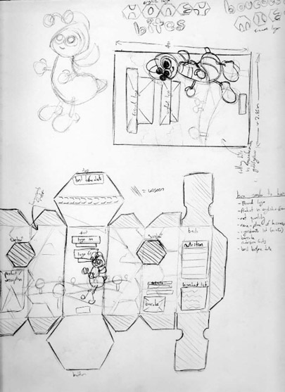
After some sketches, I settled on a design for a hexagonal-box that would feature a minimalist monochromatic sprawling countryside, communicating the honey clusters’ healthy, organic-sourcing and nutritional value to parents, while a friendly cartoon honeybee would adorn the front of the box, attracting kids’ attention.
To complement this, I used a warm, soothing yellow palette representative of honey, with green accents to reinforce the healthy aspect. For the type, I used an unassuming rounded sans-serif font, further increasing the packaging’s friendliness-factor.

Kerry promo material - a set of promotional flyers completed for Kerry Food Group
- Programs used: InDesign, Photoshop
- Size: 8.5” x 11”
Kerry promo material - a set of promotional flyers completed for Kerry Food Group
- Programs used: InDesign, Photoshop
- Size: 8.5” x 11”
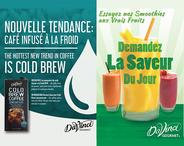
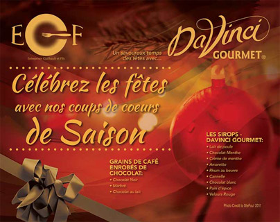
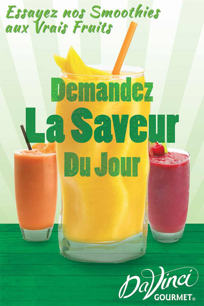
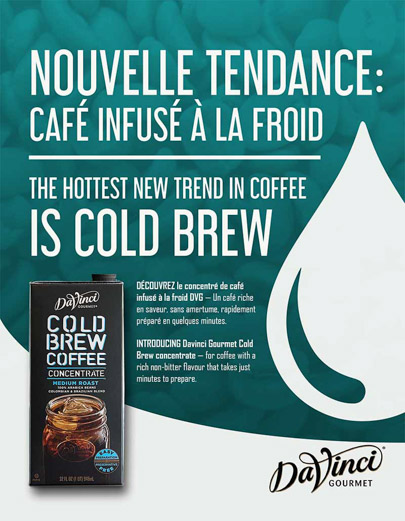
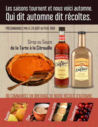
Over the span of over a year, I worked with Kerry Food service to create engaging bilingual promotional material for the province of Quebec. My projects, displayed on the right, included a warm-toned holiday flyer to remind clients of the winter selection, a poster advertising DaVinci Smoothies, an email flyer introducing the new line of Cold-brew coffee, and a fall flyer reminding clients of the pumpkin syrups and sauces.
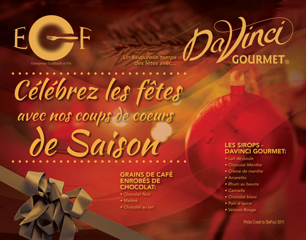

Given the informative nature of these projects, the focus remained heavily on typography, ensuring a high-contrast that would make the information really pop, while integrating interesting and engaging color schemes and imagery appropriate for each respective occasion.
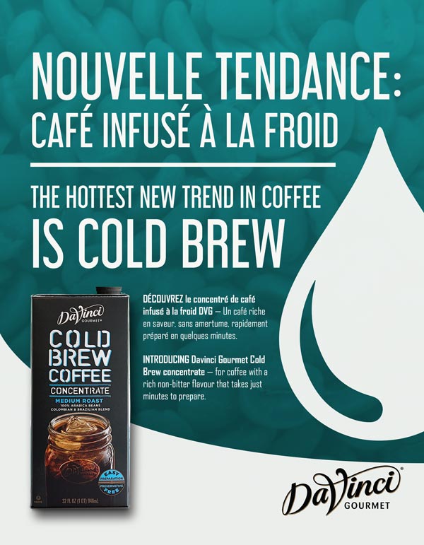
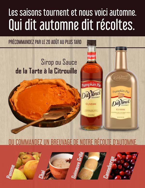
Each of the promotional materials I created for Kerry was distributed to restaurant clients all over Southern Quebec.
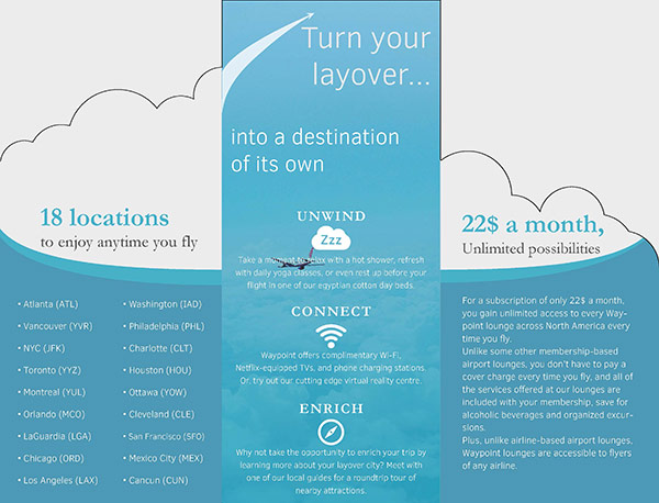
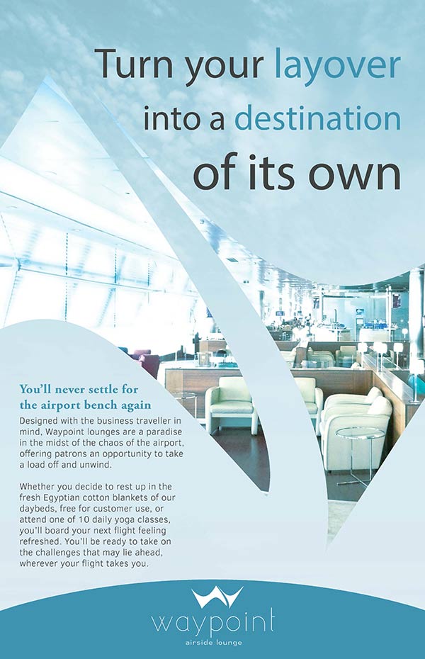
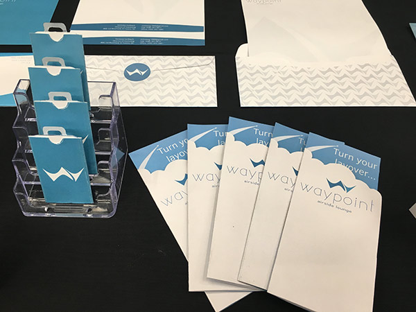
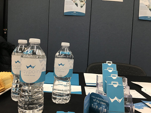
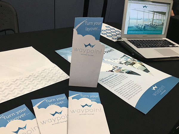
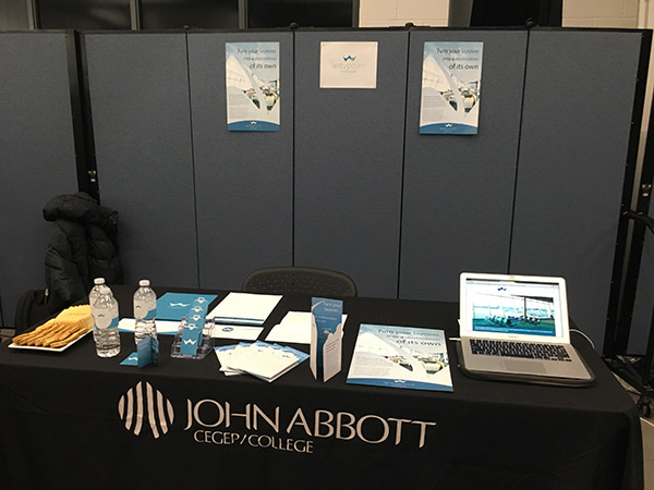
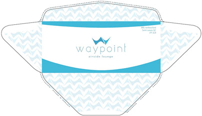
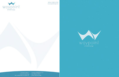
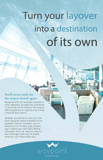
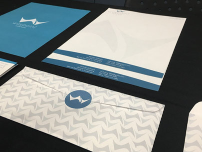
"Waypoint Airside Lounge" - A branding suite for a fictional airport lounge
- Programs used: Illustrator, Photoshop, InDesign
- Sizes: various
Waypoint Airside Lounge" - A branding suite for "Waypoint Airside Lounge"
- Programs used: Illustrator, Photoshop, InDesign
- Sizes: various
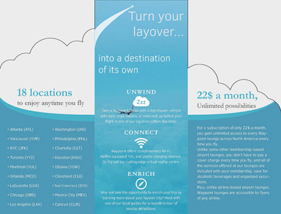
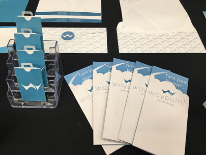
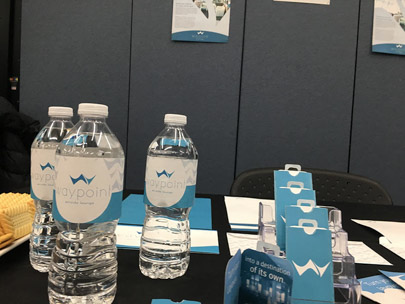
In creating the brand identity of Waypoint, a trendy airport lounge concept, I sought to create a modern, sleek and laid-back vibe that drew in viewers.
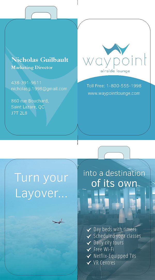
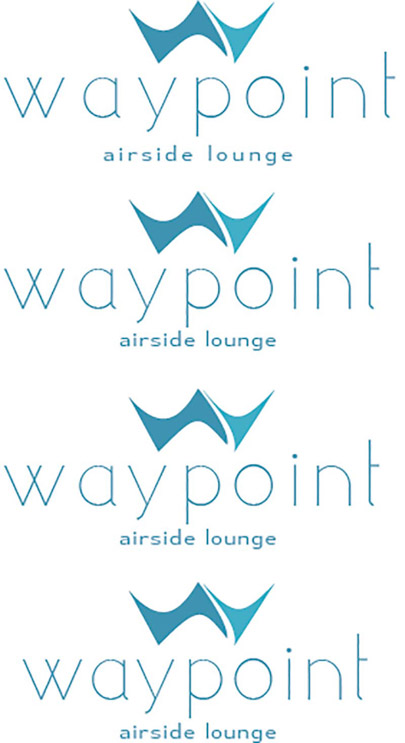
To do this, I opted for a logo with a simplified geometric shape and clean, sweeping curves to signify the prompt, smooth service guests can expect. I also chose a light and airy 2-tone turquoise color-scheme that’s calming and luxurious, while also allowing for an expectation of more affordable prices.






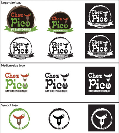
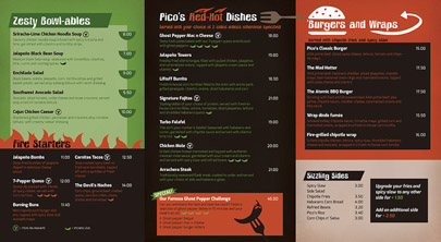
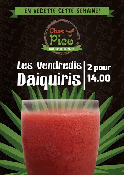
"Chez Pico" - Print branding and material for fictional restaurant "Chez Pico Gastronomic Bar"
- Programs used: Illustrator, Photoshop, InDesign
- Sizes: various
"Chez Pico" - Print branding and material "Chez Pico Gastronomic Bar"
- Programs used: Illustrator, Photoshop, InDesign
- Sizes: various
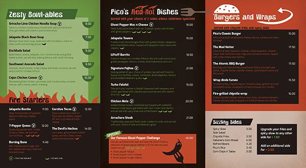
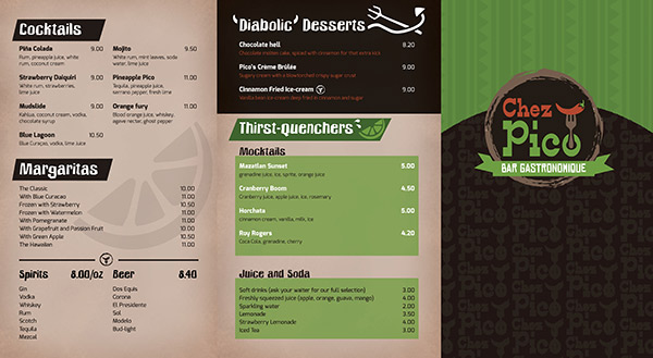
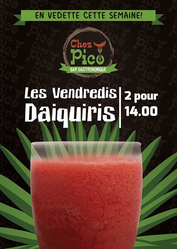
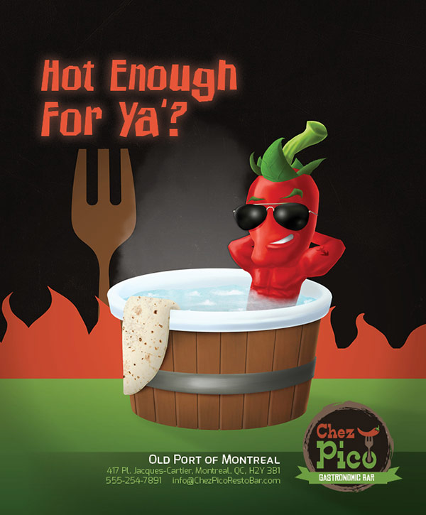
To represent Chez Pico, a Mexican Gastronomic bar with a light-hearted vibe, I created a brand identity with a non-serious, upbeat and lively feel, somewhat reminiscent of neighbourhood grill chain concepts.
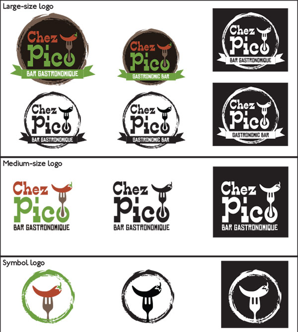
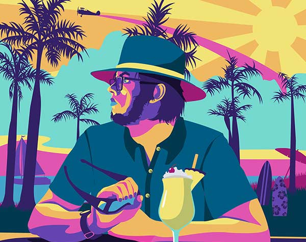
The casual font choice and bright, contrasting colors work to put the customer at ease instantly. Meanwhile, the use of simple vector illustrations in the menu and table-tent reinforce the lively, comfortable atmosphere while enhancing the visual appeal of the material.
