Image from:
https://schutzhundphotography.files.wordpress.com/2013/09/color-wheel-2-shutterstock.jpg
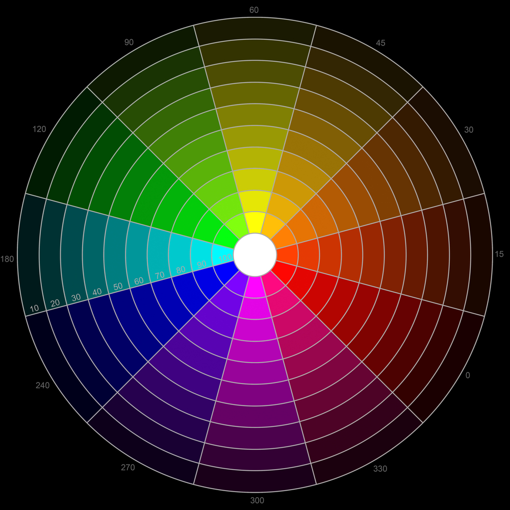
Designing is no easy tasks, designing takes a lot of skills, one of them being choosing the right colour palette for your project. When I first began in the graphic and web design program at John Abbott College, I had a particularly hard time coming up with colour palettes that were cohesive, and fit the aesthetics of what I was trying to convey. The colours I assumed went together, showed no representation of what I was trying to perceive through the website.
I really struggled to find which colours worked best together, or even which colours can be paired as a palette. So for the better part of my first semester in the program, I struggled with comprehending the ideologies behind colour selections. It wasn’t until I stumbled upon the website called https://colorpalettes.net/, which taught me the beauty and power of colour selection. Colours play a huge role in helping people to recognize and comprehend what the website is about. What really sets this website apart from others, is that it gives you images that feature the colours they have paired together.
A Splash of Colours
So, you can tell straight away that the colours will work just by the image, so there is no guessing game. Also, I found that this feature has helped me to figure out which colours will work together. To see the colours in an image, helps to visualize what the colours can look like in your website. The only downside, is that if you don’t have any idea what colours you want to use, you can look through 498 pages of colour swatches and images.
Even though, the images themselves might have nothing to do with the topic of your website, it will help to better visualize the colours in your website. I am now in year 3 of the program, and the benefits of having the knowledge to know which colour palettes work best, is essential in my opinion. Thinking back to my first year in the program, I would have been lost without the help of the https://colourpalettes.net/ website.