©SeanFilion2019
Finding Appropriate Fonts
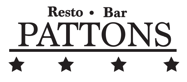
When making a logo that highlights the usage if text, it is very important to pick a font that fits the theme of the company/establishment. In this case, “Pattons” is a made up bar that is themed after the famous U.S general, George S. Patton. So, to fit the military or “tough” theme of the bar, find a block-like serif (or whatever other font that may fit your theme). Once you have chosen your font, make your title and center it. Generally, the title of the logo would be bigger than any other text that you may use.
Add design elements
Finding design elements for your logo can vary in many ways, again according to your theme. As stated before, the logo is dedicated to a WW2 icon who happened to be a four star general. The added bar beneath the title text is representative to accolades that military members would receive on their uniforms. To make the bar, use the rectangle tool accordingly. And knowing that Patton was a four star general, we will add four stars beneath the bar. To make stars, we will use the star tool which you can find by right-clicking the rectangle tool. You can also adjust how many points you want your stars to have, by placing a star and pressing on the up and down arrows on your keyboard. The following image shows the different variations of the star tool.

©SeanFilion2019
Adding colour
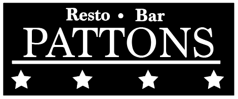
Now that we have all of our shapes and text placed accordingly, we can now play with the colour of our logo. Since this is a logo for a bar, there can be different colour variations for it’s use on business cards, websites, brochures, etc. For the general version of the logo that customers would typically see on the front of the bar itself, we will stay with black, fitting the theme of “tough WW2 general”. For a business card version, we can use white on a black background.
©SeanFilion2019
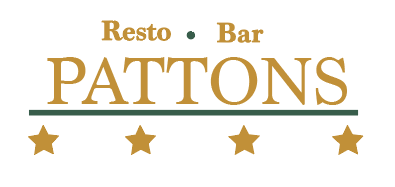
And if you want to get a little more creative and fun, we can add more colour to make an alternate logo. But again, STICK TO YOUR THEME. Still stay true true to the military look (in this circumstance, of course) by adding an Army green and maybe a gold to reinforce the fact that this is based on a general.
©SeanFilion2019
And voila! We have a resto-bar logo. Keep in mind, when designing other logos in the future you have to stick to your theme and choose appropriate elements that fit with you logo.