Web design students often ask how to center elements using CSS. Centering an element in web design is often seen as a tricky technique. This is because of the differences in between inline- and block-level element behaviors. Not to mention also adding different positioning techniques to the mix.
First Rule of CSS Centering
The first rule of centering using Cascading Style Sheets is simple. Make sure that the element you are trying to center is “aware” of the amount of space you want it to be centered in.
More on this “awareness” later when discussing absolute positioning!
That seems like a complicated sentence, but it really just means make sure the element is a block-level element. Most tags are blocks—p, div, h1, ul, li, etc—so you don’t really have to do anything.
But certain tags are inline elements—img, span and a. Images for example will need to be defined as display: block if you want to be able to center them.
.center {
  display: block;
}
Second Rule of CSS Centering
This rule is just basic math. Especially if you try to think of the calculations you are asking the browser to do when you want to center elements using CSS.
Let’s imagine your screen is 1000px wide. You want to center an element that is 500px wide. The browser has to calculate this:
1000px screen – 500px element width = 500px space left over
500px / 2 = 250px to be used as the left and right margins of the element
In other words, you need to define the width of the element you want to center. Otherwise the browser can’t do the math.
.center {
  display: block;
  width: 500px;
  height: 200px;
}
Third rule of CSS Positioning
If you followed the logic explained in the second rule, the third rule of how to to center elements using CSS becomes fairly obvious. You need to tell the browser to set the left and right margins automatically of the object you want to center.
.center {
  display: block;
  width: 500px;
  height: 200px;
  margin-left: auto;
  margin-right: auto;
}
But what about centering when using absolute positioning?
If you use absolute positioning to place an element somewhere on the screen, the above technique will not work without a few tweaks. This is because an absolutely positioned element is taken out of the context of the page (aka the “text flow“).
In other words, once an element is given the the position: absolute rule, it loses it’s relationship to most of the other elements on the page.
An absolutely positioned element will preserve only one type of relationship:
- Either the relationship to the top/left corner of the first parent element that has a positioning rule; or:
- The relationship to the top/left corner of the HTML element (aka the top/left corner of the screen) if no parent elements have a positioning rule.
(This #2 is why a lot of absolutely positioned elements wind up in the top left corner of the screen much to the dismay of many students.)
.centered-ab {
display: block;
width: 500px;
height: 200px;
top: 1em;
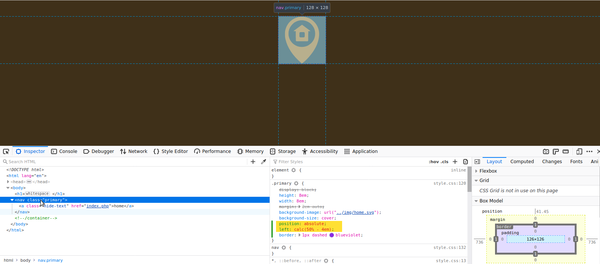
left: calc(50% - 250px);
/* place top left corner at middle of parent element (or screen)
then back up by half of the element's width to center it */
}
As you can see in the code above, centering an absolutely positioned element uses most of the same code as a regular element. However, we remove the automatic margins because the element is no longer in the text flow of the page along with all the other tags, so the browser has no idea how to calculate the margins.
But the browser is very aware of the width of parent element (or the screen width). So we can easily set the element to be positioned at 50% from the left edge.
Introducing the CSS Calc Function
This works well, but the top/left corner of our object is now right in the middle of the screen. The center of our element is too far to the right. We need to move the left edge of our object back towards the left by half it’s width. This is where the CSS calc function comes in really handy. It does math just like a calculator.
calculate: 50% (of parent, or of screen width) minus half the width of our absolutely positioned element (we defined it as width: 500px;).
left: calc(50% - 250px);
With these two types of centering solutions, you should be able to handle most situations where you need to horizontally center an element on a web page.
If you have any questions or something doesn’t seem clear, drop a comment below!