A basic set of vocabulary terms used in web design and development.
Server (software)
A software dedicated to a particular task for example serving web pages, printing files or storing data.
Server (hardware)
Once a server software requires too much power from the computer it is installed on for other programs to also run on it, the entire computer is dedicated to that particular task. For example: serving web pages.
Network
Any situation where two or more computers are connected in a way that they can “talk” to each other.
Domain Name
The name of a web site, such as “duckduckgo.com” or “johnabbott.qc.ca”.
This three minute YouTube video by Adobe XD evangelist @Pinskymust-see for designers wanting to get into screen design.
Adobe XD makes ‘responsive resizing’ design easy for those used to fixed document sizes in print layouts
From Fixed Layout to Shifty Divs
People often start their design career by learning Adobe software—namely Illustrator, InDesign and Photoshop.
Those applications are all over twenty years old. They were built with predetermined paper-based (or eventually with fixed pixel-based) sizes in mind. The apps weren’t developed with the notion that the page’s size can vary.
On the other hand, designing for a digital screen implies that the virtual page we work on is responsively resizing. In other words, whether you display your design on a smartphone, a tablet or a desktop computer – or you hold the device in portrait or landscape mode – the screen shape is isn’t the same.
Every designer weened on visually building fixed layouts faces the challenge of suddently having to previsualize a set of shifting rectangles before starting to build them out of code in order to be able to see them in the first place.
This new conceptual and analytical skillset is often diametrically opposed to the coordinated visual and gestural mouse-weilding skills that originally got students interested in visual design.
Responsive Resize to the Rescue
Adobe XD’s Responsive Resize feature lets designers visually create fluid layouts that adapt across different screen sizes and layout ratios using familiar drawing tools like the rectangle and circle.
Responsive Resize lets a whole range of previously acquired design skills suddenly translate to the dynamic nature of interactive screen layout and design.
Look at your image. Does it have millions of colors like a photograph does? Use JPEG.
Does it have flat color, as in a vector-based drawing with flat colored fills? Use PNG (or GIF).
Avoid using GIF. Use PNG instead. It is the open source equivalent (and even better) that was made to offer an alternative to the proprietary GIF image format.
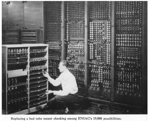
When learning to become a web designer, it is critical to understand how networking works since so many different parts come together to make a web site work.
When a web site goes down, it can be anyone of the different parts that has failed. Being able to pinpoint that part, and who is responsible for it is key to getting the web site back up and running again quickly.
Internet and WWW aren’t the same thing
First of all, let’s get one thing straight. The internet and the World Wide Web are not the same thing.
The internet is a series of interconnected networks. It is a network of networks built of of private, public, academic, business, and government networks.
Semantic HTML is the use of HTML markup to reinforce the semantics, or meaning, of the information in webpages and web applications rather than merely to define its presentation or look. Semantic HTML is processed by traditional web browsers as well as by many other user agents. CSS is used to suggest its presentation to human users.
For web design students, there are many career option when considering the universe of the World Wide Web. Front-end development, back-end development, front-end design… the options are many.
For those who wish to do more than only the visual layout of screens using tools like Sketch, the Adobe Illustrator and Photoshop (and so many others) there is one constant: writing good HTML.
Not all HTML is created equal
However, there is a distinction to be made. Not all HTML performs the equally in terms of search engine optimization, and not all HTML is easy for people to read.
Ever wonder how the web started out way back when? Check out this amazing infographic by Diana Valeanu that was published on Designmodo.
From one single server and web page in 1991 to nearly two billion web sites this year – this infographic plots the changes and milestones in the history of the World Wide Web.
Web Designer — Probably went to school for graphic design. This role has mostly been replaced by UI design since the rise of appreciation for good user experience.
UX Designer — Often a researcher that brings the site to the stage of wireframes and prototypes.
UI Designer — Designs the look and feel of the site, often creating an advanced prototype.
Although it starts off mostly talking about Computer Science students, the discussion of design and interactivity careers is very good. It’s an important read for soon-to-be graduates interested in web careers.
Soon you will be meeting teams of people. All of them with very different responsibilities and skills. This article helps differentiate the forest from the trees.
The moment you choose to get into web design and development, you choose to enter a universe of endless connections in between machines scattered across the globe.
There is you at your computer, and then there is everything else on the internet. By definition, the rest of the internet is “remote” to you dear reader of this post.
So, once again by definition, web design is a career where all the important stuff happens on other machines – on “remote web servers” usually – and being able to connect to such a machine to create and edit files and folders as well as manage transfers of data from machine to machine is a valuable skill.
The most efficient tool for logging into any remote computer is the CLI (“command-line interface“) which you gain access to when you start an application called the Terminal.
This is an old video I posted many years ago to my own web site. It is – I believe – the most popular post I have ever created. At last count, the video has over twenty-five thousand hits. I had the step-by-step written tutorial on my site back then and I lost track of how many times it was the most popular thing on my web site each month.
This is a beginner’s tutorial on how to create a valid HTML 5 template that uses PHP includes (“require” actually) that assembles the code on the server. This gives designers the opportunity to build a theme (or “skin”) that can manage the look of an entire web site – large or small.
This type of coding is a stepping-stone exercise in between coding HTML by hand and having a fully dynamic database-driven site, such as WordPress, or a custom content management system (“CMS”).
The screenshots in this tutorial were created on both an iMac (macOS 10.13.6) and a Ubuntu 18.04 Linux machine. When you configuring your instance of Virtualbox the appearance of the interface and the location of some controls may be different. The functionality remains the same on every platform (macOS, Windows or Linux).
Case-sensitivity
Please note that Linux is a case-sensitive filesystem. This means that “file.html” and “File.html” (different capitalization of the letter F) are understood by the computer as two different files!
So, in web design, please standardize your file or folder naming to:
lowercase letter and/or numbers only
periods reserved for use as the last character before the file name extension ex: .html, .css, etc.