Eric Girouard is a photography and design teacher in the Graphic & Web Design department, which he joined in 2001. He holds a BFA in Fine Art specializing in Drawing & Painting from Concordia University. His stock images were distributed worldwide by Corbis. Eric also worked at Trey Ratcliff’s “The Arcanum – Magical Academy of Artistic Mastery” and served as a photo contest judge for Viewbug.com.
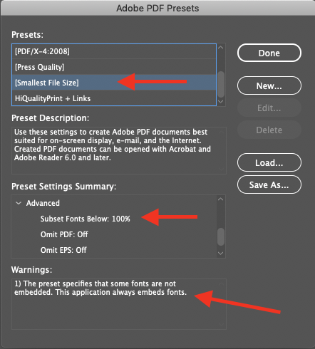
When creating an online version of print design projects, a designer must create a high quality PDF optimized for WWW distribution. For example, a PDF weighing less than 5Mb might need to be generated from a 100Mb print-quality PDF. Also, you will want to lock down the PDF to prevent theft of it’s text and images, and include a copyright notice. Follow these easy steps that explain how to optimize and secure a print PDF for web use.
Do you find yourself saying this after migrating your WordPress site: “After uploading my site from MAMP, where it worked fine, my WordPress hyperlinks point to the wrong site level”?
Screen capture of the All-in-One WordPress Migration plugin’s Advanced Options screen.
Many web designers love ServMask.com‘s All-in-One WordPress Migration plugin. It’s easy, it works very well. But it also has a file size limit of 512Mb. So what is the All-in-One-WP-Migration 512Mb limit workaround?
Or, you may also have encountered a recent bug where the upload progress stalls before completion. So, in either case, here’s a solution that will help you get your files on the server.
All-in-One-WP-Migration 512Mb limit workaround is just Old School Tech
If using static files to build your web site, the most common way to move files from the development machine to the public server is to use old school FTP or the more modern and secure SFTP.
Either of these two types of file transfers can be used to exclude some of the files needing to be uploaded from being included in the All-in-One archive file.
Uploads is by Far the Heaviest WordPress Folder
In web design in general, visual and audio-visual media files (such as gif, jpeg, and png images, but also mp4 video and mp3 audio files, etc) are the usual culprits in terms of being bandwidth hogs.
Non web files like PDFs (especially for graphic designers) and Microsoft Office documents (for businesses) can also take up a lot of space in the WordPress media library.
Option 1: Optimize!
Before considering taking any other actions, make sure your image files and other media are as optimized as possible. Read this post about image optimization and download ImageOptim (it’s free).
Option 2: Convert your PNG files to JPGs
Portable Network Graphic files are very popular, and are the default format for many applications on macOS (like screen captures). They tend however to be very heavy, especially the PNG-24 variety.
If you have a lot of PNG files already uploaded to your WordPress media library, consider installing the PNG 2 JPG plugin. With it you can select the non-transparent PNGs and automatically convert them to JPGs without breaking any links in your web pages.
Just make sure to make a backup of your media library, and select the option to delete the original PNG files.
Option 3: The Actual 512Mb limit workaround
The actual workaround consists of two parts:
Export only a small amount of data using the plugin.
Use SFTP to upload the bulk of the files using an FTP program like FileZilla.
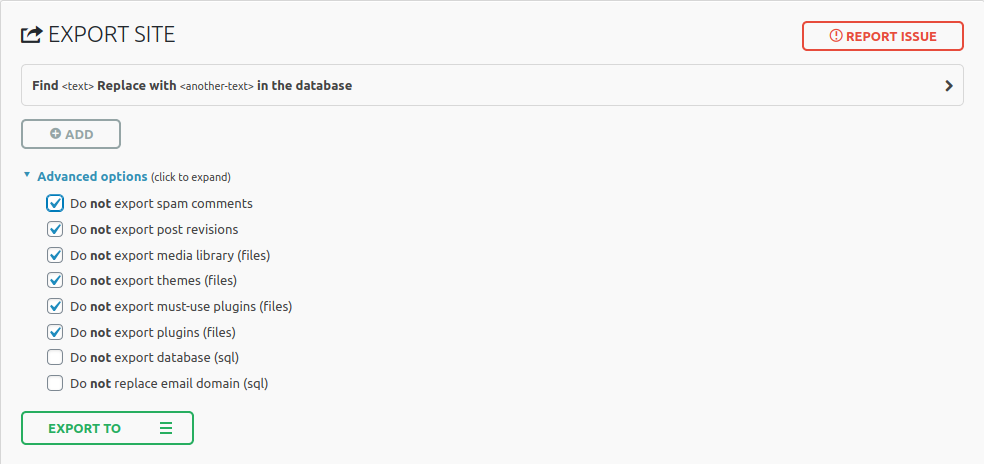
Screen capture of the All-in-One-WP-Migration 512Mb limit workaround
In the screenshot above, you will notice that we do not export useless data from the database (spam, revisions) as well as files that we can easily transfer via SFTP.
In fact, all we really need the plugin to do is export the MySQL data and automatically replace the “localhost” part of any file paths and URLs with the name of the public web server (“207.162.58.43/~gwd”).
Of course, you can tweak these preferences according to your needs, but the main concept is to not export the media files (aka the “uploads” folder). This will keep your All-in-One WP Migration archive file as small as possible.
SFTP to the Rescue
The last part of the process is just logging into the web server and uploading your files. Any SFTP capable program can do that easily.
Warning: do not upload the wp-config.php and the .htaccess files. these are custom configured for your localhost and need to be modified on the remote server. If you have WordPress already installed and working on the server, then these files are already there and do not need to be updated.
However, considering the number of files in a default WordPress installation the upload may take longer than you would hope for. Here are a few tweaks that can help:
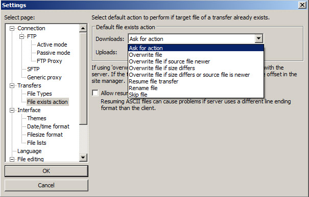
If you use FileZilla, you can use the option to only replace files when the ones you are uploading are newer or of a different file size.
The screenshot below shows the screen where you set the default value, but you will be prompted for the same choice when you start uploading.
Screenshot of the FileZilla default action preferences on Windows.
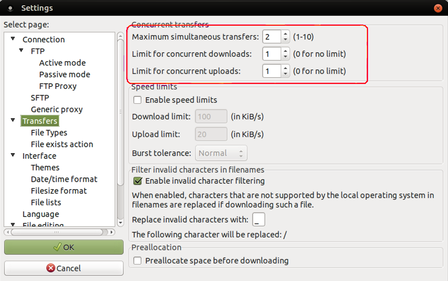
The other optimization you can use for FileZilla is to increase the number of simultaneous transfers (first field in the screen capture below). Set the two other fields to zero.
FileZilla’s default transfers settings panel on Ubuntu Linux.
This might actually be a good time to use Dreamweaver
And finally, your last option would be use AdobeDreamweaver to handle the SFTP uploads.
Dreamweaver’s local vs remote site comparison algorithm is quite good and will only upload the files that are new or have been edited since the last synchronization.
If all else fails…
Obviously, a workaround is just that: a workaround. If for whatever reason it doesn’t work we can still transfer the web site. We just have to do it manually (without the help of an automated plugin).
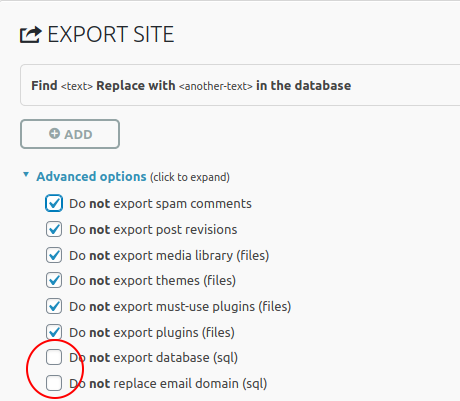
Export the database as a SQL file
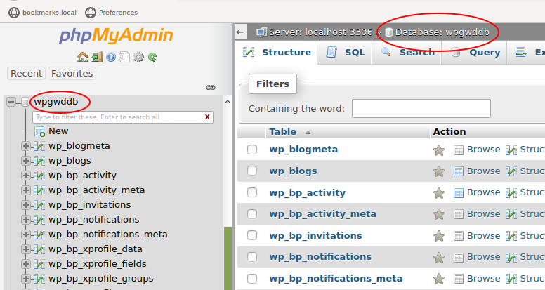
Open up your web browser on localhost and navigate to phpmyadmin. Select your WordPress database.
View of a WordPress database loaded in PHPMyAdmin
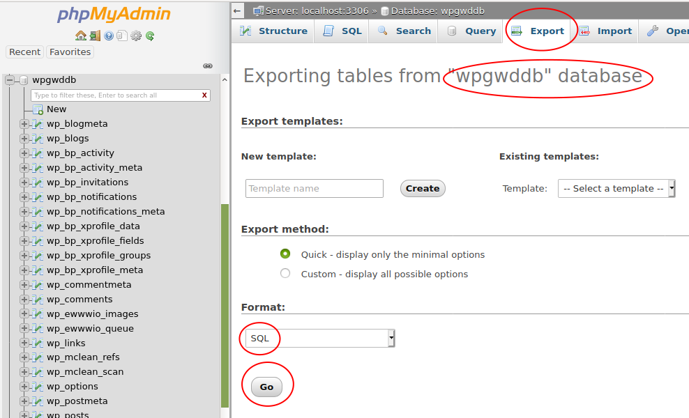
Next, click the Export tab.
View of the PHPMyAdmin database export page.
Make sure you have selected the database, not one of it’s tables. You can check this by looking at the header on the Export page. There are no options to set on this page, the default values are correct.
Click Go to save the SQL file.
(If the SQL shows up on screen instead of downloading it automatically, you can select all and paste it into a text file manually. Or, you can click the Custom radio button and select the “Save output to a file” radio button.)
Search and Replace the URL in the SQL File
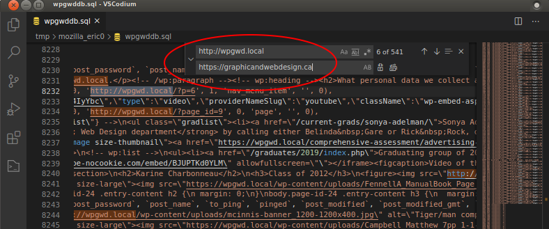
View of a WordPress SQL file opened in VSCodium with the Search & Replace function active.
Open the SQL file you just downloaded in your favorite plain text editor.
Do not use Apple’s TextEdit (by default it is a Rich Text Format editor) nor Microsoft Word. Use plain text editors like BBEdit, Visual Studio Code/Codium, Sublime Text, etc.
Use the Search and Replace function to search for your localhost name. For example: http://localhost:8888. Replace it with the name of your remote server (and folder if necessary). For example:
Pay special attention to the http on localhost vs the https on the remote server. Do a few spot checks to see if all the paths are correct by searching for http.
Delete the old Database tables using PHPMyAdmin on the Remote Server
Now that the database file has been updated with the new paths, you need to login to the remote server and open PHPMyAdmin.
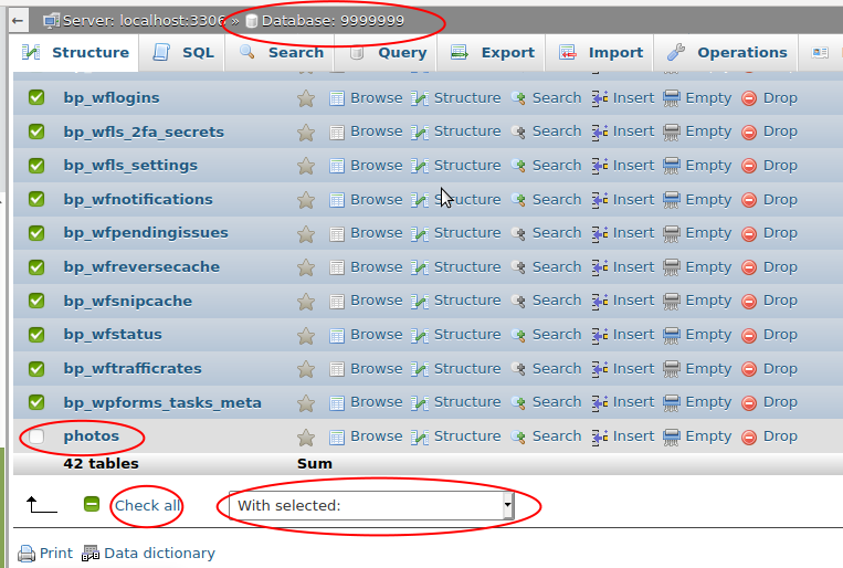
On the Graphic and Web Design server, students only have access to their own database. So there is no need to select it. In PHPMyAdmin, you will select all the data tables and “drop” them which is database-speak for deleting them.
If you previously uploaded any other tables, for example the “photos” table for the PHP Photo Gallery project, deselect that table by unchecking its box before continuing.
View of PHPMyAdmin displaying all WordPress database tables selected. The only non-WordPress table is deselected.
To drop all the selected tables, click the “With selected:” drop-down menu and choose “Drop”. This will bring you to another page where you will need to confirm the delete action.
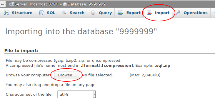
Upload the SQL file to PHPMyAdmin on the Remote Server
Next, go to the PHPMyAdmin Import tab and click Browse to select your modified SQL file. There should be not options to select as the default values will work fine.
PHPMyAdmin’s import screen.
Once you have successfully imported the SQL file, and you have uploaded the new or changed files with FileZilla or Dreamweaver, you should empty your browser’s cache and go visit your web site to see if it works.
Hopefully, all works as intended!
If you have any questions or comments, drop them in the comments section below.
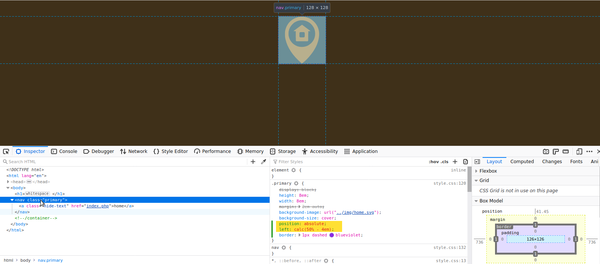
An absolutely positioned element with the Firefox web inspector displaying the relevant CSS rule.
Web design students often ask how to center elements using CSS. Centering an element in web design is often seen as a tricky technique. This is because of the differences in between inline- and block-level element behaviors. Not to mention also adding different positioning techniques to the mix.
First Rule of CSS Centering
The first rule of centering using Cascading Style Sheets is simple. Make sure that the element you are trying to center is “aware” of the amount of space you want it to be centered in.
That seems like a complicated sentence, but it really just means make sure the element is a block-level element. Most tags are blocks—p, div, h1, ul, li, etc—so you don’t really have to do anything.
But certain tags are inline elements—img, span and a. Images for example will need to be defined as display: block if you want to be able to center them.
.center {
  display: block;
}
Second Rule of CSS Centering
This rule is just basic math. Especially if you try to think of the calculations you are asking the browser to do when you want to center elements using CSS.
Let’s imagine your screen is 1000px wide. You want to center an element that is 500px wide. The browser has to calculate this:
1000px screen – 500px element width = 500px space left over 500px / 2 = 250px to be used as the left and right margins of the element
In other words, you need to define the width of the element you want to center. Otherwise the browser can’t do the math.
If you followed the logic explained in the second rule, the third rule of how to to center elements using CSS becomes fairly obvious. You need to tell the browser to set the left and right margins automatically of the object you want to center.
But what about centering when using absolute positioning?
If you use absolute positioning to place an element somewhere on the screen, the above technique will not work without a few tweaks. This is because an absolutely positioned element is taken out of the context of the page (aka the “text flow“).
In other words, once an element is given the the position: absolute rule, it loses it’s relationship to most of the other elements on the page.
An absolutely positioned element will preserve only one type of relationship:
Either the relationship to the top/left corner of the first parent element that has a positioning rule; or:
The relationship to the top/left corner of the HTML element (aka the top/left corner of the screen) if no parent elements have a positioning rule.
(This #2 is why a lot of absolutely positioned elements wind up in the top left corner of the screen much to the dismay of many students.)
.centered-ab {
  display: block;
  width: 500px;
  height: 200px;
  top: 1em;
  left: calc(50% - 250px);
  /* place top left corner at middle of parent element (or screen)
     then back up by half of the element's width to center it */
}
As you can see in the code above, centering an absolutely positioned element uses most of the same code as a regular element. However, we remove the automatic margins because the element is no longer in the text flow of the page along with all the other tags, so the browser has no idea how to calculate the margins.
But the browser is very aware of the width of parent element (or the screen width). So we can easily set the element to be positioned at 50% from the left edge.
Introducing the CSS Calc Function
This works well, but the top/left corner of our object is now right in the middle of the screen. The center of our element is too far to the right. We need to move the left edge of our object back towards the left by half it’s width. This is where the CSS calc function comes in really handy. It does math just like a calculator.
calculate: 50% (of parent, or of screen width) minus half the width of our absolutely positioned element (we defined it as width: 500px;).
left: calc(50% - 250px);
With these two types of centering solutions, you should be able to handle most situations where you need to horizontally center an element on a web page.
If you have any questions or something doesn’t seem clear, drop a comment below!
Almost every student who thinks about registering for our program asks: “Should I buy a computer for Graphic & Web Design?”. The obvious answer is yes. But the real questions are which kind, how much to spend, which specifications are required ?
The above YouTube video is a recorded virtual “meet the teachers” session held in Spring 2020 where GWD co-chair Rick Rock and web/photo teacher Eric Girouard, as well as graduating student Anastasia Dalalakis, answer incoming students questions about the hardware requirements for students in the program.
Topics discussed include:
macOS vs Microsoft Windows
the cost of the Adobe Creative Cloud software suite
laptops vs desktops
ideal screen size
during which semester is it wise to invest in a new computer
One of the most often asked questions by design students is: how do you figure out how to price your design work? In GWD, we have been asked this question dozens of times. Here’s a primer on how to go about it.
License your work. Don’t sell your time.
The main issue designers face is the impression that they must sell their work by number of hours spent in front of the computer.
In fact, what you should be selling is a license to reproduce your copyrighted artwork defined by geographic reach, time limit, type of media and release of rights.
For example, an print ad design license value can be determined by reach (local, provincial, national, international or world-wide); for a month, three months, a year; in a black and white newspaper or color magazine; and whether or not the client is purchasing the right to reproduce the work for that one time or forever.
As you can see, the same artwork can be worth many different sums in different circumstances.
The best way to learn to do it “for real”: go get the designer’s handbook to pricing https://www.amazon.com/Graphic-Artists-Handbook-Pricing-Guidelines/dp/0932102166 Follow their recommendations as far as what the job is really worth. If you don’t follow such standards you easily fall into hourly rate work (or even worse, Fiver) which usually is far below what you should be earning.
Finding your hourly rate
In terms of hourly rate, add up all your monthly expenses (rent, phone, food, etc) and divide by the number of hours you want to work. This will give you your break-even point. Under no circumstances should you be earning anywhere below or near that amount. Always 2x or more.
For example, $2000 in monthly expenses, 160 hours per month = $12.50/h. Below that you lose money. Pass on the job. At $25/h you pay your expenses and have some profit.
Most graphic designers work at least at $25 if not $40 to $80/h for freelance stuff. Remember you will need to pay taxes so 1/3 of the total should go straight into the bank.
Price your part of the job by specialty
For example, how many web page screens do you need to design? Home x 3 sizes + how many other pages? This is art direction in Adobe XD, Figma or Sketch. That’s worth one price.
Actual coding is another part of the job. That’s development @ $60-$125/h.
Writing & translation? Photography fees? Always add a markup to whatever part of the job your subcontract to other people. You are responsible for their work and you need to supervise the overall project. Add 20% to what subcontractors bill you.
Always write up a contract
Be very specific about what you are being asked to do and what you will be delivering and when. Ex: number of pages, branding, etc. Write it all down in a contract. Give them 2-3 free changes after which you start charging $XY per hour again.
If your client wants to own the copyright to your work, you should multiply the total fee by at least 3x.
First of all, MAMP is an acronym: it stands for Macintosh, Apache, MySQL and PHP. It represents the basic set of server software needed to run dynamic web sites (web sites that change on-the-fly with user interactivity).
There is also WAMP (for Windows) and LAMP (for the Linux operating system). Most of the internet runs on LAMP servers.
You need a web server
In modern web design, the web server plays a huge role in making web sites work they way we expect them to in the 21st century.
For example, the act of commenting on a social media post and having your comment display immediately on the web page requires a lot of automation in between your browser, the web server (which processes your actions on the page) and the database server where your comment text and it’s related info is stored.
As a visual designer, you need to be able to see the end product: good old HTML and CSS in your web browser. This is what MAMP does: it provides the basic back-end software of modern web sites: the Apache web server, MySQL database server and the PHP scripting language that connects the two together.
In the visual design industry, MAMP is considered the default server software when designing on your own computer. It installs everything in a single click. It has a friendly user interface. It also has been around for a long time and has a large user base.
MAMP installs in your applications folder, and thus requires an administrator’s password to be installed.
Bitnami offers the same software. The user interface is slightly less polished but works perfectly fine. It’s advantage is that you can install it anywhere on the computer, such as your Desktop folder or on an external USB drive. Therefore you can install it in the labs at school without having to know the admin password.
XAMPP (Apache distribution containing MariaDB, PHP, and Perl) offers, once again, the same software in another packaged installer. In general, XAMPP is a bit more difficult to get used to by beginners.
A selection of one point perspective images that were taken and post-processed by John Abbott CollegeGraphic & Web Design students during the Fall 2020 Photography course.
This post & selection were made by GWD photography teacher Eric Girouard.
Learning One Point Perspective
One of the first assignments in the class was to understand what is, find, and shoot a “one point perspective”. A single point perspective is when two lines (usually supposed to be parallel) converge at the horizon line. See the railroad track image for a classic example.
At this point in the semester, students were mostly learning how to use the Adobe Lightroom image post-processing software and were experimenting with creative interpretations of their photographs, including conversion to black & white.
Enjoy the efforts of our second year students!
Gallery
light hitting subway station railing at night in montreal
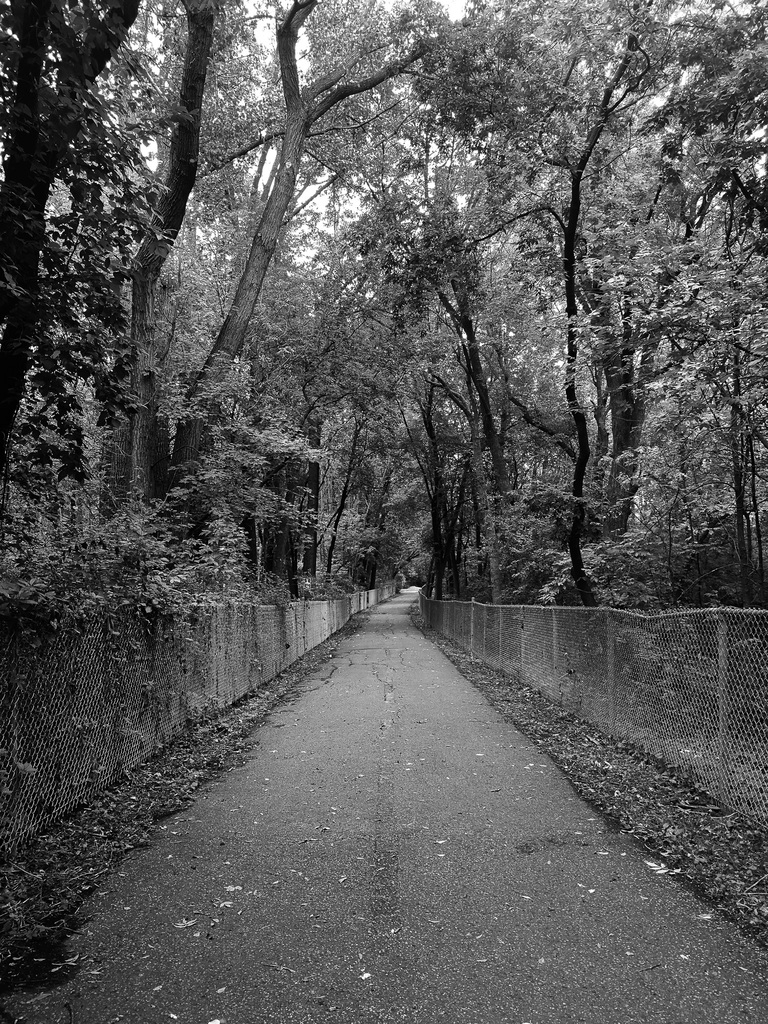
Walkway in the charming nature in the Rue Riviera street with a beautiful view between trees and fallen leaves.
A snap of the train crossing in Ile-Perrot Nord
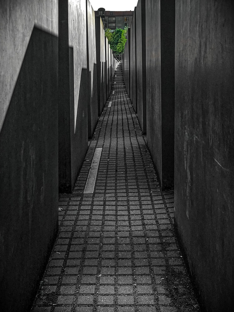
This is an image of the Holocaust Memoral in Berlin Germany. It consists of a path between stones. In the picture we see a green tree at the end of the path.
Night sky surrounded by trees and on the road.
My parents, my girlfriend and my chocolate labrador walking at a walking path near b my uncle’s country house at Mont Tremblant.
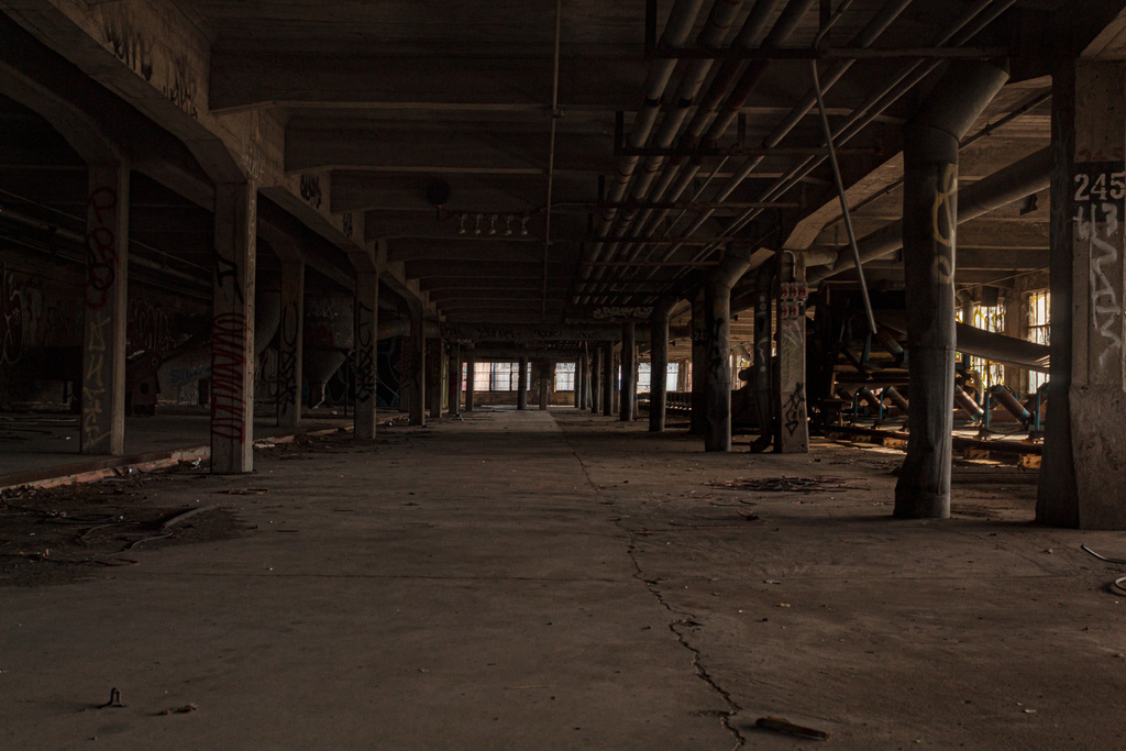
Top floor in abandoned grain silo, Old port Montreal
A one point perspective shot taken near the galipeau bridge.
Behind the N.D.I.P. library there is a small Nature Path perfect for small walks and jogs, this picture was taken on said path
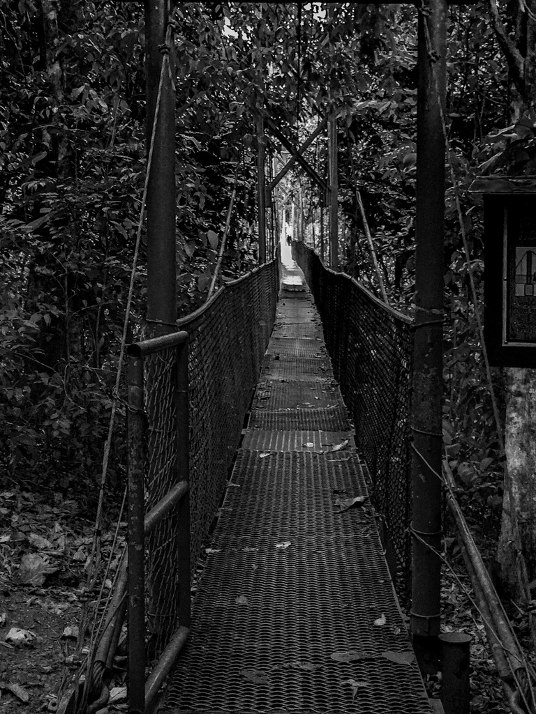
Long greem bridge in costa rica surrounded by trees and runs over a rough river.
landscape shot of girl sitting crossed leg on the bike path, looking up to the sky surrounded. by lush shrubbery and electrical towers.
One point perspective picture of building from the bottom of a modern dark building in downtown Toronto. A lot of windows.
One point perspective portrait of woman sitting in the middle of the street.
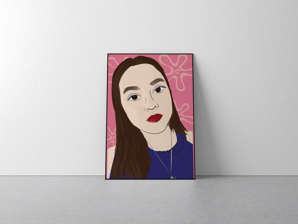
Let’s paint a picture. A young girl in her own world, notebooks covered in doodles. Hey! I’m Cassandra Luponio and I’m the girl in the beautiful painting you created.
I’ve always been interested in the arts, from as early as I can remember I always wanted to create. It didn’t matter where I was or what I was doing if I had a pen and paper, I would be occupied for hours. When I got into high school and had to choose between electives, I would choose art without hesitation. As the years’ progress and our lives aren’t so carefree any more art has also become my escape. It has been a great outlet for me to decompress when things become overwhelming.
Self-Portrait
Discovering GWD
When I found out about the Graphic and Web Design program I was ecstatic. Finally, I would be able to use one of my passions and turn it into a tangible career, a promising future. Three years later and it’s still one of the smartest choices I’ve made for myself.
Stage
I enjoy all aspects of design whether it be poster and advertising design, more illustration centric work or UI/UX design. There are some things I enjoy more than others because they come easier to me, but I’m always up for a challenge and who knows maybe those will become the most fulfilling. I’m a very hard worker and I’m willing to go above and beyond for the final product to be worth it.
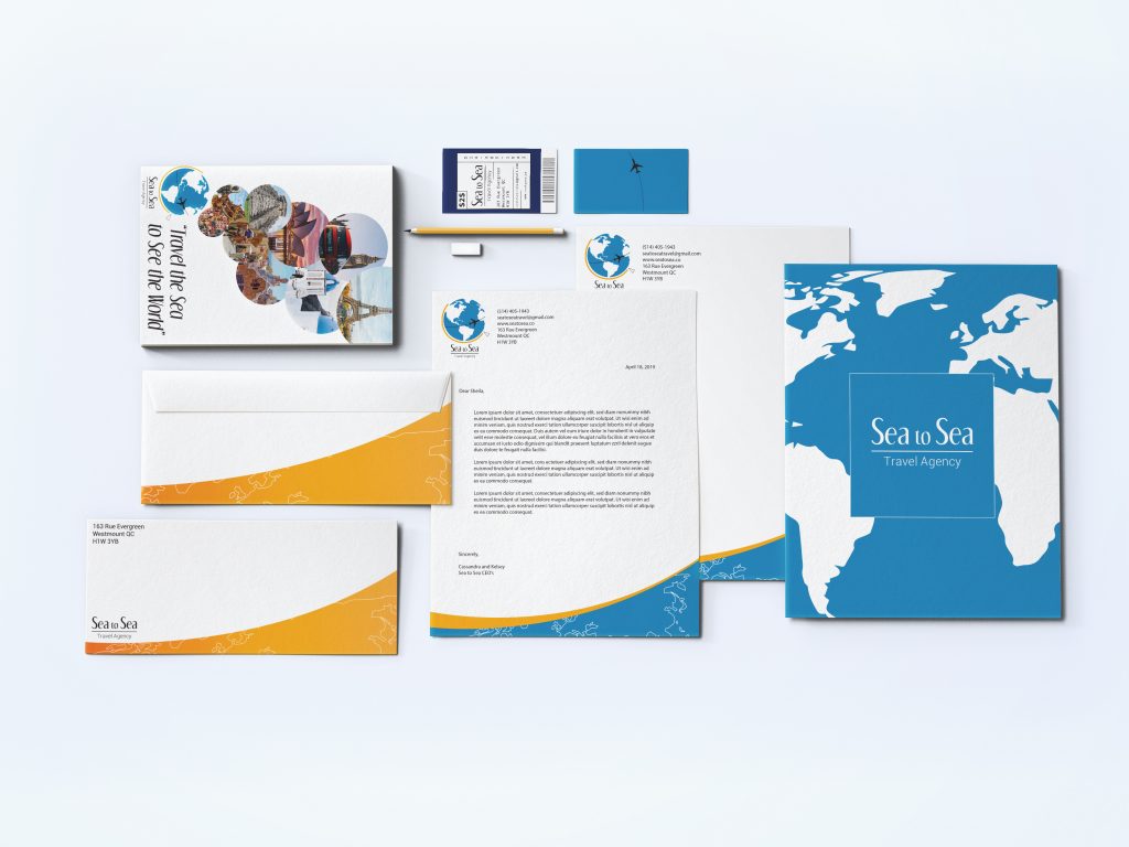
Sea to Sea Travel Agency
Looking Towards the Future
My plans right now are to take a year off school following my college graduation. I’d love to take this time to focus entirely on working full-time. Whether that be with a company or as a freelance designer, I’m ready to dive headfirst into the new stage of my life. If all goes well in that year I would be incredibly happy to continue on that path. If at some point I want to go back to school to obtain a university degree in graphic design, I would do so gladly. I’m not sure what is in store for me in the future, but I’m ready to roll with whatever life throws my way. If you’d like to get to know more about me feel free to check out my portfolio!
The Graphic and Web Design department is proud to announce the GWD Class of 2019’s Vernissage. Come join us on Monday April 15th in between 5pm and 8pm in the Agora of John Abbott College.
vernissage [ver-nuh-sahzh; French ver-nee-sazh] noun, plural ver·nis·sages [ver-nuh-sah-zhiz; French ver-nee-sazh] /ˌvɛr nəˈsɑ ʒɪz; French vɛr niˈsaʒ/.
Also called “varnishing day”: the day before the opening of an art exhibition traditionally reserved for the artist to varnish the paintings. A reception at a gallery for an artist whose show is about to open to the public.