Eric Girouard is a photography and design teacher in the Graphic & Web Design department, which he joined in 2001. He holds a BFA in Fine Art specializing in Drawing & Painting from Concordia University. His stock images were distributed worldwide by Corbis. Eric also worked at Trey Ratcliff’s “The Arcanum – Magical Academy of Artistic Mastery” and served as a photo contest judge for Viewbug.com.
James Verdesoto, the movie posters artist behind iconic posters such as Pulp Fiction, Ocean’s Eleven;Girl, Interrupted, and Training Day, explains how color schemes are used in Hollywood movie posters.
This is a great glimpse into the mindset of a graphic designer as he not only discusses the use color, but also other narrative and formal techniques such as the use of negative space in the composition, relative scales of the subject within the page, framing, and the use of logos.
A great crash course in graphic design in only ten minutes!
A must-listen podcast that sheds some light on the background of the growth and problems at Facebook, as well as the social problems linked to the successes of Silicon Valley internet and social media giants.
A former mentor to Facebook CEO Mark Zuckerberg who helped recruit COO Sheryl Sandberg to the company, McNamee said he reluctantly became a critic of the way big tech companies like Facebook and Google are abusing their users’ trust.
“You know, in advertising they say you are not the customer, you’re the product, but for Google and Facebook you are the fuel,” McNamee said. “And the problem is they gather all this data, not to improve your customer experience. Although they do a little of that, they really do it in order to create other products that may never even touch you, where you get no benefit at all. And importantly, they do this on the Silicon Valley model of shipping the product the minute it works without any consideration to the possibility there’ll be collateral damage.”
Ever wonder how professional graphic designers make their work look so… professional? And how they manage to create complex layouts so quickly?
Simple. Both web and graphic designers—as well as architects—use one of greatest tools in the visual arts: the grid system.
Of the many different attempts during art history to create a design system based on a grid, the so-called Swiss Grid is probably the foremost example. In many ways, modernist graphic design is the Swiss Grid.
Based on a strategically chosen number of columns and sometimes also on text parameters such as font size and leading as well as baseline, the grid system makes placing elements on a page fast and precise.
For the reader, it makes a series of pages—or screens—predictable and intuitive. This increases usability and comprehension. In e-commerce systems, the well structured layout increases sales by making the navigation of the site and shopping cart more efficient.
A basic set of vocabulary terms used in web design and development.
Server (software)
A software dedicated to a particular task for example serving web pages, printing files or storing data.
Server (hardware)
Once a server software requires too much power from the computer it is installed on for other programs to also run on it, the entire computer is dedicated to that particular task. For example: serving web pages.
Network
Any situation where two or more computers are connected in a way that they can “talk” to each other.
Domain Name
The name of a web site, such as “duckduckgo.com” or “johnabbott.qc.ca”.
This three minute YouTube video by Adobe XD evangelist @Pinskymust-see for designers wanting to get into screen design.
Adobe XD makes ‘responsive resizing’ design easy for those used to fixed document sizes in print layouts
From Fixed Layout to Shifty Divs
People often start their design career by learning Adobe software—namely Illustrator, InDesign and Photoshop.
Those applications are all over twenty years old. They were built with predetermined paper-based (or eventually with fixed pixel-based) sizes in mind. The apps weren’t developed with the notion that the page’s size can vary.
On the other hand, designing for a digital screen implies that the virtual page we work on is responsively resizing. In other words, whether you display your design on a smartphone, a tablet or a desktop computer – or you hold the device in portrait or landscape mode – the screen shape is isn’t the same.
Every designer weened on visually building fixed layouts faces the challenge of suddently having to previsualize a set of shifting rectangles before starting to build them out of code in order to be able to see them in the first place.
This new conceptual and analytical skillset is often diametrically opposed to the coordinated visual and gestural mouse-weilding skills that originally got students interested in visual design.
Responsive Resize to the Rescue
Adobe XD’s Responsive Resize feature lets designers visually create fluid layouts that adapt across different screen sizes and layout ratios using familiar drawing tools like the rectangle and circle.
Responsive Resize lets a whole range of previously acquired design skills suddenly translate to the dynamic nature of interactive screen layout and design.
Look at your image. Does it have millions of colors like a photograph does? Use JPEG.
Does it have flat color, as in a vector-based drawing with flat colored fills? Use PNG (or GIF).
Avoid using GIF. Use PNG instead. It is the open source equivalent (and even better) that was made to offer an alternative to the proprietary GIF image format.
When learning to become a web designer, it is critical to understand how networking works since so many different parts come together to make a web site work.
When a web site goes down, it can be anyone of the different parts that has failed. Being able to pinpoint that part, and who is responsible for it is key to getting the web site back up and running again quickly.
Internet and WWW aren’t the same thing
First of all, let’s get one thing straight. The internet and the World Wide Web are not the same thing.
The internet is a series of interconnected networks. It is a network of networks built of of private, public, academic, business, and government networks.
Semantic HTML is the use of HTML markup to reinforce the semantics, or meaning, of the information in webpages and web applications rather than merely to define its presentation or look. Semantic HTML is processed by traditional web browsers as well as by many other user agents. CSS is used to suggest its presentation to human users.
For web design students, there are many career option when considering the universe of the World Wide Web. Front-end development, back-end development, front-end design… the options are many.
For those who wish to do more than only the visual layout of screens using tools like Sketch, the Adobe Illustrator and Photoshop (and so many others) there is one constant: writing good HTML.
Not all HTML is created equal
However, there is a distinction to be made. Not all HTML performs the equally in terms of search engine optimization, and not all HTML is easy for people to read.
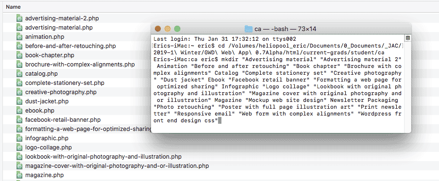
Here’s a quick tip for anyone needing to create a large set of folders. This is often required when building the hierarchy of a large web site, or just for organizing the filesystem on your computer.
For example, in Graphic & Web Design we have the end-of-program comprehensive assessment. This is what the list of items required for the assessment looks like:
Ever wonder how the web started out way back when? Check out this amazing infographic by Diana Valeanu that was published on Designmodo.
From one single server and web page in 1991 to nearly two billion web sites this year – this infographic plots the changes and milestones in the history of the World Wide Web.