Blog

Maria Vidoza: Packaging, Illustration Branding

The future

My goal is to work part time in an advertising design related field in order to gain experience and further my skills when it comes to branding and packaging. At the end of this semester I will be gone from June 14th till June 29th.Fall 2020 will be when I will start at Concordia University in order to go into marketing. It seems a little strange “changing” career paths and going into marketing but in reality, graphic and web design and marketing complement each other.Especially in social media marketing as well as advertising which are fields that interest me.

Stage

While being on stage I would bring a great and creative energy into the team and willingness to learn more. A stage downtown would be ideal to go with the downtown lifestyle that I will be living when I start next semester. Working and studying part time has always been part of my life. I am good at managing my time and organizing my self in order to deliver in both areas in my life.
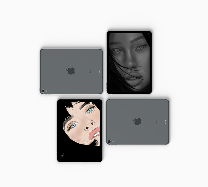
Illustrations done by Maria Vidoza
©Maria Vidoza

Why Packaging, Illustration and Branding?

All of these three subjects have something in common.They are all used to advertise and give a company the image they want to portray in order to generate consumers. The business and marketing aspect of graphic design is something that fascinates me. Branding a company can go so many creative ways and the process of creating a different world fascinates me. Packaging is something that the clientele first interacts with and it’s the first impression they get of the company. Creating that experience of that initial interaction with a visually appealing perspective is something that brings me joy. Last but not least, illustrating is what I like to use to express more in depth my views and my creative thoughts and applying it to my work to add originality.  
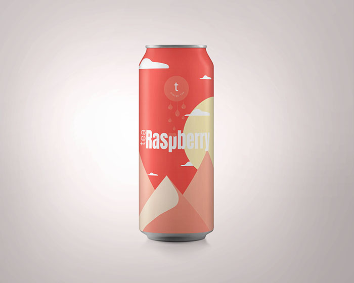
Energy Tea Packaging
©Maria Vidoza

Background

As a young adult I have a lot of ambition and passion for the design world. I am someone who keeps a positive mindset, works hard and has a radiating energy .I find these qualities important in a work environment especially when it comes to creative team work. I love interacting with people and coming out of my shell to create amazing projects with them. As a child painting and drawing were my biggest passions. As the years went by technology was developing and that is when I fell in love with creating digitally. Growing up in high school I saw that there was definitely a career for it. So I decided to enroll in web design. These past three years have fed my love for graphic design and has impacted me to continue creating amazing content. 
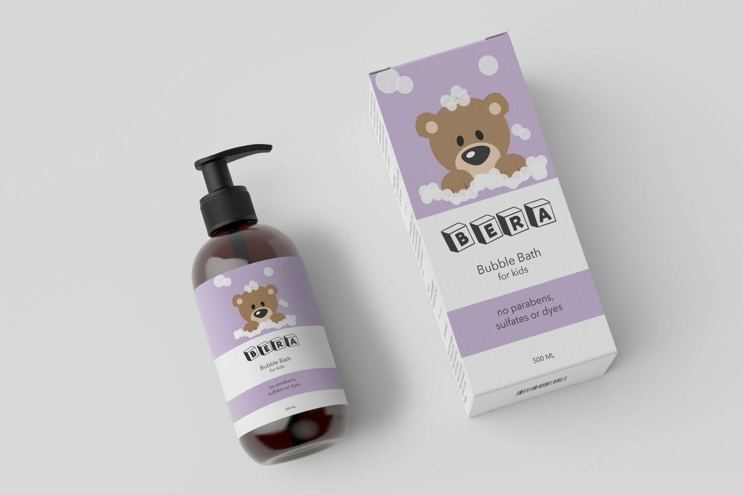
 

Kelsey Zarate-Chin: Packaging and Branding

I am a soon-to-be graduate of John Abbott’s Graphic and Web Design Program. I’m hardworking, independent and keen on learning something new every day. I intend to specialize in the packaging and branding field.

Package design by Kelsey Zarate-Chin

Who Am I?

Growing up, I never liked the math and science classes because I felt too constricted. Art let me explore my creativity and create something new. When I’m not focusing on arts, I’m outside playing soccer. I’ve been playing semi-competitive soccer for over 10 years which has taught me many skills that are needed to be successful in a team. 

I chose graphic design because it encompasses different aspects of design and you can choose to specialize in specific areas or be a general designer. 

I’m excited for what’s about to come in the shortly after Abbott. I’m ready to put all the knowledge and skill I’ve acquired over the years into a real-world work environment.

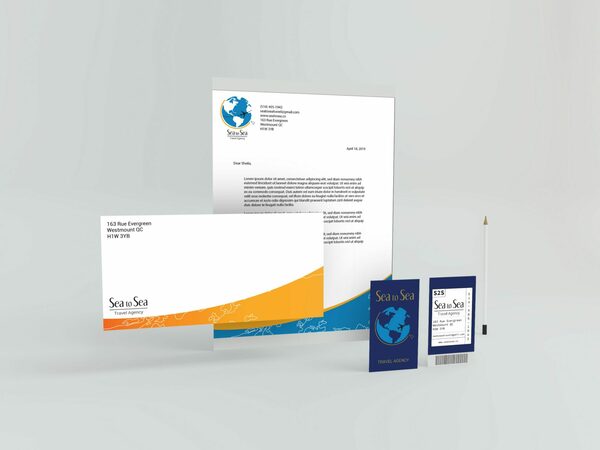
Sea to Sea Stationary Design by Kelsey Zarate-Chin

Stage

Throughout my three-week stage, I would like to experience what my life will resemble after Abbott. I want to experience what the meetings are like, the process, different departments, and the workload. Out of all the courses I took during my three years, I love packaging and branding projects the most. It’s fun designing different styles of packaging for a variety of products. I also enjoy coming up with a brand and designing a line that carries the image of the brand. I would like to work for a fashion or beauty company. Whether it be designing packaging or creating and maintaining a brands’ image, I’m open to the opportunities.

The Future

I plan on working in graphic and web design field full-time. I plan on staying with a company to gain experience and expand my professional network. My ultimate dream is to open a design firm starting in Montreal and then expanding to other locations around the world. 

I see myself working with a large company that focuses on teamwork and collaboration. A positive environment where success is recognized and appreciated. Often, a company focuses solely on the success they forget to appreciate those that were involved in making the project a success. I’ve been working retail with a large staff for a couple of years now. Over time, we all became so close that it felt like a family. Having such a tight-knit staff brought all sorts of positivity not only to the environment but it continued to strengthen the relationship.

Applying to university in the program to further my skills may also be a part of the future.

Claudia Galdones: A Creative Gal with BIG Plans

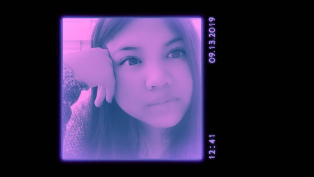
Claudia Galdones selfie with purple Snapchat filter applied
© Claudia Galdones (Snapchat Selfie)

It all simply begins with a girl, a hand full of creative skills, BIG plans AND LOTS OF COFFEE.

Hiya!

I am Claudia Galdones. Filipino. Aries. Doggy-Mama. Creative. That’s basically me in a nutshell, but let’s dive into the details.

Continue reading “Claudia Galdones: A Creative Gal with BIG Plans”

GWD Class of 2019’s Vernissage

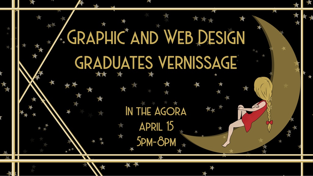
Graphic and Web Design Vernissage Promo Poster
Promo illustration by Cristina De Luca

The Graphic and Web Design department is proud to announce the GWD Class of 2019’s Vernissage. Come join us on Monday April 15th in between 5pm and 8pm in the Agora of John Abbott College.

vernissage [ver-nuh-sahzh; French ver-nee-sazh]
noun, plural ver·nis·sages [ver-nuh-sah-zhiz; French ver-nee-sazh] /ˌvɛr nəˈsɑ ʒɪz; French vɛr niˈsaʒ/.

Also called “varnishing day”: the day before the opening of an art exhibition traditionally reserved for the artist to varnish the paintings. A reception at a gallery for an artist whose show is about to open to the public.

https://www.dictionary.com/browse/vernissage
Continue reading “GWD Class of 2019’s Vernissage”

Movie Posters Expert Explains Color Schemes

James Verdesoto, the movie posters artist behind iconic posters such as Pulp Fiction, Ocean’s Eleven; Girl, Interrupted, and Training Day, explains how color schemes are used in Hollywood movie posters.

This is a great glimpse into the mindset of a graphic designer as he not only discusses the use color, but also other narrative and formal techniques such as the use of negative space in the composition, relative scales of the subject within the page, framing, and the use of logos.

A great crash course in graphic design in only ten minutes!

Adobe application shortcuts

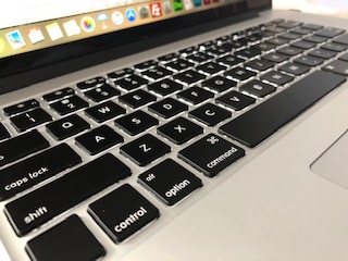
a close up picture of a macintosh laptop keyboard
© Cassandra Luponio, 2019

How they help productivity

The thing I wish I would have learned sooner, are all the Adobe application shortcuts. Instead of constantly having to go back and forth to change tools. Although Adobe application shortcuts may differ, knowing the most common ones can make the process faster. Being able to quickly switch between the tools (pen tool and selection tool, etc.) can make things a lot easier for you in the long run.

Continue reading “Adobe application shortcuts”

My Graphic and Web Design Lifestyle

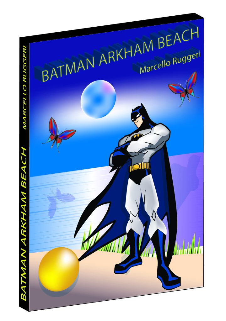
3D Game Cover Project
© Marcello Ruggeri 2019
Batman Image from Google Images
Edited by Marcello Ruggeri

The Graphic and Web Design lifestyle, takes a lot of patience, creativity and skill to get the most out of your work. You have to take your time and have to use the right tools from each program to help lead you to success in your work. The major lesson that I learned so far is to not do all your projects last minute. In my first year, I had three projects due around the same time in the same week and rushed through them that to poor results. Design takes a lot skill and time, therefore if you take your time and do your projects earlier you’ll produce your best result.

Continue reading “My Graphic and Web Design Lifestyle”

You Wish You Could Use Command Z in Real Life

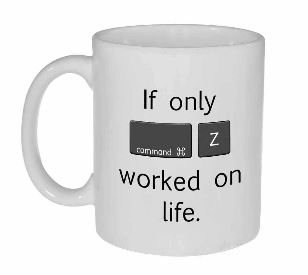
Mug with a life meme of command z
Image By www.neuronsnotincluded.com

How to Use Command Z and Why its Useful

During my graphic and web design program, I have learnt so many commands. The one that has interested me the most was the command Z. This command is very useful when you are pressured in time. It helps with undoing what you just did very fast. The steps are: hold down the “command” key and at the same time press the “Z” key. This will allow you to go back to the last thing you did.

Continue reading “You Wish You Could Use Command Z in Real Life”

How to make a duotone image in Adobe Photoshop CC

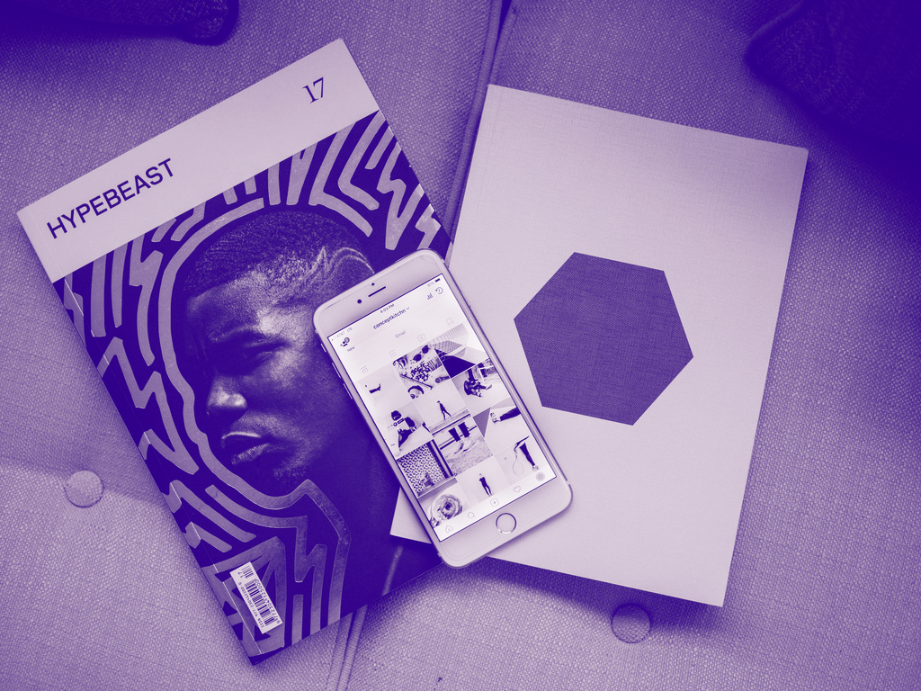
https://unsplash.com/photos/sBhg2pFvUzs
Edited by me (NosaGraphics)

Ever wonder how people make their pictures with only two or three colours instead of the regular one? Well now you can!

These types of photos are known as duotone and tritones colour schemes. Duotone is a picture that Is using only two colours instead of the original range of colours and the same thing for tritone but it has 3 colours instead of two – quite simple.

The benefit of using duotone and or tritone colour schemes is that it adds a little flavour and aesthetic to your whole design or picture which could really attract the readers eye or general public for whatever you are using it for! A lot of fun and switches things up a bit!

Here’s a quick tutorial on how to take any image you have a make it either grayscale, duotone and or tritone colour scheme in photoshop CC.

Continue reading “How to make a duotone image in Adobe Photoshop CC”

Single Point Perspective In Photography

Single Point Perspective photo of the Sainte-Anne-De-Bellevue boardwalk at dusk
Photo of the Sainte-Anne-De-Bellevue boardwalk at dusk
©Zac Taillefer, 2019

Single point perspective photography is an image with leading lines running from the edges of an image leading away from the viewer, creating a sense of depth. These lines lead to a single vanishing point. This is a perfect example of single point perspective in photography.

Continue reading “Single Point Perspective In Photography”